Minetest_game: New Inventory Design.
I`m currently designing a new inventory for MTG. It mostly differs of the default elements positioning (the creative inv locates now left side and bundled with it elems), but also attach some labels to the elements to explain what they are and colors changes.
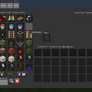
Other significant innovation is a time widget being at right top angle. Its counted each game minute is what comfortable to know current time, let when a player is being at the moment in caves and prevents a necessity to enter always /time. Also, Id like still to add day/night images near to it.
Offsetting the default creative inv is reasonable and convenient and promotes containing a more number of items per a page is what prevents switching a more number of pages.
As seen the inventory looks like still raw and needs a completion and adding more widgets as I plan. It`s considered for 5.2.0 or up.
 Andrey2470T
All 19 comments
The image is very broken, i can only see half of it, the rest is white. When i save it to my computer i can't even open it to view it. Please could you fix the image? A previous issue of yours had broken images too.
 paramat
on 2 Oct 2019
paramat
on 2 Oct 2019
Some creative/constructive criticism, all crowded in on the left & bottom, and a lot of dead/empty space in the top right, is not a very good design layout.
 TumeniNodes
on 2 Oct 2019
TumeniNodes
on 2 Oct 2019
The image is very broken, i can only see half of it, the rest is white. When i save it to my computer i can't even open it to view it. Please could you fix the image? A previous issue of yours had broken images too.
Fot me it is not broken. I tried to download, then uploaded to new hosting and only then it seemed to be broken. It has incorrect size and extremely little due to it's impossible to view form text. I'll upload a backup of my image that is on my desktop.
Some creative/constructive criticism, all crowded in on the left & bottom, and a lot of dead/empty space in the top right, is not a very good design layout.
As for me it is the best way to locate the crearive inventory so. As I alreasy said, it increases a number of items per a page (I hope do you not want to switch buttons 40 times if you have many mods when you can do it 20 ones?).
I agree with lots of blank space has appeared afterwards the redesigning. I'm thinking out now what it may be filled.
Andrey2470T
on 2 Oct 2019
The previous image loaded fine here, so I've put it back (since the current one is just a tiny preview).
Some feedback: The creative inv on left looks nice but something needs to be done about the empty space. Also I don't think showing the gametime is very useful.
 sfan5
on 2 Oct 2019
sfan5
on 2 Oct 2019
Images should be hosted on Github so that they don't disappear years in the future. Place the image on the desktop then drag and drop it into the post, Github will automatically host it for you.
/////////////////////////////////
It is good that you ae coding and experimenting, but a radical redesign of the creative inventory is best released as a mod. Unless there is very good reason to do so, a radical redesign is a bad idea as it throws away years of careful gradual improvements. Gradual evolution is almost always better than radical rewrites.
Besides, your intention has several problems:
If the intention is to provide more items per page, that should be done by altering the current design as little as possible to add another row of items.
Offsetting the default creative inv is reasonable and convenient and promotes containing a more number of items per a page is what prevents switching a more number of pages.
All of this is actually untrue.
Wasting space effectively makes item display less efficient.
The current creative inventory has 3 x 8 = 24 items, yours has 4 x 7 = 28 items, this is a tiny increase which doesn't justify a redesign, it will not reduce pages from 40 to 20.
Your design wastes a huge amount of space for no reason, this is unacceptable and looks bad. If the intent is to display more items you should be using all the space for items.
The result is a huge formspec with a size that is inconsistent with the other tabs in the inventory, which looks bad.
An advantage of the current narrow formspec is that the world is still visible to either side, so that you can look out for dangers or players.
I agree with lots of blank space has appeared afterwards the redesigning. I'm thinking out now what it may be filled.
This is a bad approach to design, to create large amounts of wasted space for no reason then to afterwards struggle to think of ways to fill it with unjustified features.
The text labels like 'trash', 'current inventory' and 'creative inventory' are unnecessary, the current inventory is graphically self-explanatory. A 'Graphical User Interface' is ideal as graphics are not subject to language. Text labels waste space, add visual clutter, add maintenance and add to translation workload.
I think displaying time and/or a day/night indicator is not justified.
For most players in almost all gaming situations the precise time is rarely needed, most of the time is spent on the surface where the sky shows the time. Time can already quickly be seen with '/time', which also doesn't open the inventory and obscure the player's view, disrupting gameplay. Accessing time in inventory is no more convenient, and when you open inventory you usually do not want to know the time.
Time and a day/night indicator again waste space, add visual clutter, add maintenance and add to translation workload.
:-1: Sorry. This is bad design in several ways, has no benefit and is unnecessary.
I can see you have a clear vision of what you want to do, but it is unacceptable for MTG. You will obviously not be happy with our requirements (which would only be: Add another item row to the current design) so i think it is best you release this as a mod so you can be free to do what you want.
paramat
on 2 Oct 2019
Why did you remove the picture again? It now looks like this:
Github will automatically rehost (or rather proxy) image links you put into your posts.
sfan5
on 2 Oct 2019
Ah, I need to just drag images to posts, thanks for info.
Well, then how about such sort of designing:
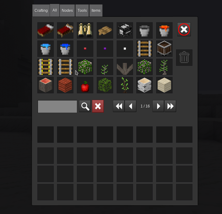
This recolors a clear button to red, add start and end page switching buttons, exit button. Due to adding exit, I needed to change size of a page (7*4 items). Also, trash field was moved to right side.
Exit button is useful for android usage as its impossible to close normally inventory, its necessary to press the screen two times. Thereby at least this idea is explicitly justified.
And main is this doesn`t look like radical and stay the creative inv at the same place!
Andrey2470T
on 2 Oct 2019
I don't think our creative tab needs a layout rework...
 Fixer-007
on 2 Oct 2019
Fixer-007
on 2 Oct 2019
I disagree with recoloring the clear button. Generally, red buttons in a UI are indicative of a truly destructive action, but resetting the search has almost no impact and is easy to 'fix' by typing the text back in.
A good rule of thumb for when a button should be red: If a user clicks this by accident, is it a mild annoyance or a major setback?
 Df458
on 2 Oct 2019
Df458
on 2 Oct 2019
I don't think our creative tab needs a layout rework...
Do you agree with the exit button is actually _extremely_ needed for android users or other OS? They can not close it the standard way which desktop users do by pressing Esc key. I would locate that outside the formspec window at top right corner, but it would appear invisible. So I needed decrease number of items per row and at the same time I increased number of items per page added still row. This must be important part of the current inventory.
Another innovation is two new page-switching buttons that assigned to execute fast hopping to the boundary pages. This is useful if a user has tens of them. I think you also evaluate and accept it.
I disagree with recoloring the clear button. Generally, red buttons in a UI are indicative of a truly _destructive_ action, but resetting the search has almost no impact and is easy to 'fix' by typing the text back in.
A good rule of thumb for when a button should be red: If a user clicks this by accident, is it a mild annoyance or a major setback?
This _has_ straight destructive assignment. This destroys a text in the field and that is all.
Andrey2470T
on 3 Oct 2019
This has straight destructive assignment. This destroys a text in the field and that is all.
You seem to have missed the point of my argument. Yes, technically it destroys the text in the field. But this is just clearing temporary input. Destructive, in a UX sense, generally means data loss. Removing text from a search field does not qualify, we're talking more on the order of deleting or irreversibly changing files on the disk.
Highlighting destructive actions red is not just color-coding for the sake of making things look pretty-it's there to send a message to the user to stop and think about what they're about to do. But clearing a search is trivial, so modern applications that highlight destructive actions never highlight search-clearing buttons. Indeed, clearing a search is so trivial that many applications slap the button directly in the search bar and don't even bother styling it as a button, let alone a red one!
EDIT: Technically destructive can sometimes be clearing fields rather than deleting files. However this is generally only the case when there's enough information there that re-entering it would be a pain (like a large order form, for instance). It's never a single field, especially not a search bar.
Df458
on 3 Oct 2019
I don't think this is a particularly good design and is worse in a lot of ways to the current design. Close buttons should be outside of the formspec and and maybe done using prepends, idk
 rubenwardy
on 3 Oct 2019
rubenwardy
on 3 Oct 2019
Heh, having the creative inventory to the left is old, not new. (See eg. here.)
 Desour
on 3 Oct 2019
Desour
on 3 Oct 2019
Heh, having the creative inventory to the left is old, not new. (See eg. here.)
I know. I just like such layout of the creative inventory.
I don't think this is a particularly good design and is worse in a lot of ways to the current design. Close buttons should be outside of the formspec and and maybe done using prepends, idk
Why? What a lot of ways do you imply? My suggested one is not much different to the current, because it only adds two page-flipping buttons, exit button and colors in red search-clearing one.
What are prepends which are you talking about? If its meant 'set_formspec_prepend' is like it sets the given formspec string for all ones, but doesnt set outside elements.
This has straight destructive assignment. This destroys a text in the field and that is all.
You seem to have missed the point of my argument. Yes, technically it destroys the text in the field. But this is just clearing temporary input. Destructive, in a UX sense, generally means data loss. Removing text from a search field does not qualify, we're talking more on the order of deleting or irreversibly changing files on the disk.
Highlighting destructive actions red is not just color-coding for the sake of making things look pretty-it's there to _send a message_ to the user to stop and think about what they're about to do. But clearing a search is trivial, so modern applications that highlight destructive actions never highlight search-clearing buttons. Indeed, clearing a search is so trivial that many applications slap the button directly in the search bar and don't even bother styling it as a button, let alone a red one!
EDIT: Technically destructive can sometimes be clearing fields rather than deleting files. _However_ this is generally only the case when there's enough information there that re-entering it would be a pain (like a large order form, for instance). It's never a single field, especially not a search bar.
Well, I may be just not such experienced designer and don`t know such trivial things...
Andrey2470T
on 3 Oct 2019
Andrey2470T, having more items per page in the creative inventory is a good idea. So i would have no objection to the following simple change:
- Making the creative inventory formspec slightly taller, or slightly wider, or maybe both.
The crafting formspec should also be made the same size so that, as currently, the formspec size doesn't change and the tabs don't jump around, when switching tabs. - Adding 1 row, or 2 or 4 columns, or maybe both, to the creative inventory slots.
- No other change to the basic layout.
- No other changes or additions.
Looking at the current creative inventory formspec, there is some empty space above and below search / trash / arrows which means an additional row could be added with only a slight increase in formspec height. This would add 8 items per page and make the area 4x8 slots which is nicely consistent with the player inventory and chests.
So adding a row seems a good idea, in which case it may not be necessary to add columns.
paramat
on 3 Oct 2019
Andrey2470T, having more items per page in the creative inventory is a good idea. So i would have no objection to the following simple change:
- Making the creative inventory formspec slightly taller, or slightly wider, or maybe both.
The crafting formspec should also be made the same size so that, as currently, the formspec size doesn't change and the tabs don't jump around, when switching tabs.- Adding 1 row, or 2 or 4 columns, or maybe both, to the creative inventory slots.
- No other change to the basic layout.
- No other changes or additions.
Looking at the current creative inventory formspec, there is some empty space above and below search / trash / arrows which means an additional row could be added with only a slight increase in formspec height. This would add 8 items per page and make the area 4x8 slots which is nicely consistent with the player inventory and chests.
So adding a row seems a good idea, in which case it may not be necessary to add columns.
At least I think two switching buttons and exit are also needed, perhaps adding a one more slots row. So a question: what are prepends do I need to use to make the exit button outside the formspec about which rubenwardy talked? As lua_api.txt says there is _set_formspec_prepend()_, but it applies the given formspecs to all others.
Andrey2470T
on 7 Oct 2019
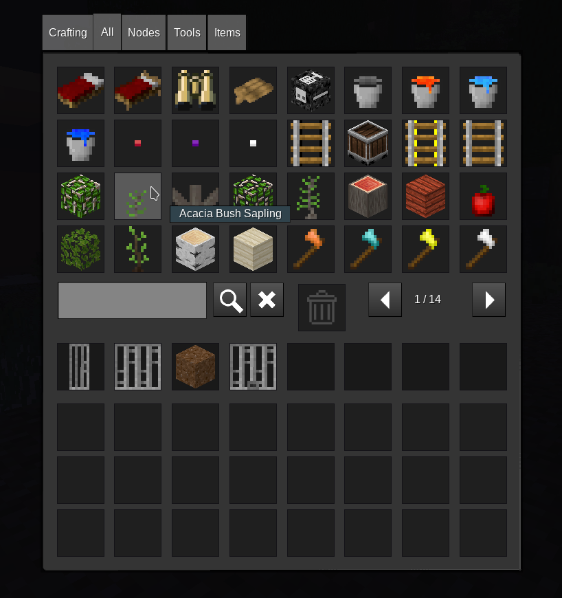
Due to adding exit, I needed to change size of a page (7*4 items). Also, trash field was moved to right side.
Exit button is useful for android usage as its impossible to close normally inventory, its necessary to press the screen two times.
It should remain 8x4, 7x4 removes the advantage of an added row and removes the width consistency with the player inventory.
The exit button is not needed, Android users can exit inventory, tapping twice isn't a problem.
The extra arrow buttons use space which means search/trash/arrows has space issues, forcing the search bar to be short. Jumping to start/end is not very useful, besides, the pages wrap so one is redundant.
I think it is best to keep search/trash/arrows unchanged and compact, allowing space for 8x4 slots.
The search clear button shouldn't be red, red is only used for dangerous functions like deleting worlds.
I don't think an external exit button is important and will add to complexity.
What exactly do Android users have to do to exit, and why is it a problem? No one has complained before now.
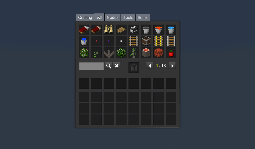
^ Current
So, here's what i would approve:
- Slightly increase formspec height, by roughly half a slot.
- Move search/trash/arrows down a little.
- Add a 4th row of items in the space created.
- Perhaps make the search bar a little longer, it is quite short (and of course move the 'search' and 'clear' buttons close to trash).
- No other changes.
paramat
on 7 Oct 2019
paramat, implemented all what you said:
Andrey2470T
on 7 Oct 2019
2517 merged.
paramat
on 23 Nov 2019
Related issues
 ghost
·
100Comments
paramat
·
71Comments
ghost
·
100Comments
paramat
·
71Comments
 HybridDog
·
50Comments
HybridDog
·
50Comments
 MarkuBu
·
94Comments
MarkuBu
·
94Comments
 benrob0329
·
41Comments
benrob0329
·
41Comments
Most helpful comment
I disagree with recoloring the clear button. Generally, red buttons in a UI are indicative of a truly destructive action, but resetting the search has almost no impact and is easy to 'fix' by typing the text back in.
A good rule of thumb for when a button should be red: If a user clicks this by accident, is it a mild annoyance or a major setback?