Minetest_game: Creative Inventory Icon Issues
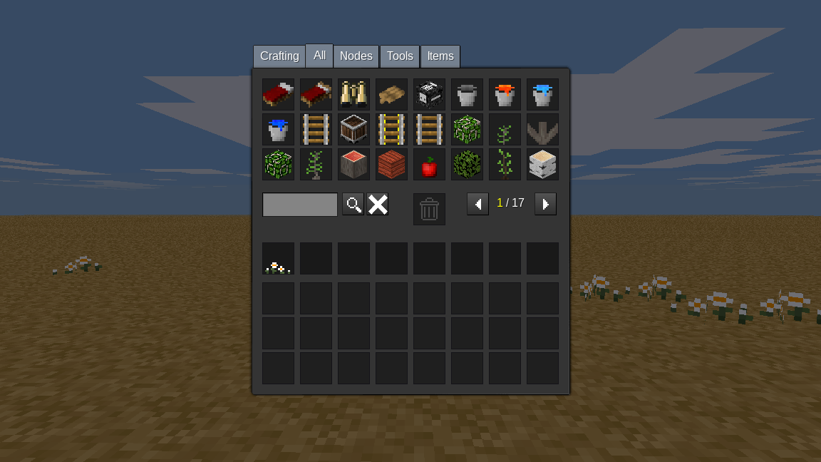
If you look closely at the cross in the image below, you'll see it's quite badly distorted. The lefthand side is fatter, while the single pixels at the innermost points from the top and bottom are tiny compared to the ones from the sides.

I assume this is due to how formspecs adjust based on screensize, and with an image that has so few pixels in it, unless you adjust to a window size that happens to work just right (for example, full screen), you are going to see the distortion. Since I value the ability to resize MT whenever I feel like so it fits nicely with whatever else I have on my screen, this is both really noticeable and really annoying.
 Ezhh
Ezhh
All 14 comments
This was exactly my objection to this change, see the PR, but others approved it. I think they look sloppy and prefer how they were before.
Note the dustbin is also distorted but seems less of an issue, we've had that icon for a long time, maybe because it is dark grey.
 paramat
on 16 Jan 2018
paramat
on 16 Jan 2018
I much prefer how they used to be and never once had an issue with them.
This, on the other hand, is a terrible change and looks really bad. Can it please be considered for reverting unless someone is willing to get high resolution images in instead?
Ezhh
on 16 Jan 2018
I support a revert (except dustbin).
Are you ok with the dustbin that has been used for a long time? There isn't really a text replacement for that.
The PR that did this sat around for a very long time with not enough support, i wish we had closed it instead.
paramat
on 16 Jan 2018
I don't mind the dustbin. The colour makes it much more subtle as well and that helps. It's just the other icons, especially that cross, which really catch my eye.
Ezhh
on 16 Jan 2018
revert. never fix what is not broken
 TumeniNodes
on 16 Jan 2018
TumeniNodes
on 16 Jan 2018
However, first let's try some high-res icons first, the original PR actually asked for an effort to reduce that distortion, so the PR was merged too quckly, a mistake, the current appearence is not acceptable.
paramat
on 16 Jan 2018
Yes it seems high-res helps a lot, i made a test 128x128 cross and resized the screen, note how bad the search icon becomes (view screenshots full size).
I'll make some new textures.
paramat
on 16 Jan 2018
@paramat That x looks huge and awkward.
If this was done properly, you should get roughly the same amount of space around each image, and it should be roughly equal on each side of each image as well.
I really have to echo TumeniNodes: don't fix what isn't broken. This should not have been merged, and the fact that a good set of icons wasn't produced in all that time suggests it's unlikely to happen.
Ezhh
on 16 Jan 2018
Yes that was just a test, it's too big.
paramat
on 16 Jan 2018
I have found the solution is to create a high-res RGBA image (128x128) then blur it slightly, the blurring is what tames the scaling implementation. It's not perfect but much improved.
Will make a PR.
paramat
on 16 Jan 2018
that looks better, and not really being able to tell, it doesn't _look_ as though blurring has left any artifacts... but, how does it scale for various resolutions?
TumeniNodes
on 16 Jan 2018
There is still very slight distortion at certain window sizes.
paramat
on 16 Jan 2018
In the PR #2020 i have done the same for the trash icon.
paramat
on 16 Jan 2018
2020 merged.
paramat
on 23 Jan 2018
Related issues
paramat
·
41Comments
 Fixer-007
·
63Comments
Fixer-007
·
63Comments
 tobyplowy
·
72Comments
tobyplowy
·
72Comments
 MarkuBu
·
94Comments
Ezhh
·
46Comments
MarkuBu
·
94Comments
Ezhh
·
46Comments
Most helpful comment
revert. never fix what is not broken