Minetest_game: Beds in all wool colours
EDIT: I disapprove of this now :-1:
///////////////////////////
1794 has some discussion on this, it was closed due to several issues and an unsuitable approach.
I request that beds are made available in all wool colours, instead of just 'MC red'.
This will also solve the often expressed frustration of requiring a rose to make a bed.
- Provide beds and fancy beds in all MTG wool mod colours, including white (no dye is needed for white wool). Total 30 beds.
- The parts of the textures that are the coloured blanket cannot use 'colourise' or 'multiply' texture modifiers, or hardware colourisation (static or param2) because wool textures have pixels of greaty varying hue (yellow wool has pixel hues varying from 42 to 61). So we need 15 separate textures for the coloured blankets, these textures could then be combined with 'base' textures that are common to all beds.
- For colour co-ordination the colored parts of the bed textures should use the wool textures unchanged.
- The bed registration code must support existing bed registrations that are in use in many mods without breaking them.
- The existing beds should be aliased to the new "beds:bed_red" and "beds:fancy_bed_red".
- Instead of 30 bed registrations a table of changing parameters should be created and the beds registered in a loop that reads this table.
 paramat
All 41 comments
Updated point 2, wool pixel hues vary greatly so we cannot use 'colourise' or 'multiply' texture modifiers, or hardware colourisation, 15 separate textures are needed for the coloured blankets.
paramat
on 25 Oct 2017
@paramat I have been trying to figure out what is the contrast and brightness adjustment that has been done from the normal red wool texture to the bed texture. However, while I get close to the same effect, I do notice that the bed texture brightness and contrast are not uniform.
The center seems to be more bright while the edges are darker.
Is it wished for this pattern to continue? In my opinion, it doesn't make sense. I'm talking here about the beds_bed_top_bottom.png file. This is part of a blanket, and therefore having a distinct square with edges at the bottom of the bed doesn't seems good to me, I think a uniform brightness and contrast adjustment is better.
 hkzorman
on 1 Nov 2017
hkzorman
on 1 Nov 2017
Close is good enough.
I just tiled the texture and yes the edges have been darkened which is not good or at best unnecessary, uniform is fine.
paramat
on 1 Nov 2017
Awesome, thanks for clarification!
hkzorman
on 1 Nov 2017
Any part of the textures which is coloured should be uniform, no edge darkening.
paramat
on 1 Nov 2017
Here is an example. The left texture is the original, beds_bed_top_bottom. The right texture is my texture.
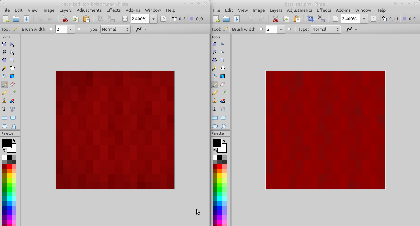
Is this coloring ok?
hkzorman
on 1 Nov 2017
Without edge darkening the texture looks a bit flat.
 Desour
on 1 Nov 2017
Desour
on 1 Nov 2017
Here is an example
Perfect.
DS-Minetest it has to be uniform as it part of a larger area of coloured blanket.
paramat
on 2 Nov 2017
@hkzorman all coloured blankets should have that lower contrast of the red one, but they don't all need to be darkened by the same amount. For example already dark colours won't need darkening and some colours may not look as good darkened (such as yellow) so i'll leave that to your artistic judgement.
paramat
on 6 Nov 2017
@paramat These are all the wool textures modified for bed usage. I will use these base textures in all bed textures that require color. Are these ok to you?


hkzorman
on 7 Nov 2017
The light green and the orange could be brighter imho.
Desour
on 7 Nov 2017
I'm already half-way modifying the textures, so I won't proceed further until you are ok with them.
hkzorman
on 8 Nov 2017
Looking at the small images they seem ok but i will compare against the wools in Gimp too.
paramat
on 9 Nov 2017
Just looked at black and blue so far.
Black is ok.
The average hue varies between your bed blue and the wool blue.
If you open both in Gimp, select the 'colour picker' tool, hold shift and click a pixel, a box opens where you can choose to show HSV values.
Now if you hold down left mouse button and drag the pointer over the pixels you can get an idea of the hue variation. Your texture is Hue 216-217 and the wool is Hue 208-216, a visually noticeable difference.
I tried reducing contrast of the wool texture to see how the process is done, and i can see it's not easy to preserve the hue of each pixel, what process did you use?
EDIT:
I can see that your red texture has hue = 0 for every pixel like the current coloured blanket.
paramat
on 9 Nov 2017
In trying to do the process myself i can see it is difficult. I started with reducing contrast, then used 'HSV' tool too boost saturation multiple times, then i needed to reduce contrast again, boost saturation again.
I think it's more important to have hue matching than to reproduce the reduction of contrast. Perhaps we can use the wool colours as they are or just make them darker, no reduction of contrast?
Direct copies of the wool colours would be fine with me.
paramat
on 9 Nov 2017
Let's get another opinion on this.
@rubenwardy @SmallJoker what do you think about bed colours being exact copies of the wool textures? I'm actually not too keen on how the red bed blanket doesn't match any wool textures used nearby.
The idea of this work is to have beds that are colour co-ordinated with other nodes, so an exact match would be good.
This would also make this PR easier.
paramat
on 9 Nov 2017
Just looked at the brown. It's an unpleasant oversaturated red-brown now, pixel hues are very different.
Cyan has non-matching hues but looks ok.
Dark green: Wool is H99-107, your texture is 120 for all.
Dark grey is ok.
Green, wool H97-106, yours 120 for all.
Grey ok.
Magenta has hue mismatch.
Orange has hue mismatch and i agree is too dark, but also too red-orange.
I won't do the others. Let's see if we take a different approach.
paramat
on 9 Nov 2017
Other devs are ok with exactly matching the wool textures http://irc.minetest.net/minetest-dev/2017-11-10#i_5132745
paramat
on 10 Nov 2017
So, no texture modification, just use the same wool texture for all colors?
hkzorman
on 10 Nov 2017
For each bed colour, simply use the corresponding wool texture unchanged.
And sorry for the change in direction.
paramat
on 10 Nov 2017
Ok, no problem, I will do so.
I had a basic formula for most of them, except the very dark and very bright textures. It was this:
- Saturation: 150
- Lightness: -25
- Contrast: -100
- Brightness: -85
For the darkest ones, I applied around -25 brightness and -25 contrast and nothing else.
No problem for the change of direction, I understand that some of my textures weren't of the best colors! I will work on these now.
hkzorman
on 10 Nov 2017
Yes in trying to process one myself it seems that the contrast change can change hue values, i had not expected this so sorry for that suggestion.
paramat
on 10 Nov 2017
@paramat No problem, I should be able to come up with a PR within this week.
hkzorman
on 13 Nov 2017
See https://github.com/minetest/minetest_game/blob/master/mods/flowers/init.lua#L29 for how to register large numbers of nodes by iterating through a data table. The registration API of beds can remain the same, then alias the old beds to the new red bed.
paramat
on 14 Nov 2017
Sorry for the long absence.
I actually was able to finish all beds and registration code. Beds look great, but all the inventory images are very poor quality.
Will work on this and improve them before I make PR.
Below screenshots:


hkzorman
on 20 Dec 2017
Looks good.
paramat
on 20 Dec 2017
The parts of the textures that are the coloured blanket cannot use 'colourise' or 'multiply' texture modifiers, or hardware colourisation (static or param2) because wool textures have pixels of greaty varying hue (yellow wool has pixel hues varying from 42 to 61). So we need 15 separate textures for the coloured blankets, these textures could then be combined with 'base' textures that are common to all beds.
Instead of registering nodes for beds in all colors maybe use hardware colors instead and optimize the textures?
 4w-zz
on 16 Jan 2018
4w-zz
on 16 Jan 2018
See point 2 in first post.
paramat
on 17 Jan 2018
See point 2 in first post.
See what I quoted and read what I replied to that quote.
4w-zz
on 17 Jan 2018
If you originally quoted point 2 in your comment, sorry.
By 'optimise the textures' do you suggest changing the textures so that they have all pixels at the same hue and using static hardware colouring? it's not very clear.
If so, wool textures would have to be changed too as the intent is to have beds match wool. However, our wool textures look good because they have varying hue pixels. The problem with hardware colouring is that it forces you to use a single base texture and applies a single hue to it, this removes a lot of possibilities and results in poorer looking textures.
paramat
on 18 Jan 2018
If so, wool textures would have to be changed too as the intent is to have beds match wool.
Yes. Change wool and beds to use hardware coloring exclusively and optimize the textures to look good in all colors.
this removes a lot of possibilities and results in poorer looking textures.
[citation needed]
4w-zz
on 18 Jan 2018
Would also break all texture packs and alter the appearence of builds.
Hardware colouring textures always look worse to me due to their limitations.
paramat
on 18 Jan 2018
Would also break all texture packs and alter the appearence of builds.
0.5.0 is a breaking release, so … :smile:
due to their limitations.
If it has limitations those limitations should be removed by implementing it differently instead of not using it, I guess.
4w-zz
on 18 Jan 2018
We're only breaking compatibility, not mods (apart from player position), worlds or texture packs.
The limitation is how they inherently work, a base texture with a colour applied, that's unavoidable.
paramat
on 19 Jan 2018
There is no stability guarantee for texture packs, they have been broken in the past.
This is not an argument.
(Same goes for "appearance of builds" by the way.)
 sfan5
on 19 Jan 2018
sfan5
on 19 Jan 2018
True, but '0.5 breakage' still doesn't mean breaking texture packs.
The appearence comment is just because i expect it would be unpopular to reduce the quality of wool textures.
paramat
on 19 Jan 2018
@hkzorman any progress?
paramat
on 14 Feb 2018
@paramat apologies for the long delay. I took long time to edit the inventory icons to look acceptable.
Hopefully they are now, at any rate, I opened a PR and then we can change the icons if needed.
PR #2052
hkzorman
on 24 Feb 2018
No problem, 0.5 is not soon.
paramat
on 25 Feb 2018
IMO the requirement of a rose (when there was only one color of bed anyway) was a poor, shameful mistake, not a feature.
 beyondlimits
on 3 Jul 2018
beyondlimits
on 3 Jul 2018
Yes i agree. It tried to mimic MC too closely.
paramat
on 4 Jul 2018
Related issues
 paanrama
·
4Comments
paramat
·
3Comments
paramat
·
6Comments
paanrama
·
4Comments
paramat
·
3Comments
paramat
·
6Comments
 Wuzzy2
·
4Comments
Wuzzy2
·
4Comments
 cx384
·
6Comments
cx384
·
6Comments
Most helpful comment
The light green and the orange could be brighter imho.