Micro has no menus. Main menu and context menus can help new users learn micro keybindings faster and in more convenient way. I will let them find out about features that otherwise can remain unknown. That's important part of any good UI, that shouldn't be underestimated.
 azazar
All 5 comments
Are you high?
- ALT+G: toggle showing some keybindings at the bottom, sort of like nano
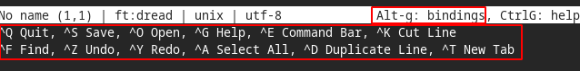
- CTRL+G: open help menu with a bunch of info
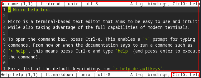
- CTRL+E + 'help defaultkeys': shows list of default bindings in help menu

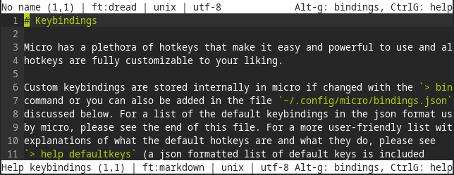
- CTRL+E + 'help keybindings': shows more info about keybindings in help menu
What user would miss all of those?
 Necklaces
on 6 Feb 2020
Necklaces
on 6 Feb 2020
It's true that there aren't any "menus" like there are in a GUI application, but I think the way it is currently set up is best for terminal users (keyboard-driven rather than mouse-driven), and there are enough indicators about accessing help documents that there shouldn't be a problem.
 zyedidia
on 7 Feb 2020
zyedidia
on 7 Feb 2020
There are objective usability metrics, such as user goal accomplishment ratio or average time to accomplish user's goal. Hierarchical menu is the best approach I know of to let user successfully find what he looks for using minimum time. Displaying hints about minimum set of keybindings at the bottom of the screen is a good thing for beginning, but it doesn't help any further. Navigating through help texts is worst option I know of. It wastes too much of precious user's time. The only proper place for keyboard shortcut hints is the hierarchical menu and context menus.
azazar
on 7 Feb 2020
but it is mouse driven - text selection, cursor placement. And that makes it really nice.
Not sure what limitations there are of a mouse driven menu in a terminal, but I think it's a convention(not in a negative connotation) that will essentially remove any learning curve. eg, sure, ctrl+, isn't that difficult, but it's not standard.
 kylepwarren
on 2 Jul 2020
kylepwarren
on 2 Jul 2020
You can take inspiration from Howl editor commands autocompletion. It is text based (no mouse) but with great discoverability.
 DriNeo
on 9 Aug 2020
DriNeo
on 9 Aug 2020
Related issues
 Mohamed3on
·
3Comments
Mohamed3on
·
3Comments
 AndreyTheHacker
·
3Comments
AndreyTheHacker
·
3Comments
 Rbagman
·
4Comments
Rbagman
·
4Comments
 KhodeN
·
3Comments
KhodeN
·
3Comments
 johnmbaughman
·
3Comments
johnmbaughman
·
3Comments
Most helpful comment
It's true that there aren't any "menus" like there are in a GUI application, but I think the way it is currently set up is best for terminal users (keyboard-driven rather than mouse-driven), and there are enough indicators about accessing help documents that there shouldn't be a problem.