Messagekit: Improve README and add MessageKit banner
Improve README and add MessageKit banner
The README could use some work 😅.
I'll definitely work on updating it but this is also a good starter task.
We also could use a banner for the README.
Something like the JSQMessagesViewController banner would be great.
I'm open to other designs, I'm just not a good artist so I have no suggestions.
Overall, I'd like to continue using the current MessageKit logo.
 SD10
SD10
All 24 comments
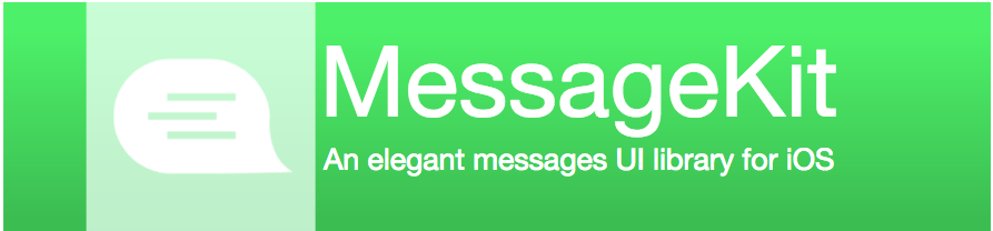
Just made some banners for fun right now, any comments on color scheme and other critiques?
Basically copied over the JSQMessageViewController banner.
I chose Orange as background colour (happy to change) because its a warmer and much more welcoming and happy colour and feels comfortable.


Noticed the subtitle font size is a bit small
 mding5692
on 10 Aug 2017
mding5692
on 10 Aug 2017
@mding5692 Thanks for doing this! I definitely think we should continue to use a green color so it matches with our organization logo. You can increase the subtitle font size if you want or even remove the subtitle altogether. I can't critique more than that, better than anything I could've done. Maybe someone else has some input?
SD10
on 10 Aug 2017
@SD10 haha no problem, I do this Sketch-related stuff for fun anyways.
Heres green colour:

Note that I dont actually know what colour green was used, so this is just roughly the same colour as JSQMessageViewController banner background colour
mding5692
on 10 Aug 2017
I'm not a designer, but here is what I got 😅


 omaralbeik
on 10 Aug 2017
omaralbeik
on 10 Aug 2017
@lionbytes would you be interested in this?
omaralbeik
on 10 Aug 2017
@SD10 @omaralbeik Guess there should be a vote for which one should be a banner based on thumbs up, haha, I like @omaralbeik 's banners too, they stand out
mding5692
on 10 Aug 2017
I personally still like the idea of changing the color to make us distinctly different then JSQ but am really ok. It does seem though like we have enough talent in this community to remake the logo if we wanted.
As for the preposed banners I really like the first one.

but could also see this one being nice.

I think seeing it on a page at the top with placeholder text would make a big difference also. I like @mding5692 colors here but am afraid that I like them because of the other colors around. The selection of colors are nice together and make it look neat but alone may not look as good. I would definitely suggest larger text for the subtitle.

but all around great job guys.
 MacMeDan
on 10 Aug 2017
MacMeDan
on 10 Aug 2017


 omaralbeik
on 10 Aug 2017
omaralbeik
on 10 Aug 2017
Also for the README, I was thinking we could copy the ideas from a few other really good READMEs we've seen for now, i think its the easiest and most efficient way for now.
I'm probably just gonna edit this post and list links of what I think are good READMEs and which bits we can use if you guys agree.
mding5692
on 10 Aug 2017
@MacMeDan I like this one me too, I think this is the more elegant and clear at the moment.
 andreaantonioni
on 10 Aug 2017
andreaantonioni
on 10 Aug 2017
I like the first one @omaralbeik posted too.
Thank you @omaralbeik and @mding5692 for working on this 🍻 🎉 👍
SD10
on 10 Aug 2017
@omaralbeik Would you mind taking your first banner and saving it as an image. My sketch is outdated 😡 and I cannot open it.
MacMeDan
on 11 Aug 2017
@MacMeDan Sure, attached in logo.zip the first logo in .png, .jpg and .svg formats,
Please use the vector .svg image, this will make the logo looks sharper on high-res screens :)
example below
<p align="center">
  <img src="https://cdn.rawgit.com/MessageKit/MessageKit/master/Assets/logo.svg" title="MessageKit logo">
</p>
@omaralbeik @MacMeDan @mding5692 @andreaantonioni Shame on you all.
No one noticed the typo in "An elegant messges library for iOS"? :joy:
SD10
on 13 Aug 2017
Oops!, my bad 🤒 😂
omaralbeik
on 13 Aug 2017
@omaralbeik I already fixed it in the XML of the .svg 😎 Sorry to make you update it
SD10
on 13 Aug 2017
@SD10 I think you noticed. 🤣
MacMeDan
on 13 Aug 2017

~I think this one may be better if you guys look at the current master 🤔~
~@omaralbeik Can you provide the SVG for this one?~
EDIT: I'll handle it
SD10
on 14 Aug 2017
Thank you for your help everyone 🎉
SD10
on 14 Aug 2017
 omaralbeik
on 14 Aug 2017
omaralbeik
on 14 Aug 2017
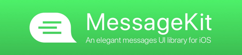
@SD10 Why does the banner look like this
and not the image above?
MacMeDan
on 14 Aug 2017
So not to bring this up again but we are looking allot like JSQ to the point of confusion mostly because we are using the exact same phrase/logo/banner . I thought the consensus was moving more towards

this logo. Gives us a distinct look but keeps the JSQ Influences. Looks Clean and new.
What say you?
MacMeDan
on 14 Aug 2017
@MacMeDan It looks like that because I thought I could get away with just pasting in an image of the logo to make the banner. I will replace it with the one Omar made :P
The reason why we're not going to use the MessageKit logo you mentioned, is because when I added it to the readme it looked horrendous. Like something from the web in 1999 😂. We definitely need a full green background.
SD10
on 14 Aug 2017
Sounds good.
MacMeDan
on 14 Aug 2017
Related issues
 pawankmrai
·
3Comments
pawankmrai
·
3Comments
 adri4silva
·
4Comments
adri4silva
·
4Comments
 mlequeux
·
3Comments
mlequeux
·
3Comments
 NiklasWilson
·
4Comments
NiklasWilson
·
4Comments
 brandon-haugen
·
3Comments
brandon-haugen
·
3Comments
Most helpful comment
@MacMeDan I like this one me too, I think this is the more elegant and clear at the moment.
