Mermaid: allow user to designate node position or justification
This graph:
graph TD
C==>D
D==>E
D==>F
E==>C
F==>C
leads to the following plot:

It'd be great to be able to specify that the D node in this situation should be centered, and the arrows go around it to make an upside Y shape, which would be much cleaner.
 chetanvsharma
All 17 comments
This might be a bit tricky. Dagre-d3 which is responsible for the layout does have support for weights fpr the relations between the nodes, perhaps that could be utilized somehow.
How do you propose the syntax should look like?
Btw: Meanwhile changing the order in the definition for changing the layout.
 knsv
on 16 Dec 2015
knsv
on 16 Dec 2015
How should I change the order of the definition to get it centered? I've tried mutating the order a few times and haven't seen any different result.
For the syntax, I could see a left/right/center justification, or an explicit pixel designated position for the center of the node, with the latter preferred for flexibility. This could be designated with:
style A justification:left or style A left-position:400,right-position:500
What do you think?
chetanvsharma
on 16 Dec 2015
This renders a different layout but this is perhaps not how you wanted to illustrate this:
graph TD
  D==>E
  C==>D
  D==>F
  E==>C
  F==>C
Anyways, I will tag this as a wanted enhancement and would be happy for help with it from someone.
knsv
on 27 Dec 2015
Hi, I see this is an issue that has been open for quite some time, are there any developments on this question? I have a similar problem at hand now, I want to create a (basic) network diagram where I have for example 2 core routers A & B, and 2 distribution routers C & D. I want A & B to sit on the same height, and C & D below that.
graph LR
A-->B
C-->D
Works fine, both A & B and C & D are on equal heights. But when I add the diagonal and vertical connections ( A-->C, B-->D for vertical and A-->D,B-->C for diagonal ) the layout is not what I want it to be. I would like to have a square layout with the diagonal lines forming an X shape between the nodes.
I think that this would be accomplished already if I could force nodes A & B to have a row height of 1 and C & D to be on height 2, but I cannot find anything in the docs relating to node position.
Please let me know if I missed something.
 n1els
on 29 Mar 2017
n1els
on 29 Mar 2017
Flowchart layout is powered by https://github.com/dagrejs/dagre-d3
Anybody who wants to help please check how upstream project supports this feature.
 tylerlong
on 17 Mar 2018
tylerlong
on 17 Mar 2018
Greater control of layout sorely needed
I see many existing issues (see specifically #522, #561, #575, #565, #333, #591) in the repo about layout pains experienced by users. Clearly solving this would rock the plaintext driven diagramming world!
A plaintext solution
@knsv asks:
How do you propose the syntax should look like?
Idea by @TeMPOraL taken from this HackerNews thread:
Pros:
- It's all plaintext. I love working with plaintext for all the usual benefits, so this fits.
- PUML renderer is technically a free-to-download JAR, so it can presumably[0] integrate well with my Org-mode life.
Cons:
- Try to draw anything more complicated than three boxes and an arrow, and you'll be spending 90% of the time fighting the layout engine.
- It's even worse when you have your own opinion about the desired layout. No way to do that reliably, the result is very brittle.
I generally like it, but I'd like it 100x more if there was a way to explicitly pin some component to absolute coordinates. Or at least a better way for giving layout hints than soft constraints introduced through invisible links.--
EDIT: A random idea if anyone is developing something PUML-like:How about separating out layouting a bit, and letting me type in something like that:
  A     F    G
  B  C  D
           E H
And then continue with regular PUML code:
  package "core" #A {
     [something]
     [something-else]
  }

  ...

  [some-component #D]-->[some-component #E]

  ...
Basically, I wish I could draw a picture representing the rough layout of key image components, and have this as a hard constraint on positioning other elements.
--
[0] - Presumably, because I gave up on it after couple large-ish diagrams, just before my use has reached the threshold above which I consider Emacs integration.
 vassudanagunta
on 29 Aug 2018
vassudanagunta
on 29 Aug 2018
Just to stress, idk, priority or something, this is a serious/blocking limitation for the system diagram I'm trying to create. Basically I have a central point that calls two bigger services which have sub services that are also called by the central service, plus several smaller independent ones called by the central point. This ends up spreading the subservices out across the entire diagram when they should really be grouped together under their non-central node parent service. Dagre seems to possibly have some features for this, but without writing my own solution in the mermaid code (I'm using the browser editor for now) this doesn't appear to be configureable through the mermaid config file.
 BHunter2889
on 1 Oct 2018
BHunter2889
on 1 Oct 2018
The inner library used by mermaid seems to support node ranking (https://github.com/dagrejs/dagre/wiki#configuring-the-layout) through the graph.ranker value. Currently the only supported value by Mermaid is rankdir (TB, LR, RL...), but adding different props to the graph key could work.
 hugmanrique
on 17 Nov 2018
hugmanrique
on 17 Nov 2018
I am trying to make mermaid to wrap a single graph to make it better fit the screen, so I would obtian something similar to https://s3.sbarnea.com/ss/promotions.png
Is this possible?
 ssbarnea
on 27 Nov 2018
ssbarnea
on 27 Nov 2018
Wanted to give my support to @n1els, having a text-based diagramming system for network diagrams would be amazing. But the auto-layout engines don't always work like we want, so we can add everything but the images are 10 times larger than we need. I've been playing with Graphviz, but I just can't quite get things right. I love the inline text for connections on Mermaid!
 firedrow
on 28 Nov 2018
firedrow
on 28 Nov 2018
Hi , I found this https://466023746.github.io/face/
I have the same problem above, so I change my mind, use another way to solve this.
I use the color to distinguish each other, and without any loop.
 466023746
on 13 Dec 2018
466023746
on 13 Dec 2018
Similar to some layout issues experienced by other users, Mermaid code like this will result in a flowchart that gets wider and wider with the number of nodes:
````
graph TB
    A((START))-->B
    B(Condition1?)-->|yes|C
    C(Condition2?)-->|yes|D
    D(Condition3?)-->|yes|E
    E(Condition4?)-->|yes|X
    X[ConclusionA]-->Z((DONE))
    Y[ConclusionB]-->Z
    B-->|no|Y
    C-->|no|Y
    D-->|no|Y
    E-->|no|Y
````
Mermaid will output this flowchart:

What I would like to see, however, is something like this:

Any suggestions on how to do this, would be most welcome.
 FrankKooij
on 17 Jan 2019
FrankKooij
on 17 Jan 2019
I used subgraphs to solve this
graph TD
linkStyle default interpolate basis
subgraph
A[gunung]-->B[NOUN]
C[Krakatau]--> D[NOUN]
E[Yang]-->F[PRON]
G[Pernah]-->H[ADV]
I[meletus] --> J[VERB]
K[mulai]-->L[VERB]
M[terbatuk-batuk] --> N[VERB]
end
subgraph
  B --> O[FN]
  D --> O
  F --> O
  J --> O
  L --> P[FV]
  N --> P
end
subgraph
  O --> Q[Subject]
  P --> R[Predicate]
end
subgraph
 Q-->S[clause]
 R-->S
end
But I need to preserve the order of the nodes. I defined Pernah before Yang but it comes in the end. Please help, on how to maintain the order of the nodes. Thanks
 vidur149
on 30 Mar 2019
vidur149
on 30 Mar 2019
This whole area is obviously a pain point, but tricky to say what a proper solution should even look like. Some of the examples people post above (like n1els) are probably solved well with sub-graphs to ensure that certain nodes stay grouped. Some seem like minor complaints about the exact way to draw the graph (FrankKooij) but it seems like at that point you should just be using a hand-drawn system. Part of the point is that the diagrams are auto-generated, right? If you want to specify absolute pixel coordinates, you aren't really auto-generating the diagram, you're just coding it in text and that seems like a different use-case to me. Perhaps PDF is what you are really looking for?
There's also a divide, I think, between people who are drawing static graphs, like where you are hand-writing the mermaid code for some documentation; and people who are dynamically generating graphs. For example, I'm using mermaid to render a graphical view of a user-created flow chart on a website. In this case I'm dynamically generating the mermaid code from user content and don't know a priori what the set of nodes or their relationships are. Where-as with the static case you do know and could potentially specify some alignments. These two cases possibly need different tools.
To my point earlier about auto-generating, I think you have to accept some non-determinism in the generated graph, but I have also seen some weird behavior in a large chart where two nodes end up far apart even though the one node is not connected to anything else except the other node. So, there's a long path between them and a lot of empty space in the diagram where they could have been closer together without changing any of the rest of the diagram. Clearly the graphing algorithm is not optimizing on short connectors. This seems like something that would fit in the language scheme: have a way of indicating layout optimization priorities. Like, "I want nodes to show up in the order that I specify them", "I want to minimize average connector length", "I want to minimize connector intersections", or maybe "i want nodes to be orthogonally aligned". Being able to specify a layout preference like this (or even an ordered list of preferences) would, I think, address a lot of the largest problems that people are calling out here.
The other thing I would love to have, and really is needed when the graph is dynamically created, is some way for the end user (viewer) to drag the boxes around. This allows them to re-arrange things as needed for the semantics of the graph (that only they understand), or just to help them focus on one part of the graph versus another at any given time.
 dskarbek
on 16 May 2019
dskarbek
on 16 May 2019
BTW, here's a sample of the sort of graph I'm working with (all text has been removed). Note that the first node (in green) is no where near the top of the chart, even though it is declared first. Also note the yellow nodes which only connect to one other node are often far from their one connection even though there is empty space they could be in closer to their connection.
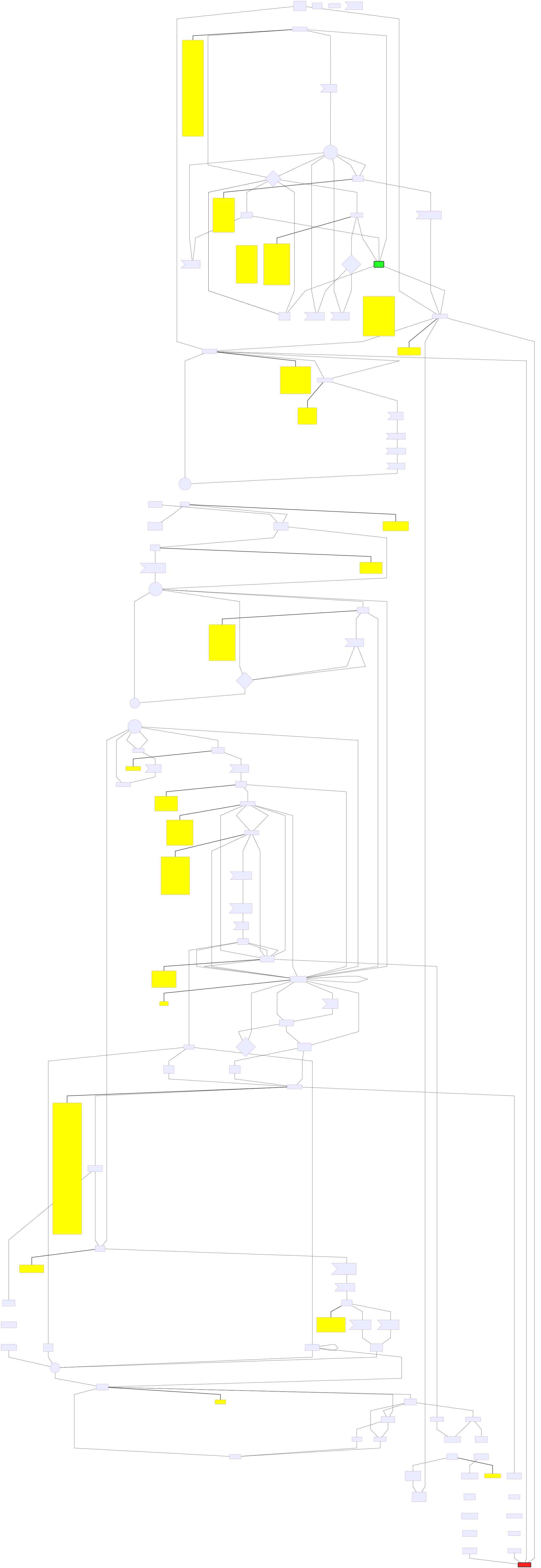
dskarbek
on 16 May 2019
This issue has been automatically marked as stale because it has not had recent activity. It will be closed if no further activity occurs. If you are still interested in it, and it is still relevant, you can comment or remove the label to revive it.
![github-actions[bot] picture](https://avatars2.githubusercontent.com/in/15368?v=4&s=40) github-actions[bot]
on 24 Sep 2019
github-actions[bot]
on 24 Sep 2019
This issue has been been automatically closed due to a lack of activity. This is done to maintain a clean list of issues that the community is interested in developing.
![stale[bot] picture](https://avatars3.githubusercontent.com/in/1724?v=4&s=40) stale[bot]
on 8 Oct 2019
stale[bot]
on 8 Oct 2019
Related issues
 The-Alchemist
·
4Comments
The-Alchemist
·
4Comments
 vi
·
5Comments
vi
·
5Comments
 init-dcat-ap-de
·
3Comments
init-dcat-ap-de
·
3Comments
 gvlx
·
5Comments
gvlx
·
5Comments
 tokyo786
·
3Comments
tokyo786
·
3Comments
Most helpful comment
Just to stress, idk, priority or something, this is a serious/blocking limitation for the system diagram I'm trying to create. Basically I have a central point that calls two bigger services which have sub services that are also called by the central service, plus several smaller independent ones called by the central point. This ends up spreading the subservices out across the entire diagram when they should really be grouped together under their non-central node parent service. Dagre seems to possibly have some features for this, but without writing my own solution in the mermaid code (I'm using the browser editor for now) this doesn't appear to be configureable through the mermaid config file.