Mattermost-server: UI/UX Improvements to the mobile post draft area
This ticket is done on the mattermost-mobile repository
See design: https://projects.invisionapp.com/share/UCTBUSUK5BH#/screens/377642040
If you're interested please comment here and come join our "Contributors" community channel on our daily build server, where you can discuss questions with community members and the Mattermost core team. For technical advice or questions, please join our "Developers" community channel.
New contributors please see our Developer's Guide.
 mattermod
All 23 comments
This seems like an awesome improvement, I'd like to give it a shot at implementing this UI/UX change if possible :)
 avasconcelos114
on 4 Oct 2019
avasconcelos114
on 4 Oct 2019
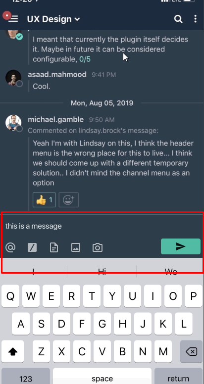
I got a couple of questions regarding the icons that are going to be used at the bottom.
I initially started trying to fill up the icons at the bottom using AwesomeIcon (as I noticed other components around the mobile app using it) and it's looking a little like this:
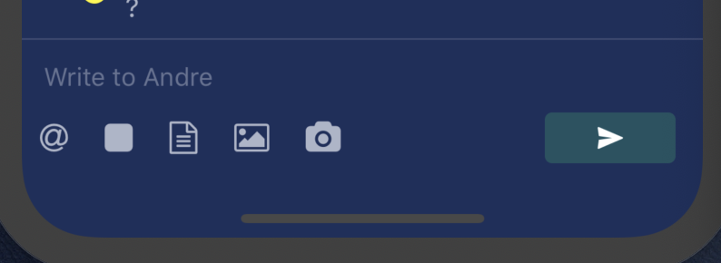
But what I can gather from the document linked above:
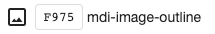
- Each of the icons in the design specs look slightly different from the ones seen in
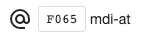
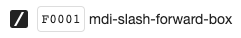
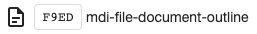
AwesomeIcon - The slash command icon (displayed as a box with a slash sign inside it) doesn't seem to exist in
AwesomeIcon. For now I put the closest looking icon I could find over there, but for obvious reasons we'd want to switch over the one seen in the specs
So I guess the questions I have would be:
- Should I continue to use
AwesomeIconfor the icons that I did find that were similar enough? - How should I go about getting a hold of the icons displayed in the design specs (be it only the slash command one, or all of them, if not using
AwesomeIcon)?
Thank you in advance!
avasconcelos114
on 5 Oct 2019
@esethna Can you help with theses questions?
 hanzei
on 8 Oct 2019
hanzei
on 8 Oct 2019
Thanks @avasconcelos114! Super excited about this ticket too. @andrewbrown00 is the designer on this so he can help answer your questions re icons.
 esethna
on 8 Oct 2019
esethna
on 8 Oct 2019
@avasconcelos114 stoked about this feature!
For now, will you add the Material Design Icon font to the resources.
Screen shots for reference

Cheatsheet
https://cdn.materialdesignicons.com/4.4.95/
 andrewbrown00
on 8 Oct 2019
andrewbrown00
on 8 Oct 2019
Ah my mistake, I hadn't realized the project also used material icons
Thank you for the helpful links and icon names! :)
avasconcelos114
on 9 Oct 2019
Not your mistake at all and you're welcome! Let me know if you need anything else 😄
andrewbrown00
on 9 Oct 2019
Welp I seem to have run into another bit of a hiccup with regards to the icons
The library Mattermost currently uses to get its icons from, react-native-vector-icons, doesn't seem to be up to date with the version of @mdi/font that includes the mdi-slash-forward-box icon. Their master branch has already caught up with the correct version but until there's a new release this icon won't be accessible
So right now the options seem to either be wait until they run another release and update the version on package.json, or to fork that repo and reference a specific commit on that fork (as I've noticed it's already been done with a few other dependencies)
Is there any preference to what course of action would be best in this sort of circumstance?
avasconcelos114
on 16 Oct 2019
That's a bummer.
@enahum do you have a recommendation for the best path forward based on @avasconcelos114's last comment?
andrewbrown00
on 17 Oct 2019
@andrewbrown00 Mattermost font as we talked in the past
 enahum
on 17 Oct 2019
enahum
on 17 Oct 2019
@andrewbrown00 Mattermost font as we talked in the past
@enahum agreed, and it's in progress as part of the UX Redesign but not complete. What about an interim solution so we don't block this feature?
andrewbrown00
on 17 Oct 2019
@andrewbrown00 png images that we could set a tintColor
enahum
on 17 Oct 2019
Sounds good, thanks for the feedback 👍
@avasconcelos114 the icons can be found here: https://materialdesignicons.com/ and they have a variety of download options. Let me know if this doesn't give you what you need and I will provide the necessary assets.
andrewbrown00
on 17 Oct 2019
Ah that should be a nice workaround, downloaded a png icon and will be coloring it with tintColor for the time being
Thank you again for your help!
avasconcelos114
on 18 Oct 2019
Hey @avasconcelos114 how is this ticket going? Let us know if we can help!
esethna
on 25 Oct 2019
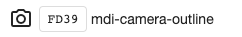
For now, I transferred all the functionality for the image and file upload buttons
I'm hoping to add the camera functionality but that'll take a few extra changes to how the previous attachment methods worked (having video and photos as two separate buttons)
After I'm done with all that I'll add unit tests and submit a PR (hopefully before the end of the month)
avasconcelos114
on 25 Oct 2019
Great, thanks for the update! Looking forward to it!
esethna
on 25 Oct 2019
I finally got some free time to make more progress on this feature (apologies for the constant delay!)
I ended up hitting a bit of a technical limitation regarding how the design docs originally wanted the camera button to behave like.
In the designs, the camera button would bring up the camera, which then allowed users to select if they would like to take a video of a photo in there. But as it turns out, the Android devices have a limitation where they can't have the mixed option set to change media type inside the camera (i.e. you have to pick if the camera is going to be for photos or videos beforehand).
I was wondering which of these options would be better UX-wise:
A) Use the mixed mediaType for iOS, and have android users select which option they want with the modal that's already currently implemented (except it would only display the Take Video and Take Photo options)
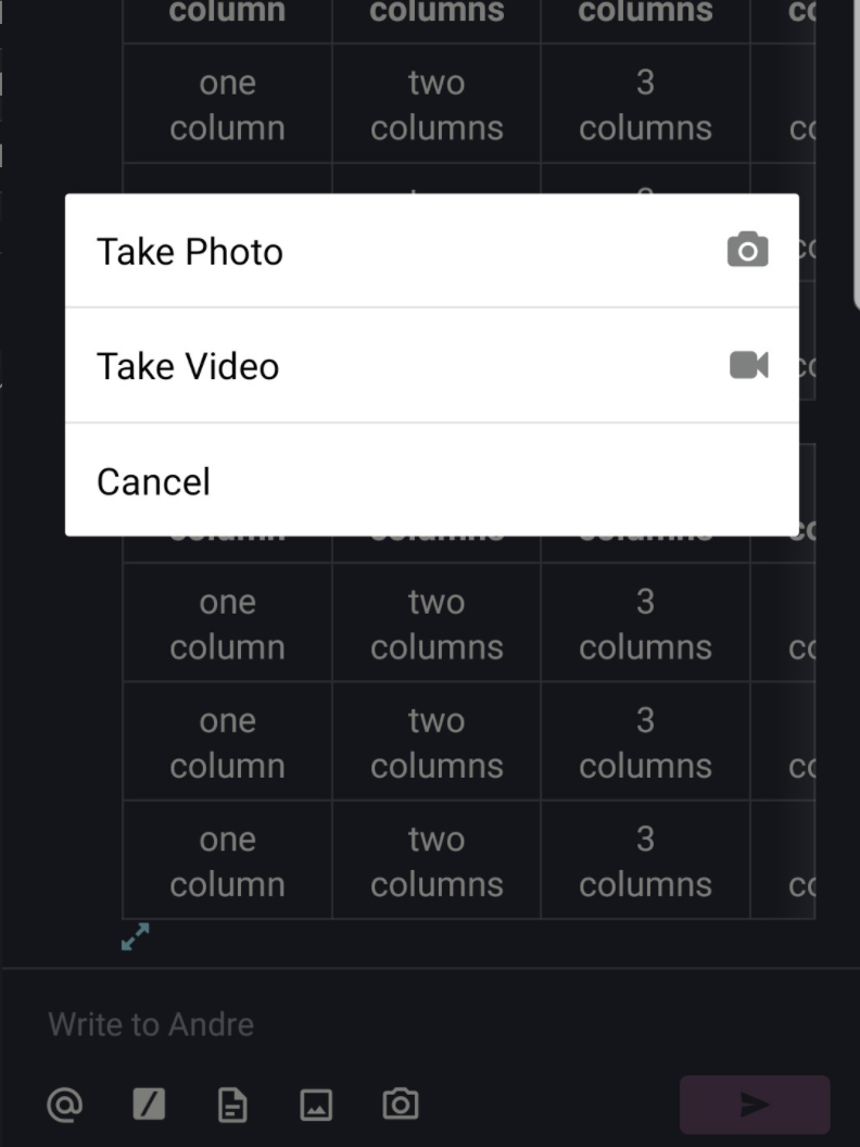
B) Have both iOS and Android behave the same way by presenting users with the modal for Take Video and Take Photo when pressing the camera button
Let me know what you think :)
avasconcelos114
on 6 Nov 2019
I have an additional question regarding how should the app behave when the user is in landscape mode, and they have attached a few images to their message.
Reason being that according to the new design specs, the attachments are going to be positioned under the textbox (like below)
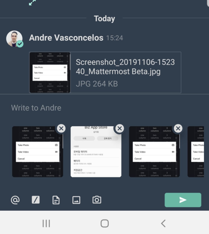
Which looks super nice
The problem is that when the user flips to landscape mode it becomes impossible for a user to see how their post looks like due to lack of real estate on the screen
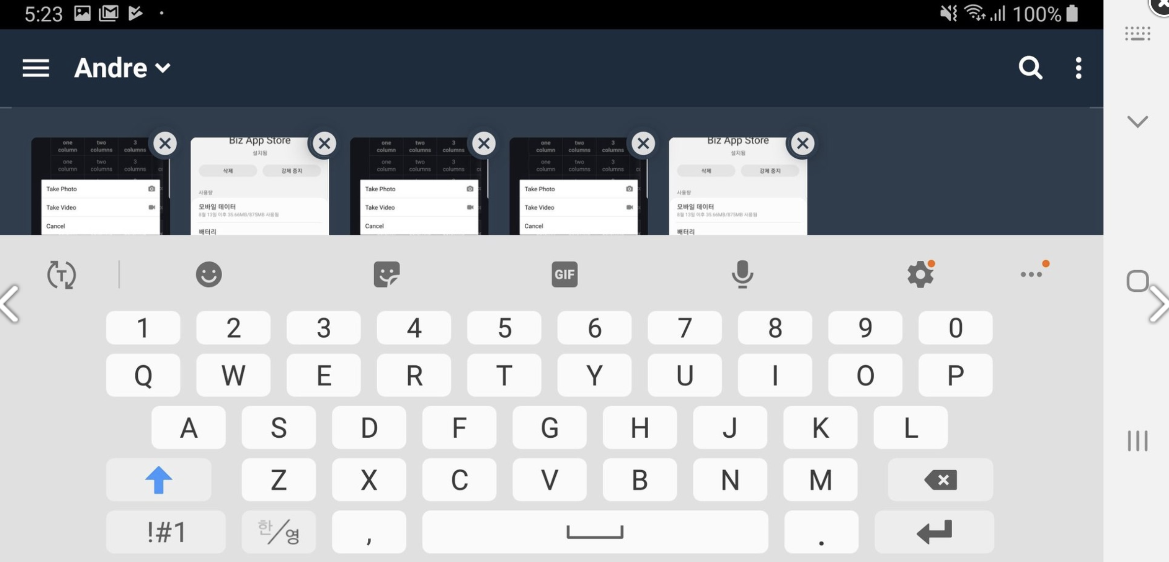
Would this be considered just a limitation of the device and left as is? or would there be a good way for the app to respond to this sort of use-case?
The best thing I can think of is to make sure that the entire post textbox is scrollable so that the user can scroll through as they type to keep whatever they're writing visible on the screen
avasconcelos114
on 6 Nov 2019
@avasconcelos114 thanks for bringing these issues up, sorry for the delayed response.
Here's my feedback for the following items:
I noticed what appears to be a mixed mediaType on the native messages app on my Pixel 3a, but that's after I tap the expand icon button. Has the mediaType been updated recently or is Android doing something else here?
After tapping the camera icon | After tapping the expand icon
------------ | -------------
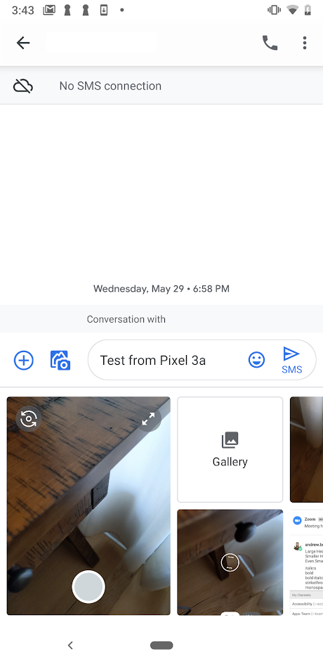 |
| 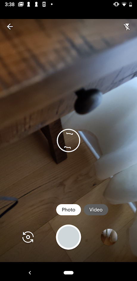
If we can't do what is displayed on the "After tapping the expand icon" screenshot, then go with option A for the camera behavior and use the
mixedmediaType for iOS, and have android users select which option they want with the modal that's currently implemented.This is going to be a limitation of the devices view area when the keyboard is open. It's definitely not the greatest experience, but not sure what we can do about that when the keyboard is open because there are so many variables to account for. We'd have to create separate ticket to try and solve the landscape problem.
andrewbrown00
on 11 Nov 2019
Looks like this commit https://github.com/react-native-community/react-native-image-picker/commit/454fff34df11a5c99eb053c3ea515c820d35bddc added mixed content to android
enahum
on 12 Nov 2019
Awesome work @avasconcelos114 ! We now have a PR open against the feature branch to get this effort through.
 chuttam
on 14 Jan 2020
chuttam
on 14 Jan 2020
Amazing! super excited to see this one through :)
avasconcelos114
on 14 Jan 2020
Related issues
esethna
·
3Comments
esethna
·
3Comments
 saturninoabril
·
3Comments
esethna
·
3Comments
saturninoabril
·
3Comments
esethna
·
3Comments
 NotSqrt
·
3Comments
NotSqrt
·
3Comments
Most helpful comment
Awesome work @avasconcelos114 ! We now have a PR open against the feature branch to get this effort through.