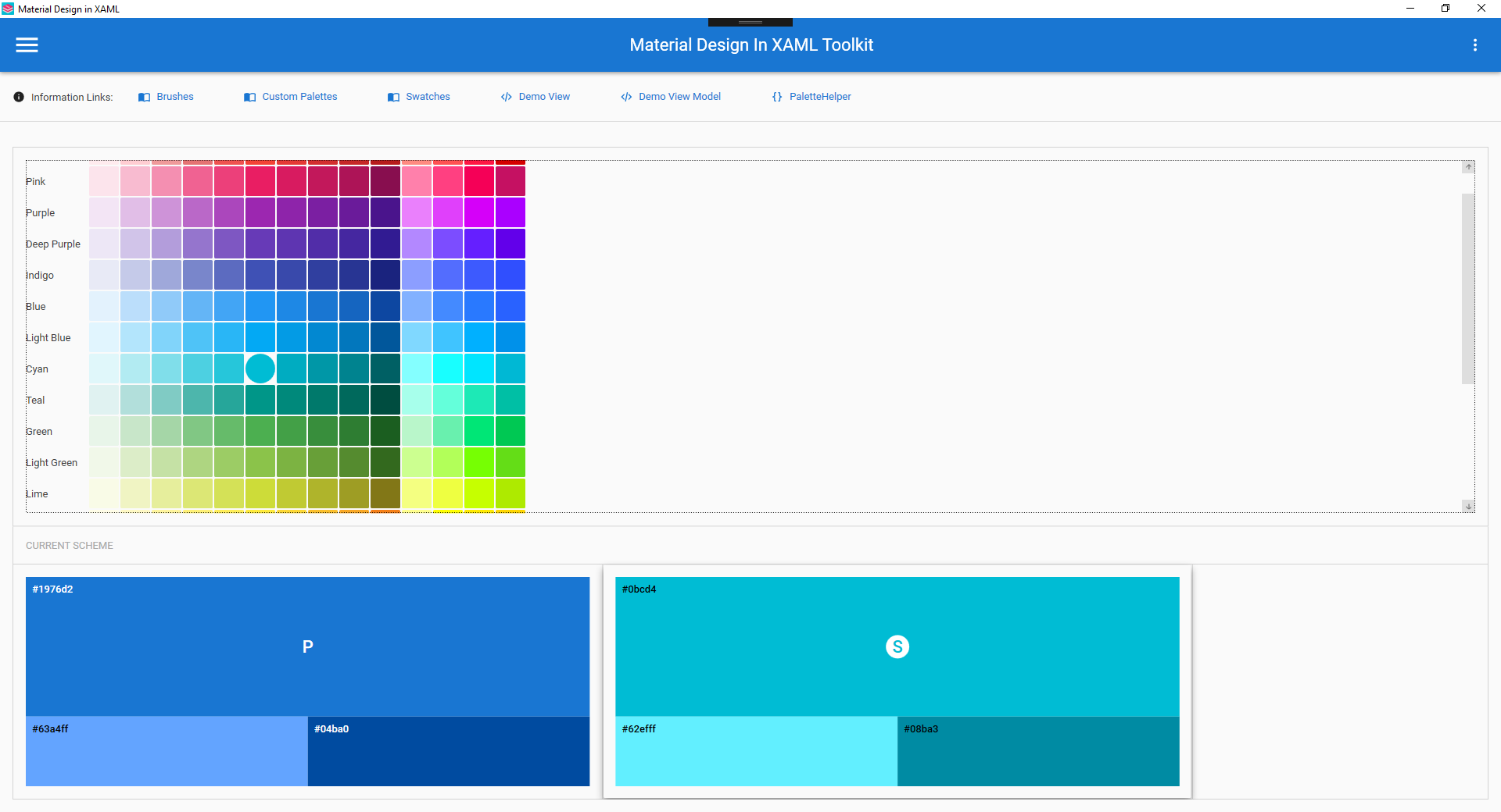
Materialdesigninxamltoolkit: Secondary colors.
The material design guidelines suggest secondary colors are like primary in that they have a light, mid, and dark tone. It would be awesome if the color palette was adapted to include these variations out of the box. I'm interested in hearing what others have to say on the matter.
 rrs
rrs
All 18 comments
Adding link to material design documentation
 Keboo
on 4 Oct 2018
Keboo
on 4 Oct 2018
My bad. Thanks for that @Keboo.
To start off with my opinion. If the accent color was converted to a secondary color palette. You could keep the old accent color references, which would link to secondary mid as a stop gap, but it would allow both future development and any refactoring to use the secondary light, and dark variants. It would give an expanded color palette for consumers of the toolkit to play with.
The color palette picker is awesome in the test project but it would knock the ball out of the park if you could select colors from the full range of swatches, just from the 2014 colors would be a big step forward but if you could select from a color range like on the link provided by @Keboo that would just be golden. Similarly a picker for background, surface etc would be amazing.
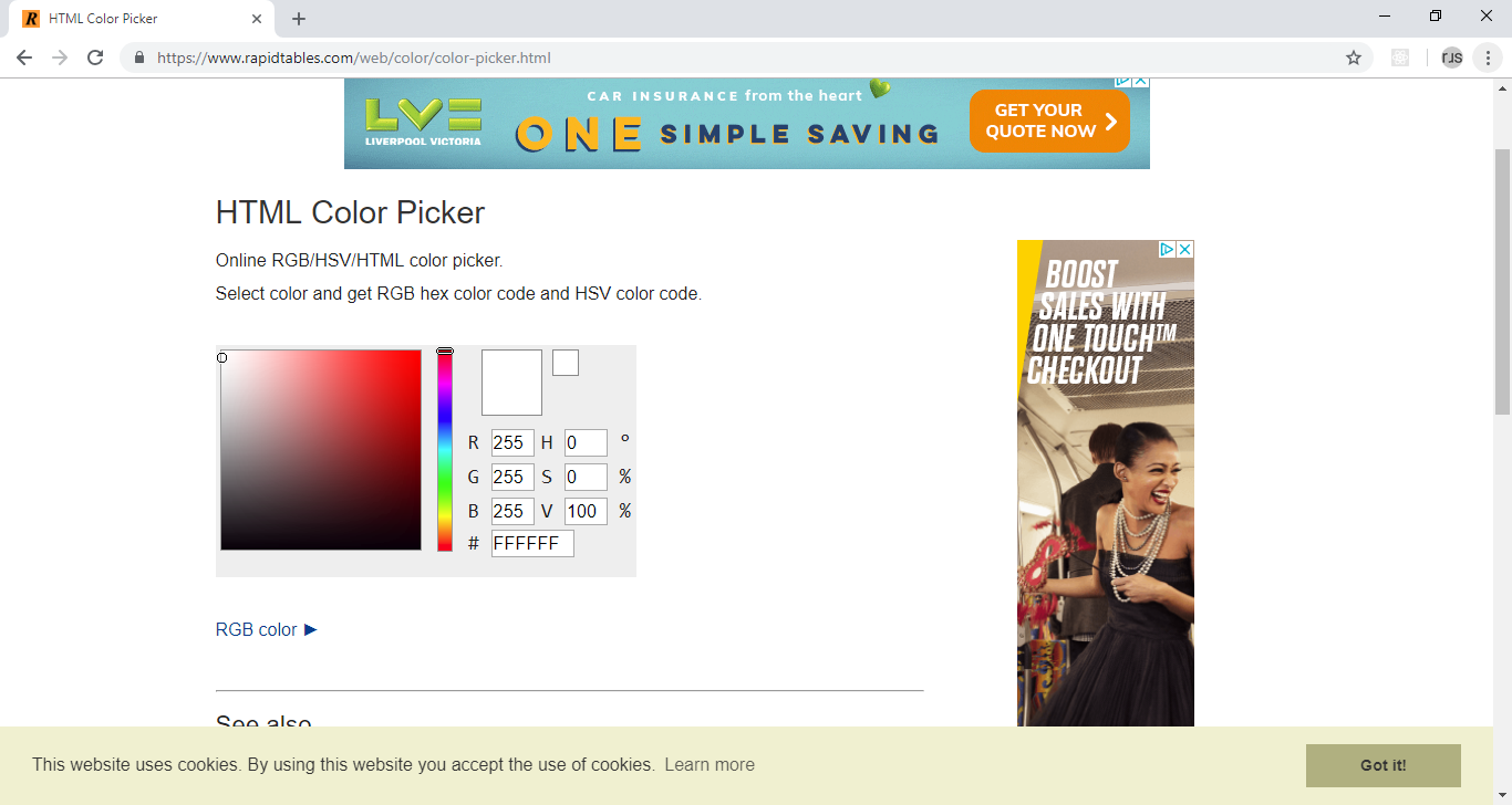
There is also a link to this color tool from their site which is nice
rrs
on 4 Oct 2018
I was thinking over the way the color tool works and how the current toolkit works. In this toolkit the primary colors are fixed at the intervals of 200, 500, and 700 and the accent is set at 700. The md color tool allows you to select any of the colors from the range of palettes, and it then adjusts that color by some method to the light and dark variants. The same logic applies to the secondary color. So the palette selector would set the mid to the chosen color and would need to generate the light and dark variants dynamically. I'll see if i can figure out the calculation google use...
rrs
on 4 Oct 2018
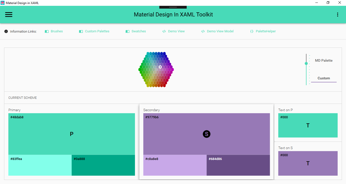
I have hacked out a picker emulating the md color tool.

You pick a primary and secondary color and the code generates light and dark variants and picks the highest contrast foreground color for all colors.
What i am considering now is how to mesh it with the existing color system. The options i see are to generate all the variants and store them like the current palettes, for example you would have a resource dictionary for just red 50 or green 200. You would have duplicates for the secondary colors too. Then you would instead of including a primary and accent dictionary, include a primary and secondary, specifying the level, for example
<ResourceDictionary Source="pack://application:,,,/MaterialDesignColors;component/Themes/Primary/MaterialDesignColor.DeepPurple500.xaml" />
                <ResourceDictionary Source="pack://application:,,,/MaterialDesignColors;component/Themes/Secondary/MaterialDesignColor.LimeAccent700.xaml" />
The existing dictionaries in Recommended would remain for backwards compatibility and the secondary dictionaries would also contain brushes called SecondaryAccentBrush and SecondaryAccentForegroundBrush which would allow for a transition to using the SecondaryHueMidBrush, Light and Dark variants.
Alternatively this color system could be applied through code, for example, in app.xaml.cs you would have
PaletteHelper.SetPrimaryHue(DeepPurpleSwatch.DeepPurple500);
PaletteHelper.SetSecondaryHue(LimeSwatch.LimeA700);
Finally it could be done using both
rrs
on 6 Oct 2018
Progress...

rrs
on 7 Oct 2018
my repo is at https://github.com/rrs/MaterialDesignInXamlToolkit/tree/feature/EnhancedPalette if anyone wants a play. Still a WIP.
Latest color tool (colors indicate which is selected)
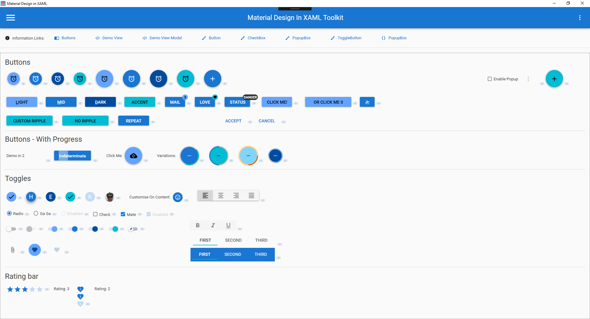
Scheme in use on the demo buttons page
rrs
on 8 Oct 2018
I have implemented the foreground pickers to mimic the google color tool. Its a bit limited in usefulness, but what the hell it was easy to hack out.

Now the difficult part. The existing palette code is opinionated in regards to where an accent color should and shouldn't be, where this code isn't. I can more easily murder the current hue, swatch, and palette classes and make the old resource dictionaries work with the new code, but that would cause breaking changes. How many people use the existing palette code i don't know. The two methods could be used side by side to some degree as they are in this codebase but the PaletteHelper.QueryPalette() for example will not handle the new palette arrangement, but then it doesn't work with custom colors anyway.
Short version - can the project tolerate breaking changes to Hue.cs, Swatch.cs, and Palette.cs?
rrs
on 8 Oct 2018
@rrs First of all this is looking amazing. Really nice work.
As for your question. Custom colors/themes has been a bit of a pain point in the library for a while. The existing stuff works, but is pretty limited with the current API, and is not very extendable. I have an existing PR (#923) that I did a while back and I hope to move many of those concepts forward for a 2.6.0 release. Ideally with as few breaking changes as possible (my current PR is bad at this and needs some fixing).
I think ultimately the API on those classes needs to change, but I would like to keep the breaking changes as small as possible and give a smooth upgrade path for people who may be using the old stuff. I have not spent much time looking over your code, but I think it may be best to (at least initially) start with rolling your own version of those classes.
Thoughts?
Keboo
on 8 Oct 2018
I thought that would be the case so yeah slow upgrade path is fine by me. I'll have a look through the PR you linked and see what I can marry up, use or adapt. This dev is still in the hack it out and see what makes sense stage.
I'll give you a brief on whats new and what its doing.
MaterialDesignDemo
ColorTool.xaml
This is what you have seen. Few supporting converters etc.
MaterialDesignColors.Wpf
CodeHue.cs
This takes just takes a color, name and interval. It currently has all the color manipulation code, I extracted the useful bits from chroma.js which the material design color tool uses. It converts the RGB color into LAB which is easy to darken / lighten in a linear way. It then converts it back to RGB. It also generates the appropriate foreground colors, for the source color and the two generated colors.
{ColorName}Swatch.cs (e.g. RedSwatch.cs)
These are static and contain all the hues from the original palettes.
SwatchHelper.cs
Just a place to hold all these swatches together. Much like the existing SwatchesProvider.cs
MaterialDesignThemes.Wpf
PaletteHelper.cs
Added some methods to handle changing the primary and secondary colors given a CodeHue.cs
Ripple.cs & RippleAssist.cs
Added a dependency property RippleOnTop which is used to control the z order of the ripple, control templates can use a converter to convert this into a zorder.
ShadowAdorner.cs
Had to bench this for now as i couldn't get it to work. I wanted to be able to render a shadow aboe other controls, specifically outside of the bounds of the control or its layout area. In an effort to emulate that online tool. You can see on the demo page that when you select one of the color scheme selection controls the shadow sort of changes but its clipped by the surrounding controls. In contrast look at the online tool to see what i had in mid.
ButtonAssist.cs
This exposes a dependency property for controlling the border radius of a button.
rrs
on 8 Oct 2018
Just done a very quick read of PR (#923) and a skim through some of the code, some quick thoughts.
- Code seems like the preferred color set up method. However allow xaml still.
- Emphasis on allowing the ease of customizing colors. I was going to look at theme-ing sub sections after this so that's great you have that in mind already.
- I prefer primary and secondary colors being the same structure, and scrapping accents in their current form
- I think it would be beneficial to absorb the color picker into MaterialDesignThemes.Wpf as a control in its own right. I know its a fully fledged user control but it is arguably a lower level control like a date picker and could be coded as such, even giving it template parts for the swatches etc. This would allow consumers of the toolkit to expose this to clients easily, obviously it can take a back seat but i'd keep it in mind.
- A full color wheel / picker is the next thing to add to the color picker. So obviously the project needs to be able to handle custom colors across the board
rrs
on 8 Oct 2018
Wish I could fav' this issue. Looking fantastic
 jespersh
on 9 Oct 2018
jespersh
on 9 Oct 2018
@Keboo I had a better look through your code and I can just merge your pr into mine. I would then tweak it slightly so that the code based configuration takes colors instead of enums, and convert accent's to a full secondary palette. Reason for taking colors instead of enums is that it can just accept any colors from the user. There are static helpers in my code to use like the enums in yours. I'll also provide helpers to provide additional palettes through code for example AddPalette(string name, Color midColor) which would do all the same auto generation as in my code but allow you to reference for example 'AlternateHueMidBrush' or 'AlternateHueLightBrusgh' in xaml, the same as if you created those in xaml and used them in the same way
rrs
on 11 Oct 2018
@rss that sounds like a great approach. If you have any questions or things you would like my help with, let me know.
Keboo
on 11 Oct 2018
Finally managed a HSV color picker. It needs some polish. Struggled with some parts of this so the hacks started creeping in especially at the end. Not entirely comfortable writing controls + templates, as opposed to usercontrols witm MVVM, what i do know I have learnt largely from this library. Clock for example. Anyway I'll merge in @Keboo's PR next then some help or guidance on sorting out some of this mess would be welcome. I think a better color picker for the space in the demo project would be where Saturation is on the x axis and Value on the y, and the slider is Hue, like
It would better fill the width of the palette area. Should be quite simple too, custom gradient brush or something. The hexagon would be better suited to a combo box pop up style.
Have fun playing around with the slider :)
rrs
on 14 Oct 2018
@Keboo I stalled on this a while ago. I have struggled coming up with a way to marry up the resource dictionary approach with the code based approach. Your betterTheming branch uses the resource dictionary source names to look up what is a 'real' resource dictionary. What I would like to do is deprecate the use of the 'classic' resource dictionaries and just generate the resources themselves from classes. The rational is that the 'enhancedpalette' branch i have been working on has a single palette structure but you can have N, as opposed to 2 distinct types primary and accent. The default will be to support Primary an Secondary, but I'd like for Alternate1 and Alternate2 for example, to also be possible. It would be unwieldy to support that in the form of resource dictionaries. I could complete the task if I was to, 'leave behind' xaml resource dictionaries, but I would like to support both if possible
rrs
on 18 Jan 2019
Hi @rrs I opened up a PR from your branch just to give a bit more visibility to your work.
So if I understand correctly the issue is with how the developer specified the color theme that they want in their application. When you say the resource dictionary approach, I am assuming you are referring to the way we set the initial color theme dictionaries as merged resource dictionaries in the App.xaml?
If that is the case, then yes I am ok with leaving behind the xaml resource dictionaries (at least for now). I will probably come back to them and look at potential options when we get closer to merging. Simply because I want to reduce the friction for people upgrading existing apps as much as possible. With that said, I don't want that to prevent this from moving forward. The theming API has been an area that has needed some breaking changes in order to be improved for a while, and I like what I am seeing here. Thank you.
Keboo
on 19 Jan 2019
Ok great thanks @Keboo, I actually created a different branch from that feature branch EnhancedPaletteBetterTheming which is the first branch with your betterTheming branch merged in. Its still a WIP of course
rrs
on 20 Jan 2019
I believe the original intent of this PR has been handled by #1239.
Keboo
on 18 May 2019
Related issues
 TheSylence
·
12Comments
TheSylence
·
12Comments
 bebenins
·
11Comments
bebenins
·
11Comments
 arc95
·
10Comments
arc95
·
10Comments
 StephanBis
·
16Comments
StephanBis
·
16Comments
 mgnslndh
·
13Comments
mgnslndh
·
13Comments
Most helpful comment
I thought that would be the case so yeah slow upgrade path is fine by me. I'll have a look through the PR you linked and see what I can marry up, use or adapt. This dev is still in the hack it out and see what makes sense stage.
I'll give you a brief on whats new and what its doing.
MaterialDesignDemo
ColorTool.xaml
This is what you have seen. Few supporting converters etc.
MaterialDesignColors.Wpf
CodeHue.cs
This takes just takes a color, name and interval. It currently has all the color manipulation code, I extracted the useful bits from chroma.js which the material design color tool uses. It converts the RGB color into LAB which is easy to darken / lighten in a linear way. It then converts it back to RGB. It also generates the appropriate foreground colors, for the source color and the two generated colors.
{ColorName}Swatch.cs (e.g. RedSwatch.cs)
These are static and contain all the hues from the original palettes.
SwatchHelper.cs
Just a place to hold all these swatches together. Much like the existing SwatchesProvider.cs
MaterialDesignThemes.Wpf
PaletteHelper.cs
Added some methods to handle changing the primary and secondary colors given a CodeHue.cs
Ripple.cs & RippleAssist.cs
Added a dependency property RippleOnTop which is used to control the z order of the ripple, control templates can use a converter to convert this into a zorder.
ShadowAdorner.cs
Had to bench this for now as i couldn't get it to work. I wanted to be able to render a shadow aboe other controls, specifically outside of the bounds of the control or its layout area. In an effort to emulate that online tool. You can see on the demo page that when you select one of the color scheme selection controls the shadow sort of changes but its clipped by the surrounding controls. In contrast look at the online tool to see what i had in mid.
ButtonAssist.cs
This exposes a dependency property for controlling the border radius of a button.