Materialdesign: Confused reaction icon
I have:
- [x] Searched open issues to make sure there isn't a request for this icon.
- [x] Followed the material guidelines.
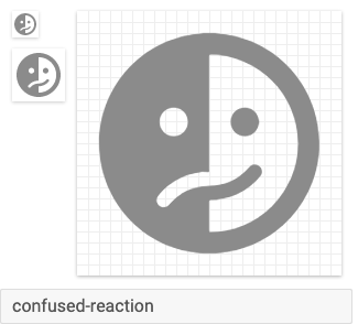
PS: I am not really a designer, I just made this my merging other icons for a project. This might be a really bad icon actually. 😅
Preview
Zip Download
 sourabhv
All 8 comments
The confused emoji is defined as "A [...] face with open eyes and a skewed frown, as if scrunching its cheeks or chewing its lips. A look of feeling unsure. An Google’s design heightens its intended puzzlement by including contorted eyebrows."
This is similar to our emoticon-sad:
Perhaps there's more we can do to that base icon further distinguish it as "confused." Regardless, I'm not a fan of the split mouth/color. If we come up with something for this, I believe we should have a filled and outline variant, like all our other emoji icons.
 goyney
on 1 Jul 2019
goyney
on 1 Jul 2019
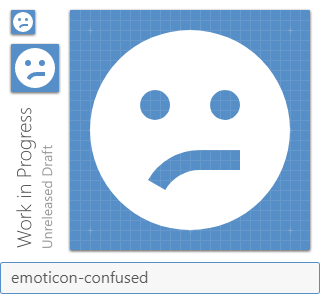
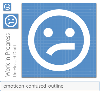
Yeah I agree with @goyney. The icon you contributed doesn't really fit in with the others. I think if we copied the emoticon-sad icon but made one side of the mouth flat it would line up with the general consensus of how such an icon should look.

 JamesCoyle
on 2 Jul 2019
JamesCoyle
on 2 Jul 2019
 MrGrigri
on 2 Jul 2019
MrGrigri
on 2 Jul 2019
Yeah I think that works well. The curved side of the mouth on the outline version looks a bit too close to the circle though IMO.
JamesCoyle
on 2 Jul 2019
Updated. I moved the mouth up one pixel.
MrGrigri
on 2 Jul 2019
Yeah that looks right.
JamesCoyle
on 2 Jul 2019
P.S. I love that both you and Michael responded with a confused reaction! 😆
MrGrigri
on 2 Jul 2019
goyney
on 10 Aug 2019
Related issues
 Templarian
·
3Comments
Templarian
·
3Comments
 alvaroc1
·
3Comments
alvaroc1
·
3Comments
 jonnyborg
·
3Comments
jonnyborg
·
3Comments
 EdricChan03
·
3Comments
EdricChan03
·
3Comments
 ButchMonkey
·
3Comments
ButchMonkey
·
3Comments
Most helpful comment
P.S. I love that both you and Michael responded with a confused reaction! 😆