Materialdesign: Home icon set with ground, 1st and attic floors for home automation
Hi,
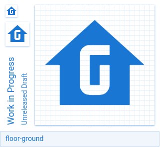
I designed a set of icons to represent the floors of a home (ground, 1st and attic) for home automation purposes (e.g. group/view for different floors, sensors/switches on floors etc).
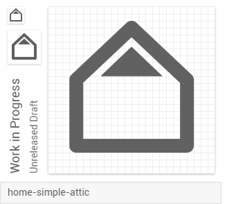
I created a new simpler home icon first as I feel it is neater to show the floors this way, but I am also submitting floors versions of the default solid home icon from MDI.
 james-fry
All 33 comments
I really like the home-simple ones. I believe that they are less confusing and more on-par with MD.
 MrGrigri
on 26 Mar 2017
MrGrigri
on 26 Mar 2017
The home-simple are my preference also.
james-fry
on 26 Mar 2017
I like the idea, too. And yes, the home-simple set is a better fit. However they look a little similar to the current garage icons.
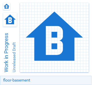
I would additionally like a basement or cellar icon.
 metbril
on 31 Mar 2017
metbril
on 31 Mar 2017
@rtvb, even though they look similar, they function and their identification is dictated by it's surrounding. It's up to the application designer to implement icons in a way that there is no confusion that they want it to be a level in a house instead of a garage door.
MrGrigri
on 31 Mar 2017
@rtvb I agree they look similar to the garage, but used for different purposes. Also there are not enough variations of garage to fulfill the objective of indicating floors in a home.
Regarding basement, I agree it would be nice but to do it properly (i.e. keeping good spacing etc) I would need to redesign all the other icons. I attached the best I can do without the refactoring.
(attachment updated)
james-fry
on 2 Apr 2017
Please can this post be labelled with "Home Assistant".
Also is there any info on how the submissions process works? There are of course comments etc in this thread, but what is the decision process on if/when icons will be added to main? Or what changes would need to be made to meet quality criteria?
james-fry
on 16 Apr 2017
Is there anything further that would need to be done to get the home simple icons added?
james-fry
on 9 Aug 2017
Please remember that the US and UK have different names for these floors. I suggest the names home-simple-floor-low and home-simple-floor-high.
 JapanYoshi
on 9 Aug 2017
JapanYoshi
on 9 Aug 2017
Its a good point - thanks.
I updated the names to be locale agnostic per your suggestion.
The icons are maintained here:
https://github.com/james-fry/svg_icons/tree/master/home-simple
james-fry
on 9 Aug 2017
Seems there is more demand from the Home Assistant community for icons to represent floors in a home.
https://community.home-assistant.io/t/custom-icons-top-view/29928
What needs to done to progress this icon submission?
james-fry
on 18 Oct 2017
Any updates on getting these icons merged?
 brent20
on 27 Nov 2017
brent20
on 27 Nov 2017
Previews:


At larger sizes, the floor and attic ones look a bit odd. I think it's the lack of rounded corners and the spacing. It could work with a couple of tweaks though. The basement variant should be moved down 1px to be consistent.
 CoDEmanX
on 14 Apr 2018
CoDEmanX
on 14 Apr 2018
I'd be happy to make the changes, but I'm not 100% sure what you're requesting re rounded corners and spacing - do you mean on the floor indicators within the house shape?
Re the basement icon, this was added at another users request and I agree it's not nicely consistent with the other floors, but I couldnt get it to work any better... please by all means feel free to make any changes :)
james-fry
on 16 Apr 2018
I'm not sure either. I think it's the spacing of the second floor. But I don't like it this way either:

Inverting kinda works for all floors, but not sure about the other configuration with only one floor highlighted...

(corners have 2px rounding BTW., as a test)
CoDEmanX
on 17 Apr 2018


If they were consistent with the normal home icons they'd look like this. Definitely prefer them like this, but I still don't like them at all.
 GreenTurtwig
on 17 Apr 2018
GreenTurtwig
on 17 Apr 2018


 GreenTurtwig
on 17 Apr 2018
GreenTurtwig
on 17 Apr 2018


 GreenTurtwig
on 17 Apr 2018
GreenTurtwig
on 17 Apr 2018
Thanks for more options!
Whilst I explored using the Google MD home icon (see 1st post), my personal preference was for the "simple home" as I captured it - I just prefer that google home style.
i.e.
https://lh3.googleusercontent.com/EIX5pscg5l1Quvsz17LKk6W5oCSIxOfukBAUmbGR4Uvs1uKDYvbNr0XYE7hqpI3KHQ=s180
Regarding the alphanumeric for the home floor/position - great idea. It allows more flexibility for home size (3 floors) but localisation becomes important (attic vs loft, UK Ground = US 1 etc).
I support the above icons as the most flexible and consistent (with Google MD home icon) approach (even though my personal aesthetic preference is for the outline home icon that is based on google home)
james-fry
on 17 Apr 2018
Attic, as we discussed, is going to be a tricky one as, whichever you refer to it as, neither A nor L are going to be understood in other languages.
 PeterShaggyNoble
on 17 Apr 2018
PeterShaggyNoble
on 17 Apr 2018
Same is true for B, although usage for elevator (lift :)) is probably well understood.
But you have to draw the line somewhere...
Maybe if there are a 0, 3 and 4 versions there are enough permutations to allow people to substitute e.g. 3 for attic.
james-fry
on 17 Apr 2018
Yep, both basement and ground letters are understood in most parts of the world. We would likely have to rename floor-loft to floor-lobby though as that's what the letter usually represents.
GreenTurtwig
on 18 Apr 2018
I'm thinking of adding the ones with the numbers. I'm still not sure what we should do about the letters.
We've been trying very hard to keep things as international as possible, so maybe there is a nice way to represent this?
 Templarian
on 20 Aug 2018
Templarian
on 20 Aug 2018
international as possible
Numbers aren't really international as well. See https://en.wikipedia.org/wiki/Storey#Consecutive_number_floor_designations
 mueller-ma
on 20 Aug 2018
mueller-ma
on 20 Aug 2018
That's up to the application to determine though. They are still usable. The issue with the letters is there would be no solution for other languages.
Templarian
on 20 Aug 2018
Really looking forward to this being merged
 johntdyer
on 20 Aug 2018
johntdyer
on 20 Aug 2018
I think we should add variations of the home with the numbers 0 thru 3 or 4. This would allow us to accommodate calling the ground floor 0 or 1 and typically residential homes don't really go over 3 stories.
If we want to go all out, we could do 0-9 to match the numeric sets, but I don't know if that is really needed.
 goyney
on 20 Aug 2018
goyney
on 20 Aug 2018
@goyney I agree, although I'd add -1 to that list for basements.
GreenTurtwig
on 21 Aug 2018
Hi All. Love the variations/improvements on my concept :) Really hoping this will drop soon.
My stop gap of using page-layout-footer, page-layout-body, and page-layout-header is not idea.
james-fry
on 25 Jan 2019
I'm going to reassign this to the next milestone which will be going out shortly. I think we should just go with the numbers/letters and let users assign where appropriate.
Assuming 3 stories etc seems too limiting.
Templarian
on 25 Jan 2019
Great. Looking forward to it @Templarian. thanks
james-fry
on 25 Jan 2019
These were added to the 3.4.93 release that is going out to the public shortly. Right now it's in preview.
Templarian
on 28 Jan 2019
Any plans to also add -1 and 0 as I think this is more common in EU? Otherwise: Good work! Really helpful.
 Roemer
on 31 Jan 2019
Roemer
on 31 Jan 2019
@Roemer Sure, can you please create another issue and I'll add it to the 3.5.xx milestone we just started. Should be pretty quick.
Templarian
on 31 Jan 2019
Related issues
 Kanga-Who
·
3Comments
Kanga-Who
·
3Comments
 kimdv
·
3Comments
kimdv
·
3Comments
 adambiggs
·
3Comments
adambiggs
·
3Comments
 danielhickman
·
3Comments
danielhickman
·
3Comments
 vishnu1991
·
3Comments
vishnu1991
·
3Comments
Most helpful comment
That's up to the application to determine though. They are still usable. The issue with the letters is there would be no solution for other languages.