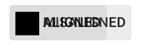
Material: md-button: md-icon-button vertically misaligned, text misaligned when used with icon
Icon Button Alignment
Vertical alignment for the icon within a md-icon-button is not correct.
.md-button.md-icon-button {
  width: 39px !important;
  height: 39px !important;
  // Setting line-height to 0px fixes the issue
  line-height: 0px !important;
}
_Kudos Workaround_ @bluestella
Text Alignment
<md-button>
  <md-icon md-svg-src="your/icon.svg"></md-icon>
  Register Now
</md-button>
Probably a simple margin-top: -2px on md-icon would solve the problem. (Also tested on the said browsers.)
Using the above snippet the icon is misaligned vertically by 2px.
Tested in latest Chrome, FF and Edge (31.14267.1000).
ngMaterial Version: 1.0.5
All 22 comments
Had the same problem, and used the workaround from here: http://stackoverflow.com/a/33950707/1436981 (uses height: auto instead of px margins)
Yes, can reproduce that. I will take a look at that.

Update - Just saw the margin-top inline style, and removed that - so now everything works as expected by default.

Any statement @ivoviz?
Well I must be blind then, but even on your second image the icon seems to be a bit off for me (probably the text as well), but please correct me if I'm wrong.

Indeed, can be true :+1: Can you tell me, is the text normally (without an icon - plain text) correctly aligned?
btw: Nice specification, you created your image manually?
Yeah I did. :)
Text seems to be inconsistent. On Win10 (14267) with latest Chrome it's misaligned:

On Ubuntu though, it seems to be correct (same version of Chrome):

If needed I can check other browsers too.
@ivoviz Awesome detailed images!
Wow, different operating systems with same browser have different results...
- Actually it seems like Ubuntu isn't using the same font / or
font-weight, can you confirm that?
Both chrome say font-weight: 500 with Roboto Medium, but indeed, Ubuntu's one looks a bit thinner. Interestingly though, on the material demo page its quite the opposite, Ubuntu's looks thicker there.
Funny :smile: , That really seems to relate to the buttons inner contents, like the icon or text, they both will affect the alignment. There should be some dynamic calculation which aligns that in the middle, depending on the inner contents. I'll drive into this tomorrow.
Actually... scratch the text part, that was my mistake, I totally forgot to import the Roboto font... Sorry!
(After importing it's just a bit thicker on Ubuntu, but vertically aligned, so that's all good.)
The icon inside is still misaligned though, but only on Ubuntu! And it's happening on the demo page as well.
I've taken a button from there (the 3rd icon button) for comparison:


You gotta zoom in to see the difference, but it's there. On Windows both red lines are 11-11 px, on Ubuntu though, the upper one is 12 while the bottom one is 10. I wouldn't say it's a big issue, but in some cases it's really noticeable and a bit irritating for the eye. :)
@ivoviz Just took a look and changed the text alignment. Can you confirm the change with your nice images? :wink:

Text looks fine on this one!

@ivoviz Sorry for the late response, I'm a bit busy. I think now I got it. Please verify again.

Update - I bet the text is now not aligned? :smile:
Yup, you won! The icon is okay now, the text is 12px from the top, 14px from the bottom.
@ivoviz Uff, that's so weird, it seems that the baseline is correct for the text, but invalid for the icon.
What's weird is that the text height is 10px on Windows and 11px on Ubuntu. (Using Roboto.)
To summerize the problems:
Windows
- Text is misaligned
Ubuntu
- Text height is different (meaning it could actually be aligned, but it's an odd number of pixels so don't know.)
- Icon is misaligned.
I bet this is correct :smile:

Yes, this one is. The Windows fix is quite easy, still no clue on the other one though.
Actually! If you remove line-height from the button element the icon works on both Windows and Ubuntu. After that you just need this on the text span element:
display: inline-block;
line-height: 16px;
height: 14px;
vertical-align: middle;
Obviously it won't work if the font-size is bigger than 14px, but it works for regular buttons with or without md-caption. So if the support of bigger font-size is a requirement then it still needs some adjustments.
@ivoviz That's exactly what I did. Just kept the line-height for the min-height.
Summary:
- The icon is md-icon-button is vertically misaligned on Ubuntu.
line-height: 0px;fixes the problem. - Icon with text:
- Icon vertically misaligned on Ubuntu.
- Text vertically misaligned, adding the above mentioned css properties to the
spanelement fixes the problem.
Vertical alignment for the icon within a md-icon-button is not correct.
This should be fixed with @epelc's fix #8194
Text Alignment
I just want to summarize a few things for @ThomasBurleson
- This is a pretty nitpicky issue and we're actually not able to fix it easily.
We would have to make the button's height dynamic and make some custom adjustments regarding the alignment. - Also it depends on different font-sizes / fonts for different platforms / browsers.
Need some feedback from you @ThomasBurleson
Closing as fixed in https://github.com/angular/material/pull/8194. We don't plan to address the text alignment issue here.