Material-ui: [Autocomplete] start adornment position issue with filled variant autocompletes
- [x] The issue is present in the latest release.
- [x] I have searched the issues of this repository and believe that this is not a duplicate.
Current Behavior 😯
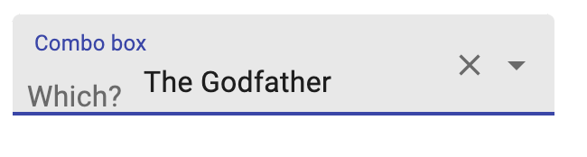
_start adornment_'s position is not correct when autocomplete has a filled variant. it has an extra margin on top:


Expected Behavior 🤔
Steps to Reproduce 🕹
Demo: codesandbox
Your Environment 🌎
| Tech | Version |
| ----------- | ------- |
| Material-UI | v4.11.0 |
| MUI lab | 4.0.0|
| React | 16.13.1 |
| Browser | chrome |
 ImanMahmoudinasab
All 3 comments
Thanks for the repro @ImanMahmoudinasab
Seems like the margin is coming from the InputAdornment styles:
  /* Styles applied to the root element if `variant="filled"`. */
  filled: {
    '&$positionStart:not($hiddenLabel)': {
      marginTop: 16,
    },
  },
so we need to basically remove the margin. I would propose the following change:
diff --git a/packages/material-ui-lab/src/Autocomplete/Autocomplete.js b/packages/material-ui-lab/src/Autocomplete/Autocomplete.js
index 88e164428..77c4d7c34 100644
--- a/packages/material-ui-lab/src/Autocomplete/Autocomplete.js
+++ b/packages/material-ui-lab/src/Autocomplete/Autocomplete.js
@@ -122,6 +122,9 @@ export const styles = (theme) => ({
         padding: '4.5px 4px',
       },
     },
+    '& [class*="MuiInputAdornment-filled"][class*="MuiInputAdornment-positionStart"]:not([class*="MuiInputAdornment-hiddenLabel"])': {
+      marginTop: 0,
+    },
   },
   /* Styles applied to the input element. */
   input: {
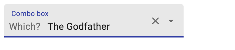
This is the end result:
What do you think about this? Would you like to work on a PR for this? :)
 mnajdova
on 11 Sep 2020
mnajdova
on 11 Sep 2020
@mnajdova +1
The structural difference is that the OutlinedInput has the <input /> takes the whole height, while with the Autocomplete, it behaves likes a multiline OutlinedInput, the <input /> only takes the minimum amount of height it needs to function correctly.
We have the same issue with:
<TextField
  InputProps={{
    startAdornment: <InputAdornment position="start">Which?</InputAdornment>
  }}
  multiline
  label="Combo box"
  variant="filled"
/>
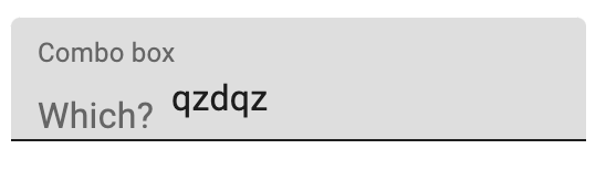
https://codesandbox.io/s/material-demo-forked-1bdng?file=/demo.js
This has the same root cause than what we have with #21409 (Autocomplete) and #22241 (multiline TextField).
 oliviertassinari
on 11 Sep 2020
oliviertassinari
on 11 Sep 2020
Maybe in the future, we should look into how we can unify the CSS for multiline and Autocomplete use cases.
oliviertassinari
on 11 Sep 2020
Related issues
 sys13
·
3Comments
sys13
·
3Comments
 iamzhouyi
·
3Comments
iamzhouyi
·
3Comments
 TimoRuetten
·
3Comments
TimoRuetten
·
3Comments
 chris-hinds
·
3Comments
chris-hinds
·
3Comments
 mb-copart
·
3Comments
mb-copart
·
3Comments
Most helpful comment
Thanks for the repro @ImanMahmoudinasab
Seems like the margin is coming from the
InputAdornmentstyles:so we need to basically remove the margin. I would propose the following change:
This is the end result:
What do you think about this? Would you like to work on a PR for this? :)