Material-ui: [Divider] Height is not correct for vertical divider in a flexbox
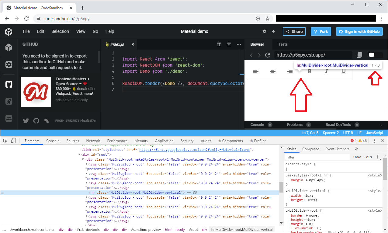
When a divider component with vertical orientation is inside a container with flex and height set to 100%, the height is calculated as 0px in chrome.
- [x] The issue is present in the latest release.
- [x] I have searched the issues of this repository and believe that this is not a duplicate.
Current Behavior 😯
The vertical dividing lines do no appear to show up on the page in chrome, but when inspecting the page, I can find the <hr> tag and see that it has height: 100% and a calculated height of 0px. When opening the page in firefox the vertical lines appear as expected.
This only happens when the parent component has flex properties. If I wrap the divider component in an empty <span>, the lines do appear.
The height of the lines should be calculated to be the full hight of its parents when set to height: 100%.
Expected Behavior 🤔
In all cases, the height of the divider component should be calculated as the height of its parent when set to height: 100%
Steps to Reproduce 🕹
Open this link in both chrome and firefox to see the the issue: https://codesandbox.io/s/reverent-kare-iuonx
Your Environment 🌎
| Tech | Version |
| ----------- | ------- |
| Material-UI | v4.5.1 |
| React | 16.10.2 |
| Browser | Chrome |
All 4 comments
@hdstusnick In a flex container, use:
hr {
  align-self: stretch;
  height: auto;
}
I don't know how we could internalize this style. Maybe with a flexItem?: boolean prop?
Is the below bug is related to this issue? As you can see, the vertical divider is not visible (its calculated height is 0!).

That's from the official example in documentations:
I tested it on _Chrome 78.0.3904.108 (Official Build) (64-bit)_ and _Firefox 69.0 (64-bit)_.
@mirismaili Yes, I believe it's exactly the problem we are discussing here. I would propose that we move forward with the flexItem prop so people can declare when the parent is a flex container so the divider can use a different strategy to cover the whole screen: https://github.com/mui-org/material-ui/issues/18022#issuecomment-546060009
@mirismaili @oliviertassinari Can I pick it up ?
Most helpful comment
@hdstusnick In a flex container, use:
I don't know how we could internalize this style. Maybe with a
flexItem?: booleanprop?