Material-ui: Outlined Select renders label with line through
- [x] The issue is present in the latest release.
- [x] I have searched the issues of this repository and believe that this is not a duplicate.
Current Behavior 😯
When rendering the outlined version of Select, there is a line through the label:
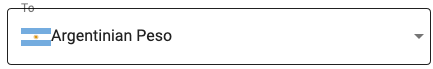
I'd notice this behavior until version 4.0, but with TextField, when the first rendered page showed an outlined text field. Updating, switching the page or interacting with the field would render it correctly. This won't happen with Select. No matter what, the line through the label continues.
Steps to Reproduce 🕹
My code is very simple, really similar to the example code from material-ui website:
 <FormControl variant="outlined" fullWidth>
            <InputLabel ref={inputLabel} htmlFor="outlined-currency-simple">
              To
            </InputLabel>
            <MUSelect
              value={values.currency}
              onChange={handleChange}
              name="currency"
              input={
                <OutlinedInput
                  name="currency"
                  id="outlined-currency-simple"
                  notched
                />
              }
            >
              {rates.state.rates.map(currency => (
                <MenuItem key={currency.currency} value={currency.currency}>
                  <img
                    src={require(`../../assets/flags/${currency.currency.toLowerCase()}.svg`)}
                    alt={currency.name}
                    width="30px"
                  />
                  {currency.name}
                </MenuItem>
              ))}
            </MUSelect>
          </FormControl>
MUSelect is the Select from @material-ui/core, it's just using an alias.
Your Environment 🌎
| Tech | Version |
| ----------- | ------- |
| Material-UI | v4.3.1 |
| React | v16.8.6 |
| Browser | Firefox v68.0.1 |
 otaviobps
All 11 comments
@otaviobps This looks expected, you have to set the label width prop on the OutlinedInput component. It's the public API. You would need to use the TextField component to have it automatically handled for you.
 oliviertassinari
on 9 Aug 2019
oliviertassinari
on 9 Aug 2019
Thanks @oliviertassinari it worked!
otaviobps
on 10 Aug 2019
What is the fix? What code do I need to add?
 yan-michael
on 2 Jan 2020
yan-michael
on 2 Jan 2020
@yan-michael my solution:
function FileInput(props) {
  const labelRef = useRef()
  const labelWidth = labelRef.current ? labelRef.current.clientWidth : 0

  return (
    <FormControl required variant="outlined">
      <InputLabel ref={labelRef} shrink htmlFor="my-input">Arquivo</InputLabel>
      <OutlinedInput labelWidth={labelWidth}  type="file" id="my-input" aria-describedby="my-helper-text" />
      <FormHelperText id="my-helper-text"></FormHelperText>
    </FormControl>
  )
}
 thismarcoantonio
on 3 Jan 2020
thismarcoantonio
on 3 Jan 2020
Just curious because I ran into this issue recently: Why is this logic included in TextField by default but not Select? While, this is documented in the API, I would argue that it should also be documented under the variant prop. Something akin to: Note if using variant="outlined", you must also provide the labelWidth props. This also seems like something that typescript could help with by throwing a type error if you try to create a Select with variant="outlined" and without a labelWidth.
 willwill96
on 9 Jan 2020
willwill96
on 9 Jan 2020
It will be solved with #17680.
oliviertassinari
on 9 Jan 2020
I'm returning to this issue again. Is it possible to automatically get the labelWidth when using the <OutlinedInput />? Why does the <TextField /> set the labelWidth automatically and the <OutlinedInput /> doesn't?
otaviobps
on 16 Jan 2020
@otaviobps probably because TextField always should have label, but OutlinedInput can be used without it.
thismarcoantonio
on 16 Jan 2020
Simple only-CSS workaround:
const theme = createMuiTheme({
  overrides: {
    MuiInputLabel: {
      outlined: {
        backgroundColor: WHITE,
        paddingLeft: 2,
        paddingRight: 2
      }
    }
  }
})
However, it is necessary to find a selector so that it does not apply to the InputLabel of the TextField.
 mrjdavidfg
on 30 Jan 2020
mrjdavidfg
on 30 Jan 2020
I have another case when this issue occurs. When you have an item with empty value <MenuItem value=""><em>None</em></MenuItem> select is displayed with crossed label even if label had been set everywhere.
 pastushenkoy
on 5 Feb 2020
pastushenkoy
on 5 Feb 2020
Please open an issue if you can reproduce this bug with the latest version.
oliviertassinari
on 5 Feb 2020
Related issues
 mb-copart
·
3Comments
mb-copart
·
3Comments
 ghost
·
3Comments
ghost
·
3Comments
 finaiized
·
3Comments
finaiized
·
3Comments
 rbozan
·
3Comments
rbozan
·
3Comments
 pola88
·
3Comments
pola88
·
3Comments
Most helpful comment
Just curious because I ran into this issue recently: Why is this logic included in
TextFieldby default but notSelect? While, this is documented in the API, I would argue that it should also be documented under thevariantprop. Something akin to:Note if using variant="outlined", you must also provide the labelWidth props. This also seems like something that typescript could help with by throwing a type error if you try to create a Select with variant="outlined" and without a labelWidth.