Material-ui: [Tooltip] Allow placement to be below cursor
Traditional title attributes make the popup display under the mouse cursor - it would be great if we could replicate this behaviour using the Tooltip component, maybe with <Tooltip placement="cursor" />.
- [x] This is not a v0.x issue.
- [x] I have searched the issues of this repository and believe that this is not a duplicate.
 ahtcx
ahtcx
All 9 comments
@ahtcx Here is a working implementation:
--- a/packages/material-ui/src/Tooltip/Tooltip.js
+++ b/packages/material-ui/src/Tooltip/Tooltip.js
@@ -145,6 +145,9 @@ class Tooltip extends React.Component {
     const { children, enterDelay } = this.props;
     const childrenProps = children.props;

+    this.pageX = event.pageX
+    this.pageY = event.pageY
+
     if (event.type === 'mouseover' && childrenProps.onMouseOver) {
       childrenProps.onMouseOver(event);
     }
@@ -340,7 +343,21 @@ class Tooltip extends React.Component {
             [classes.popperInteractive]: interactive,
           })}
           placement={placement}
-          anchorEl={this.childrenRef}
+          anchorEl={this.childrenRef ? {
+            clientWidth: this.childrenRef.clientWidth,
+            clientHeight: this.childrenRef.clientHeight,
+            getBoundingClientRect: () => {
+              const rect = this.childrenRef.getBoundingClientRect()
+              return {
+                left: this.pageX,
+                bottom: rect.bottom,
+                height: rect.height,
+                right: rect.right,
+                width: rect.width,
+                top: this.pageY,
+              }
+            },
+          } : null}
           open={open}
           id={childrenProps['aria-describedby']}
           transition
This is just a quick hacking. If you want to take the time to consolidate the implementation, we can talk about it. Alternatively, you can use the existing API to build the feature on top of it.
 oliviertassinari
on 22 Jan 2019
oliviertassinari
on 22 Jan 2019
@oliviertassinari Please merge it. I want to design a seekbar for my custom player. When I
mouse overing, A tooltip should desplay with the time under the cursor.
 whizsid
on 5 Aug 2019
whizsid
on 5 Aug 2019
@whizsid Consider using the Popper component directly.
oliviertassinari
on 5 Aug 2019
@oliviertassinari could you kindly provide a quick example on how to use popperOptions to achieve this, Thanks
 arslanakhtar61
on 11 Sep 2020
arslanakhtar61
on 11 Sep 2020
This works for me
  const [position, setPosition] = React.useState({ x: undefined, y: undefined });

  return <Tooltip
      ...
      onMouseMove={e => setPosition({ x: e.pageX, y: e.pageY })}
      PopperProps={{
        anchorEl: {
          clientHeight: 0,
          clientWidth: 0,
          getBoundingClientRect: () => ({
            top: position.y,
            left: position.x,
            right: position.x,
            bottom: position.y,
            width: 0,
            height: 0,
          })
        }
      }}
    >
    {...}
    </Tooltip>
 Morcatko
on 14 Sep 2020
Morcatko
on 14 Sep 2020
Thanks, @Morcatko. Your sample code works.
arslanakhtar61
on 15 Sep 2020
What about the following diff?
diff --git a/docs/src/pages/components/tooltips/tooltips.md b/docs/src/pages/components/tooltips/tooltips.md
index 649a035354..12565510b6 100644
--- a/docs/src/pages/components/tooltips/tooltips.md
+++ b/docs/src/pages/components/tooltips/tooltips.md
@@ -111,6 +111,18 @@ Use a different transition.

 {{"demo": "pages/components/tooltips/TransitionsTooltips.js"}}

+## Follow cursor
+
+You can enable the tooltip to follow the cursor with a single prop:
+
+{{"demo": "pages/components/tooltips/FollowCursorTooltip.js"}}
+
+## Faked reference object
+
+In the event you need to implement a custom placement, you can use the `anchorEl` prop:
+The value of the `anchorEl` prop can be a reference to a fake DOM element.
+You just need to create an object shaped like the [`ReferenceObject`](https://github.com/FezVrasta/popper.js/blob/0642ce0ddeffe3c7c033a412d4d60ce7ec8193c3/packages/popper/index.d.ts#L118-L123).
+
+{{"demo": "pages/components/tooltips/AnchorElTooltip.js"}}
+
 ## Showing and hiding

 The tooltip is normally shown immediately when the user's mouse hovers over the element, and hides immediately when the user's mouse leaves. A delay in showing or hiding the tooltip can be added through the `enterDelay` and `leaveDelay` props, as shown in the Controlled Tooltips demo above.
diff --git a/packages/material-ui/src/Tooltip/Tooltip.d.ts b/packages/material-ui/src/Tooltip/Tooltip.d.ts
index 64329e6915..3d98bb440d 100644
--- a/packages/material-ui/src/Tooltip/Tooltip.d.ts
+++ b/packages/material-ui/src/Tooltip/Tooltip.d.ts
@@ -71,6 +71,10 @@ export interface TooltipProps extends StandardProps<React.HTMLAttributes<HTMLDiv
    * @default 700
    */
   enterTouchDelay?: number;
+  /**
+   * If `true`, the tooltip follow the cursor over the wrapped element.
+   */
+  followCursor?: boolean;
   /**
    * This prop is used to help implement the accessibility logic.
    * If you don't provide this prop. It falls back to a randomly generated id.
diff --git a/packages/material-ui/src/Tooltip/Tooltip.js b/packages/material-ui/src/Tooltip/Tooltip.js
index c117278a9c..3b581ca430 100644
--- a/packages/material-ui/src/Tooltip/Tooltip.js
+++ b/packages/material-ui/src/Tooltip/Tooltip.js
@@ -172,6 +172,7 @@ const Tooltip = React.forwardRef(function Tooltip(props, ref) {
     enterDelay = 100,
     enterNextDelay = 0,
     enterTouchDelay = 700,
+    followCursor = false,
     id: idProp,
     interactive = false,
     leaveDelay = 0,
@@ -439,6 +440,22 @@ const Tooltip = React.forwardRef(function Tooltip(props, ref) {
     open = false;
   }

+  const positionRef = React.useRef({ x: 0, y: 0 });
+  const popperRef = React.useRef();
+
+  const handleMouseMove = (event) => {
+    const childrenProps = children.props;
+    if (childrenProps.handleMouseMove) {
+      childrenProps.handleMouseMove(event);
+    }
+
+    positionRef.current = { x: event.clientX, y: event.clientY };
+
+    if (popperRef.current) {
+      popperRef.current.scheduleUpdate();
+    }
+  };
+
   // For accessibility and SEO concerns, we render the title to the DOM node when
   // the tooltip is hidden. However, we have made a tradeoff when
   // `disableHoverListener` is set. This title logic is disabled.
@@ -453,6 +470,7 @@ const Tooltip = React.forwardRef(function Tooltip(props, ref) {
     className: clsx(other.className, children.props.className),
     onTouchStart: detectTouchStart,
     ref: handleRef,
+    ...(followCursor ? { onMouseMove: handleMouseMove } : {}),
   };

   const interactiveWrapperListeners = {};
@@ -518,7 +536,23 @@ const Tooltip = React.forwardRef(function Tooltip(props, ref) {
           [classes.popperArrow]: arrow,
         })}
         placement={placement}
-        anchorEl={childNode}
+        anchorEl={
+          followCursor
+            ? {
+                clientHeight: 0,
+                clientWidth: 0,
+                getBoundingClientRect: () => ({
+                  top: positionRef.current.y,
+                  left: positionRef.current.x,
+                  right: positionRef.current.x,
+                  bottom: positionRef.current.y,
+                  width: 0,
+                  height: 0,
+                }),
+              }
+            : childNode
+        }
+        popperRef={popperRef}
         open={childNode ? open : false}
         id={childrenProps['aria-describedby']}
         transition
Then with two new demos:

import * as React from 'react';
import Box from '@material-ui/core/Box';
import Tooltip from '@material-ui/core/Tooltip';
const box = (
<Box p={2} border={1} borderColor="text.secondary">
Tooltip area
</Box>
);
export default function FollowCursorTooltip() {
return (
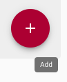
<Tooltip title="Add" followCursor>
{box}
</Tooltip>
);
}

import * as React from 'react';
import Box from '@material-ui/core/Box';
import Tooltip from '@material-ui/core/Tooltip';
import PopperJs from 'popper.js';

export default function AnchorElTooltip() {
  const positionRef = React.useRef<{ x: number; y: number }>({
    x: 0,
    y: 0,
  });
  const popperRef = React.useRef<PopperJs>(null);
  const areaRef = React.useRef<HTMLDivElement>(null);

  const handleMouseMove = (event: React.MouseEvent) => {
    positionRef.current = { x: event.clientX, y: event.clientY };

    if (popperRef.current != null) {
      popperRef.current.scheduleUpdate();
    }
  };

  return (
    <Tooltip
      title="Add"
      placement="top"
      arrow
      PopperProps={{
        popperRef,
        anchorEl: {
          clientHeight: 0,
          clientWidth: 0,
          getBoundingClientRect: () => ({
            top: areaRef.current?.getBoundingClientRect().top ?? 0,
            left: positionRef.current.x,
            right: positionRef.current.x,
            bottom: areaRef.current?.getBoundingClientRect().bottom ?? 0,
            width: 0,
            height: 0,
          }),
        },
      }}
    >
      <div ref={areaRef}>
        <Box
          onMouseMove={handleMouseMove}
          p={2}
          border={1}
          borderColor="text.secondary"
        >
          Tooltip area
        </Box>
      </div>
    </Tooltip>
  );
}
I have used https://wwayne.github.io/react-tooltip/ and https://atomiks.github.io/tippyjs/#follow-cursor as a point of reference.
oliviertassinari
on 20 Sep 2020
Hey, can I try and make a PR on this one? 😁
 xtrixia
on 3 Oct 2020
xtrixia
on 3 Oct 2020
@xtrixia Yes :)
oliviertassinari
on 3 Oct 2020
Related issues
 mb-copart
·
3Comments
mb-copart
·
3Comments
 iamzhouyi
·
3Comments
iamzhouyi
·
3Comments
 revskill10
·
3Comments
revskill10
·
3Comments
 sys13
·
3Comments
sys13
·
3Comments
 finaiized
·
3Comments
finaiized
·
3Comments
Most helpful comment
@ahtcx Here is a working implementation:
This is just a quick hacking. If you want to take the time to consolidate the implementation, we can talk about it. Alternatively, you can use the existing API to build the feature on top of it.