Material-ui: [TextField] Make filled variant background / hover / focus states lighter
- [x] This is not a v0.x issue.
- [x] I have searched the issues of this repository and believe that this is not a duplicate.
Hello,
I find the new filled variant TextField's background too dark.
How were the different rgba values picked? (https://github.com/mui-org/material-ui/blob/master/packages/material-ui/src/FilledInput/FilledInput.js#L17)
I tried using a tool to calculate contrast ratio between the main background and the filled background on material design example and here are the difference between material-design examples and material-ui for each states :
| State| Material Design Spec|Material-UI|
|-------------|-------------|-----|
|Inactive|1.22|1.21|
|Activated|1.22|1.51|
|Focused|1.62|1.51|
|Hover|1.34|1.34|
|Error|1.22|1.51|
|Disabled|1.38|1.38|
These numbers are based on a light theme.
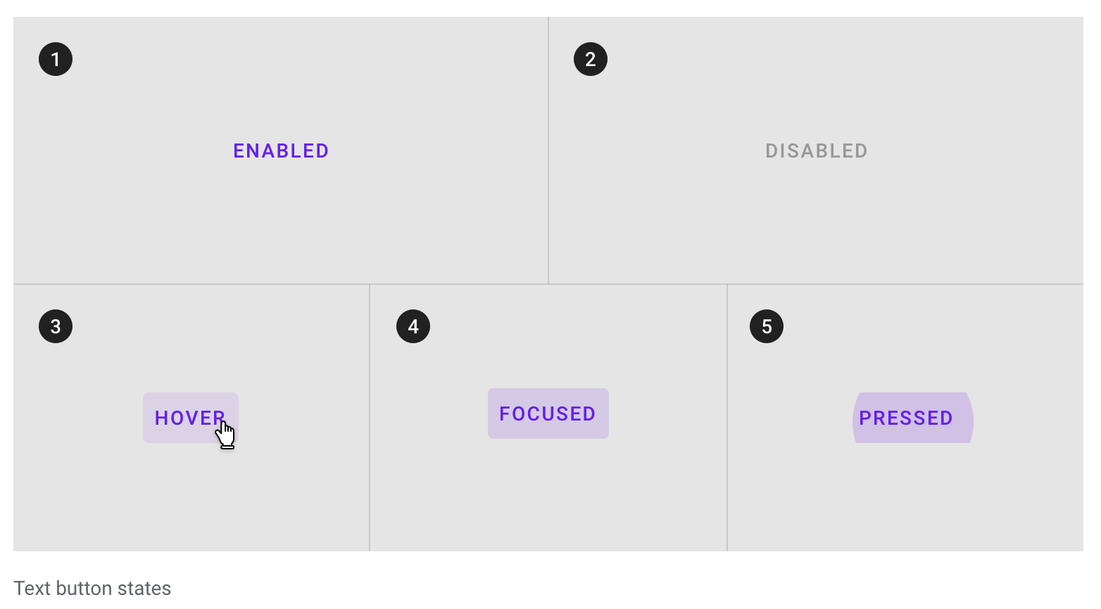
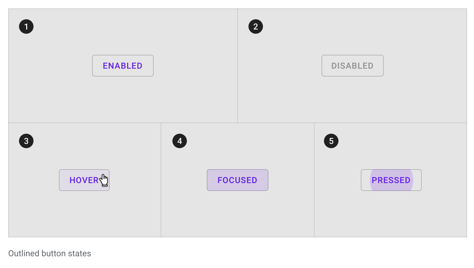
We can see that according to the specs, there is a difference between the focused state and the activated state in term of background color (the activated one is the same color as the inactive one, which is lighter than the focused one). You can see the different states here, at the "States" section.
I suppose we should at least respect the "activated" state background color, so the contrast is better when typing.
 jgoux
jgoux
All 18 comments
I find the new filled variant TextField's background too dark.
@jgoux Same feeling.
 oliviertassinari
on 17 Sep 2018
oliviertassinari
on 17 Sep 2018
I think the same applies to buttons. In this project they are rendered darker when hovered, not so on the marterial ui specs
 valoricDe
on 18 Sep 2018
valoricDe
on 18 Sep 2018
@jgoux What's the distinction between focused and activated in Material-UI?
We chose the one from the spec that distinguished focused from inactive and hover. (Going back to the inactive color when focused didn't seem right, but I could be convinced otherwise). I agree it could be a little lighter, as your testing shows.
Regarding error, at the moment it follows the same background color for inactive / hover / focus whether error or not.
 mbrookes
on 18 Sep 2018
mbrookes
on 18 Sep 2018
@valorize That doesn't seem correct:
One difference is that they've dropped the focus ripple in v2. Not sure that's a change for the better, as a focused text button will somewhat resemble a filled one.
mbrookes
on 18 Sep 2018
@mbrookes I don't think it's possible to style a focused input differently based on :focus and :activate so in our case the focused state would be hard to implement (or we would have to capture the focus on a outer element so the "activated state" doesn't trigger, and then on keyboard event starts the real focus on the input so the user can actually type).
In my opinion we should go for the "activated" state with a lighter background. The bottom line being bolder and the colors are enough to denote the state.
jgoux
on 18 Sep 2018
In my opinion we should go for the "activated" state with a lighter background.
@jgoux I agree so is Vuetify doing. I think that we can leave the focused state aside here. I don't really see the use case yet. It's to be noted that MCW doesn't follow the specification for the activated state.
Here is what I have using HSL:
| State| Material Design Spec|Material-UI|
|-------------|-------------|-----|
|Inactive|91%|91%|
|Activated|91%|82%|
|~Focused~|||
|Hover|87%|87%|
|Error|91%|91%|
|Disabled|88%|86%|
So, there are only two value to change, and we are good:
-backgroundColor: light ? 'rgba(0, 0, 0, 0.18)' : 'rgba(255, 255, 255, 0.18)',
+backgroundColor: light ? 'rgba(0, 0, 0, 0.09)' : 'rgba(255, 255, 255, 0.09)',
-backgroundColor: light ? 'rgba(0, 0, 0, 0.14)' : 'rgba(255, 255, 255, 0.14)',
+backgroundColor: light ? 'rgba(0, 0, 0, 0.12)' : 'rgba(255, 255, 255, 0.12)',
@jgoux Looks like my comment was accidentally marked as off topic, but yes, that was my point - there is no distinction between activated and focused in Material-UI.
In my opinion we should go for the "activated" state with a lighter background. The bottom line being bolder and the colors are enough to denote the state.
👍
mbrookes
on 19 Sep 2018
Can I work on this guys? :)
 adeelibr
on 23 Sep 2018
adeelibr
on 23 Sep 2018
@adeelibr Sure :)
oliviertassinari
on 23 Sep 2018
Sorry to revive an old topic, but it seems the default background is still too dark as compared to the material design specs.
Spec: #f5f5f5

mui implementation (on white background): #e8e8e8

It's not obvious at first because the FilledInput demos are using a darker background.
 fzaninotto
on 23 Aug 2019
fzaninotto
on 23 Aug 2019
Also, it seems that Google has deprecated the default variant, because the spec shows only the filled and outlined variants.
fzaninotto
on 23 Aug 2019
it seems the default background is still too dark as compared to the material design specs
That isn't the spec, it's the MCW implementation of it, which differs from the spec. (Which is not to say that we couldn't follow it if it is superior.)
That playground is something I've been meaning to look into though, as the current wall of Textfields is rather unappealing,
it seems that Google has deprecated the default variant
Yes:
https://material-ui.com/components/text-fields/#textfield
Note: This version of the text field is no longer documented in the Material Design guidelines, but Material-UI will continue to support it.
mbrookes
on 23 Aug 2019
That playground is something I've been meaning to look into though, as the current wall of Textfields is rather unappealing,
Notice that @joshwooding was working on this very problem recently.
That isn't the spec, it's the MCW implementation of it, which differs from the spec. (Which is not to say that we couldn't follow it if it is superior.)
I have a call with the Material Design team next tuesday, I can ask about the recommended color.
oliviertassinari
on 23 Aug 2019
@joshwooding was working on this very problem recently.
Ah yes, perfect.
mbrookes
on 23 Aug 2019
The Material Design Team recommends going with the MCW version. But waiting for a final answer.
oliviertassinari
on 27 Aug 2019
That would be fortunate, because I don't think there is a way to override the MuiFilledInput background color for both the light and dark palettes using a custom theme.
fzaninotto
on 27 Aug 2019
Bad news, I had a confirmation that we should stick with the spec, not MCW. Oh, I might have an idea for this problem. Are you using the CssBaseline component? What if the component was applying a global class name to the body depending on the light/dark mode value? Alternatively, global theme overrides support style functions (but might be a bit slower until we take the time to speed it up).
oliviertassinari
on 27 Aug 2019
I had a confirmation that we should stick with the spec
Well that won't work either, since the spec doesn't have a differentiated color for focused / active, which is why we went with what we have now.
mbrookes
on 27 Aug 2019
Related issues
 revskill10
·
3Comments
revskill10
·
3Comments
 ghost
·
3Comments
ghost
·
3Comments
 FranBran
·
3Comments
ghost
·
3Comments
FranBran
·
3Comments
ghost
·
3Comments
 zabojad
·
3Comments
zabojad
·
3Comments
Most helpful comment
@jgoux I agree so is Vuetify doing. I think that we can leave the focused state aside here. I don't really see the use case yet. It's to be noted that MCW doesn't follow the specification for the activated state.
Here is what I have using HSL:
| State| Material Design Spec|Material-UI|
|-------------|-------------|-----|
|Inactive|91%|91%|
|Activated|91%|82%|
|~Focused~|||
|Hover|87%|87%|
|Error|91%|91%|
|Disabled|88%|86%|
So, there are only two value to change, and we are good: