Material-ui: Cannot use theme breakpoints in render()
- [x] I have searched the issues of this repository and believe that this is not a duplicate.
Expected Behavior
I expect to be able to use values from theme breakpoints at render() time
Current Behavior
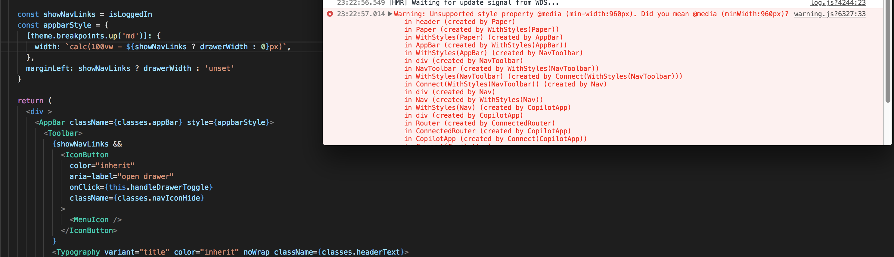
using theme.breakpoints.up('md') in a withStyles() declaration produces CSS min-width but using it for an inline style property is invalid because it wants minWidth. See screenshot.
Steps to Reproduce (for bugs)
render() {
    const appbarStyle = {
      [theme.breakpoints.up('md')]: {
        width: `calc(100vw - ${showNavLinks ? drawerWidth : 0}px)`,
      },
    }
....
<AppBar style={appbarStyle}>...</AppBar>
Warning: Unsupported style property @media (min-width:960px). Did you mean @media (minWidth:960px)?
| Tech | Version |
|--------------|---------|
| Material-UI | .35 |
| React | 16 |
| browser | chrome |
| etc | |
 revmischa
>All comments
@revmischa The following approach is called "inline-style", it's almost a direct binding with the style HTML attribute.
<Component style={style} />
Inline styles don't support media queries. You have to use CSS for this. Material-UI exposes his internal styling solution: withStyles(). You can rely on it. Here is an example in the documentation: https://material-ui-next.com/layout/css-in-js/#responsive-breakpoints
import React from 'react';
import PropTypes from 'prop-types';
import { withStyles } from 'material-ui/styles';

const styles = theme => ({
  root: {
    padding: theme.spacing.unit,
    [theme.breakpoints.up('md')]: {
      backgroundColor: theme.palette.primary.main,
    },
    [theme.breakpoints.down('sm')]: {
      backgroundColor: theme.palette.secondary.main,
    },
  },
});

function MediaQuery(props) {
  const { classes } = props;

  return (
    <div className={classes.root}>
      {'Foo'}
    </div>
  );
}

MediaQuery.propTypes = {
  classes: PropTypes.object.isRequired,
};

export default withStyles(styles)(MediaQuery);
 oliviertassinari
on 6 Mar 2018
oliviertassinari
on 6 Mar 2018
Related issues
 revskill10
·
3Comments
revskill10
·
3Comments
 TimoRuetten
·
3Comments
TimoRuetten
·
3Comments
 zabojad
·
3Comments
zabojad
·
3Comments
 sys13
·
3Comments
sys13
·
3Comments
 pola88
·
3Comments
pola88
·
3Comments
Most helpful comment
@revmischa The following approach is called "inline-style", it's almost a direct binding with the
styleHTML attribute.Inline styles don't support media queries. You have to use CSS for this. Material-UI exposes his internal styling solution:
withStyles(). You can rely on it. Here is an example in the documentation: https://material-ui-next.com/layout/css-in-js/#responsive-breakpoints