Material-ui: [TextField] Contributing solo field
- [x] I have searched the issues of this repository and believe that this is not a duplicate.
I was thinking I could contribute a "solo field" to Material UI, if you're interested, and given you don't already have a solution for it already. The idea is to have a input field that can be used as the main search form in webapps. I have created a custom one that I use together with material-ui, and figured it would be cool to make a contribution to the project.
First of all, does it make sense to have this as a component or is the idea that it is easy enough to change the existing TextField / AutoComplete components with the new classes API and withStyles HOC?
Second, I was thinking of making it a separate component, but perhaps it's better to include it in the existing TextField component? Thoughts? Actually, when I think about it, it definitely needs to support auto-complete, so on a second thought it should probably rely on AutoComplete (which I assume in turn is based on TextField).
It should support an icon (and potentially a drop down menu) and auto-complete.
Examples:
- Search for "solo fields" in the Text fields spec
- Search for "Floating toolbar" in the Layout/structure guideline
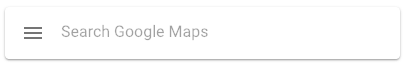
- Google Maps - floating toolbar with solo field
- Google Drive - the search field in the toolbar
Screenshot examples:
Floating toolbar with solo field:

Regular toolbar/app bar with solo field:

 lirbank
All 4 comments
@lirbank Hey, before all, thank for your interest in the project!
First of all, does it make sense to have this as a component
I'm not 100% sure about what you are referring to but I do think that a new component would be the best approach. The closest thing we have so far is a custom component I have been writing to host the Algolia search:

I would love to see the global architecture you are proposing (API, component structure). You said that you have already been building one component for an in-house use case. Maybe you could be sharing it on codesandbox.io so we have a better idea about the component :).
 oliviertassinari
on 13 Sep 2017
oliviertassinari
on 13 Sep 2017
Does this need more than maybe a styling option on Textfield otherwise it's just a Paper, Toolbar, Buttons and TextField isn't it? All we would do is replace these generic components with the more specific ones. Only advantage I can see would be to handle the responsive aspects of the design guidelines automatically. Perhaps a demo in the docs would be sufficient?
 eyn
on 9 Oct 2017
eyn
on 9 Oct 2017
@oliviertassinari Is this needed anymore?
 joshwooding
on 18 Dec 2018
joshwooding
on 18 Dec 2018
Vuetify has a solo field but given the composition capability we have, I'm not sure we need more than a demo:
import React from "react";
import PropTypes from "prop-types";
import { withStyles } from "@material-ui/core/styles";
import Paper from "@material-ui/core/Paper";
import InputBase from "@material-ui/core/InputBase";
import IconButton from "@material-ui/core/IconButton";
import MenuIcon from "@material-ui/icons/Menu";

const styles = theme => ({
  root: {
    padding: "2px 4px"
  },
  input: {
    marginLeft: 4
  }
});

function PaperSheet(props) {
  const { classes } = props;

  return (
    <Paper className={classes.root} elevation={1}>
      <IconButton className={classes.menuButton} aria-label="Menu">
        <MenuIcon />
      </IconButton>
      <InputBase className={classes.input} placeholder="Search Google Maps" />
    </Paper>
  );
}

PaperSheet.propTypes = {
  classes: PropTypes.object.isRequired
};

export default withStyles(styles)(PaperSheet);
Related issues
 iamzhouyi
·
3Comments
iamzhouyi
·
3Comments
 rbozan
·
3Comments
rbozan
·
3Comments
 ghost
·
3Comments
ghost
·
3Comments
 zabojad
·
3Comments
zabojad
·
3Comments
 ericraffin
·
3Comments
ericraffin
·
3Comments
Most helpful comment
Vuetify has a solo field but given the composition capability we have, I'm not sure we need more than a demo:
https://codesandbox.io/s/pjq9nrmkqx