Material-theme-jetbrains: [Suggestion] More discrete JS icon
Hi, after the update the js file icon catches too much attention from the eyes.
A suggestion is to remove the background of the icon and have only the letters JS with the color.
Environment
WebStorm 2017.2.2
Build #WS-172.3757.55, built on August 15, 2017
JRE: 1.8.0_152-release-915-b10 amd64
JVM: OpenJDK 64-Bit Server VM by JetBrains s.r.o
Windows 10 10.0
 carlosflorencio
All 14 comments
No. If you want this icon yourself you're welcome to fork the project and do your changes in your build.
 mallowigi
on 25 Aug 2017
mallowigi
on 25 Aug 2017
Why no discussion on this?
carlosflorencio
on 25 Aug 2017
Because this is an opinionated theme and I cannot take requests for every people not okay with icons or colors.
Plus this was a change in one of the releases, it doesn't make sense to revert back the old icon.
mallowigi
on 25 Aug 2017
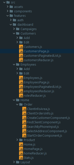
Actually, I think this is a relevant discussion. Although this theme and the original theme by equinusocio is inspired by the Material Design, it should be customized to fit inside an IDE. The icon you are talking about is just an example of that, and I would think that the original author has a good reason for using a different version of the icon, which looks like this:
![]()
When I started with this theme, I first tried with the Material Design icons, but it was too obtrusive. That's why I went for the original theme's icons.
The original theme uses these icons(with minor modifications): https://github.com/ihodev/a-file-icon
 ChrisRM
on 25 Aug 2017
ChrisRM
on 25 Aug 2017
Welp, if you look at the repository itself you'd see that it uses another icon completely. Anyway after I've looked at the real Atom File Icons (the source of the a-file-icon repository) I've seen that JS icons are the ones I used. And I don't see why it doesn't fit with an IDE.
mallowigi
on 25 Aug 2017
Although in all honesty I think the icon is too big and could be reduced a little, but it's not that bad to require working on such a thing.
mallowigi
on 25 Aug 2017
Why not use the icon that the original theme uses too?
carlosflorencio
on 25 Aug 2017
A good reason is that most icons are taken from their logos - sass, typescript, html, java... some others don't (xml comes to mind) but usually all icons are taken from their logos. On the other hand, Javascript is one of the few that didn't. Even though Mattia said that he was using a-file-icon icons for his theme he didn't bother change the JS icon, because, well, it is a good icon anyway - not too obtrusive like you said.
However when I first saw the Atom Editor with the Atom File Icons package, I immediately thought that the JS icon is way more suited than the simple JS, so I decided to include it in replacement of the small, JS icon.
But there is one point that I agree of, and it's exactly because I made the icon myself, is that it is a little too big, e.g not enough padding between the lines as in other icons. I will probably take care of it at some point.
But I really want you to get used to it. I know you've been using the old icon for a long time so it's difficult to adapt to changes, but IMO it's more suited to the theme.
mallowigi
on 25 Aug 2017
Icon has been resized in v0.10.0, it should be better now
mallowigi
on 1 Sep 2017
When the release in the Jetbrains plugin repo will occur? Thanks
carlosflorencio
on 2 Sep 2017
It is currently in beta, I'm waiting on people to open issues, but if not, I will release it next week.
mallowigi
on 2 Sep 2017
@mallowigi it is not better after update
 sh-a-v
on 13 Sep 2017
sh-a-v
on 13 Sep 2017
It is better, I resized it from 16px to 12px. There is much more padding
mallowigi
on 13 Sep 2017
I think its better now.
carlosflorencio
on 13 Sep 2017
Related issues
 sheinfeld
·
4Comments
mallowigi
·
3Comments
sheinfeld
·
4Comments
mallowigi
·
3Comments
 timrspratt
·
3Comments
timrspratt
·
3Comments
 dg00GT00
·
3Comments
dg00GT00
·
3Comments
 nammaianh
·
3Comments
nammaianh
·
3Comments