Material-design-icons: The icon font isn't centered in the middle of other text..
 rbozan
All 7 comments
Do you have a screenshot or some more detail to add to this issue? Thanks!
 liquidx
on 31 May 2015
liquidx
on 31 May 2015
@youssefdetovernickr This is somewhat intentional.
It can be quite difficult to correctly center align an icon with the middle of text.
This article really illustrates well a lot of the details and challenges: http://christopheraue.net/2014/03/05/vertical-align/
In order to accomplish what you want, you likely need to style both the icon and the text you're aligning it to. Since we can't do that all together, we opted for the more expected default alignment behavior, and leave it to you to style things appropriately to achieve various other alignments you might want.
To accomplsih what you want, you probably want vertical-align: middle; applied to both the icon and the text you're aligning to it.
    .material-icons, .icon-text {
      vertical-align: middle;
    }
This will likely look correct if the text is lowercase, as middle actually aligns to the middle of a lowercase letter. If you're text is all caps, or even starts with a capital letter, it may not appear quite aligned to you.
This example shows a lowercase example, an all caps example – that doesn't look quite right – and a tweaked uppercase one, that looks pretty good.
http://jsbin.com/jerapi/11/edit
Let us know if you still have questions.
 jestelle
on 3 Jun 2015
jestelle
on 3 Jun 2015
In my opinion wrapping Icon and text in a flexbox div with align-items: center works better than a simple vertical-align. While flexbox might be the best solution when working with several single icon + text items, for example in a list, toolbar, nav, etc. it isn't a universal solution: Using it inline in a paragraph of regular text creates new issues since one has to find a way to align the wrapping flexbox div. However, I don't use the icons in that way - so flexbox works best for me. Your mileage may vary.
 michaelfeihstel
on 4 Jun 2015
michaelfeihstel
on 4 Jun 2015
thanks
 JonDotsoy
on 18 Nov 2015
JonDotsoy
on 18 Nov 2015
.material-icons {
  vertical-align: middle !important;
  padding-bottom: 3px;
}
 clusteratlas
on 5 Sep 2017
clusteratlas
on 5 Sep 2017
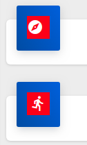
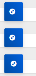
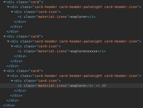
I've noticed an issue with some icons not being horizontally centred, not sure if here is the right place to add the comment.

Hope this helps.
 jaxwilko
on 20 Nov 2018
jaxwilko
on 20 Nov 2018
Ah, I found the issue. If you have any trailing text, it will shunt the icon to the left a bit.
Again, hope this helps somebody making the same mistake.
Sorry for the confusion :)
jaxwilko
on 20 Nov 2018
Related issues
 dy
·
3Comments
dy
·
3Comments
 VeeK727
·
4Comments
VeeK727
·
4Comments
 GelsonMR
·
4Comments
GelsonMR
·
4Comments
 coogle
·
4Comments
coogle
·
4Comments
 Kyrosee
·
3Comments
Kyrosee
·
3Comments
Most helpful comment
@youssefdetovernickr This is somewhat intentional.
It can be quite difficult to correctly center align an icon with the middle of text.
This article really illustrates well a lot of the details and challenges: http://christopheraue.net/2014/03/05/vertical-align/
In order to accomplish what you want, you likely need to style both the icon and the text you're aligning it to. Since we can't do that all together, we opted for the more expected default alignment behavior, and leave it to you to style things appropriately to achieve various other alignments you might want.
To accomplsih what you want, you probably want
vertical-align: middle;applied to both the icon and the text you're aligning to it.This will likely look correct if the text is lowercase, as
middleactually aligns to the middle of a lowercase letter. If you're text is all caps, or even starts with a capital letter, it may not appear quite aligned to you.This example shows a lowercase example, an all caps example – that doesn't look quite right – and a tweaked uppercase one, that looks pretty good.
http://jsbin.com/jerapi/11/edit
Let us know if you still have questions.