Material-components-web: Tab Scroller Indicators
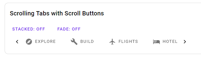
With the new tab components, the tab scroller indicators have gone. Are there plans to bring them back? On a desktop without touch, this means having to navigate to tabs unnecessarily in order to force the scroller to scroll. The guidelines seem to suggest "on desktop, provide a visual indicator that more tabs are available off screen."
 aeromac
All 6 comments
Thanks for filing this issue!
It looks like that feature might have gotten lost in translation during the tab bar rewrite.
Sorry about that!
Adding this to our issue tracker.
 acdvorak
on 8 Oct 2018
acdvorak
on 8 Oct 2018
Correction: I talked to @patrickrodee, who implemented the new tab bar, and he said that the left/right arrows were intentionally left out of the initial version of Tab Bar for several reasons:
- They have ambiguous usability on touch-enabled desktop devices
- The interaction between touch and mouse devices becomes super hairy (some devices have both - e.g., laptops with touch screens)
- Determining how functionality should change between desktop and mobile was not clear
- E.g., at what breakpoint should the arrows be shown/hidden?
- Native scrolling was the simplest to get working, and covered the most use cases
It's still a valid feature request though 😀
acdvorak
on 8 Oct 2018
+1 for this.
Is there any workaround or is it best to stay on an older version?
 niallel
on 19 Oct 2018
niallel
on 19 Oct 2018
Unfortunately there is no workaround for the new mdc-tab-bar package.
If this is something you need, you can use the (deprecated and unmaintained) mdc-tabs package.
acdvorak
on 20 Oct 2018
@aeromac @niallel
It's possible to implement visual indicators using mdc-icon-button or another component, and interaction call mdc-scroller methods incrementScroll(number) or scrollTo(number) for going forward and back.
I wrote a very basic example with angular, but stopped before adding breakpoint functionality. I could expand on the example if you'd like.
https://trimox.github.io/angular-mdc-web/#/tabs-demo
<button mdc-icon-button (mousedown)="scroller.incrementScroll(-65)" icon="keyboard_arrow_left"></button>
<button mdc-icon-button (mousedown)="scroller.incrementScroll(65)" icon="keyboard_arrow_right"></button>
 trimox
on 20 Oct 2018
trimox
on 20 Oct 2018
I would encourage you to reconsider the decision to drop the arrows. I think this suboptimal UX for desktop users. We're building a desktop app with a lot of tabs. When the user has to navigate to offscreen tabs one by one, there is no sense of an overview—plus it is tedious to do if you need to get to the last tab or are looking for something but aren't sure what tab it's on. In my office, most desktop users have mice, and I don't think mouse users do much swiping.
Google got this right in Sheets, where you have the little arrows at bottom-right that move the user forward one screenful of tabs at a time. It's a good model....
 jmatazzoni
on 9 Apr 2020
jmatazzoni
on 9 Apr 2020
Related issues
 traviskaufman
·
3Comments
traviskaufman
·
3Comments
 ronnieroyston
·
3Comments
ronnieroyston
·
3Comments
 broros
·
3Comments
broros
·
3Comments
 robzenn92
·
4Comments
robzenn92
·
4Comments
 ghost
·
3Comments
ghost
·
3Comments
Most helpful comment
Correction: I talked to @patrickrodee, who implemented the new tab bar, and he said that the left/right arrows were intentionally left out of the initial version of Tab Bar for several reasons:
It's still a valid feature request though 😀