Materia-theme: [Accessibility] Update primary color for light variants
I've been feeling that the current primary color for light variants (#4285F4) is sometimes a bit too bright. Especially it's noticeable where the color is used for text.
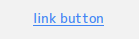
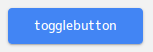
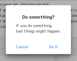
The contrast ratio between #4285F4 and #FFFFFF is 3.56:1. It doesn't pass the WCAG's passing score 4.5:1 which Material Design recommends.
We probably need a little darker primary color. Ideally it should pass the WCAG's level AA.
 nana-4
All 8 comments
I have 2 colors that I'm considering as a candidate:
#1A73E8
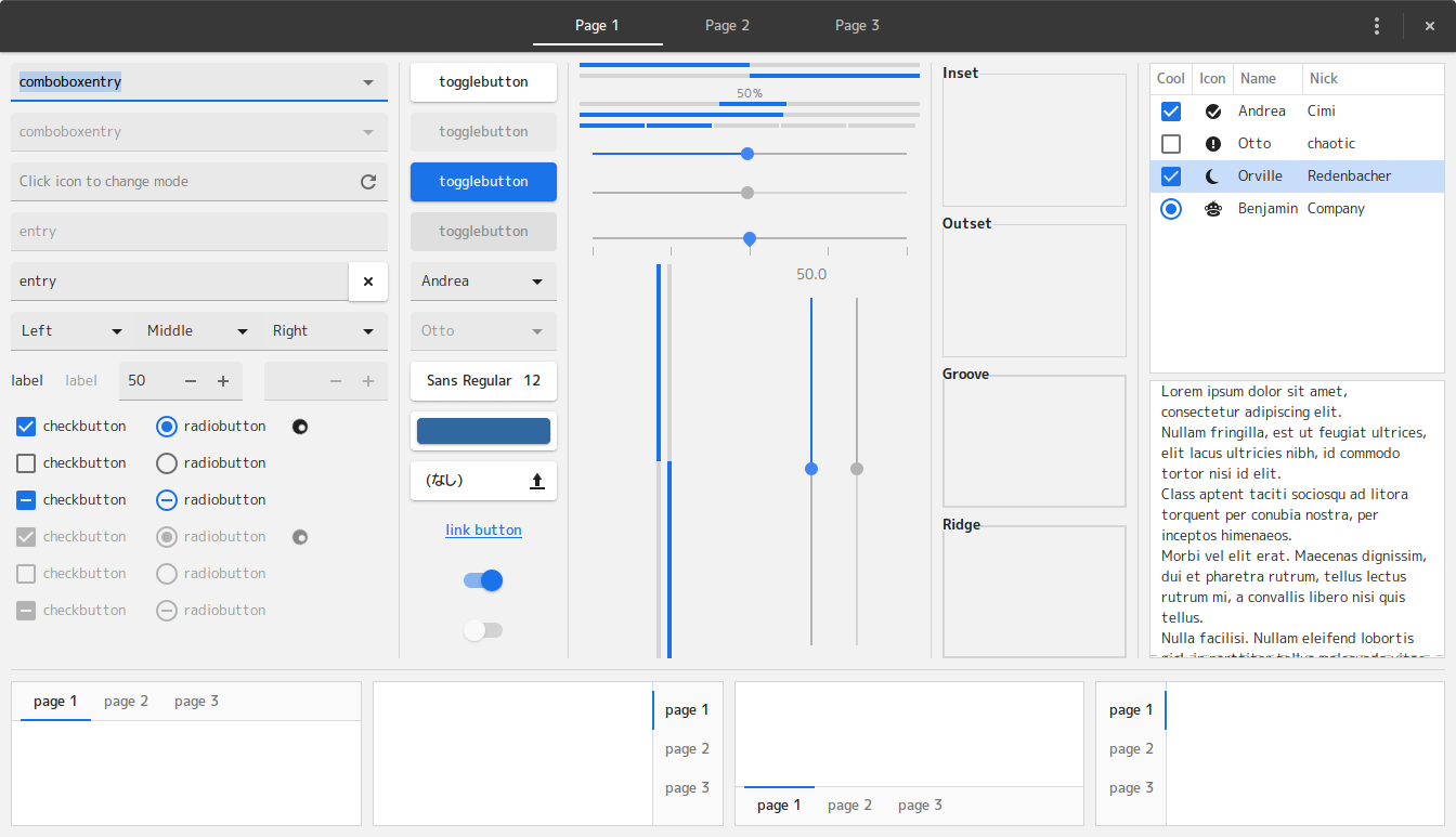
- The contrast ratio is 4.51:1.
- Used in many Google products.
- Might be too dark/vivid?
#3B78E7
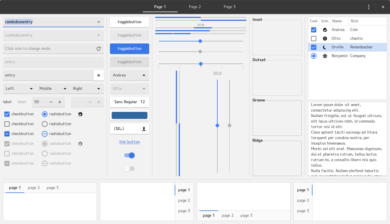
- The contrast ratio is 4.18:1.
- Softer than the above.
- Doesn't pass the WCAG level AA.
I'm leaning toward the former, because it passes Level AA.
nana-4
on 24 Jun 2019
#1A73E8 is "pixel blue", right?
It's got my vote (for what it's worth)
 m-thorsen
on 27 Jun 2019
m-thorsen
on 27 Jun 2019
I also like #1A73E8, again for what it's worth. Thank you for your work.
 mjfa12
on 8 Jul 2019
mjfa12
on 8 Jul 2019
I also like #1A73E8. It makes blue so blue :)
 haunt98
on 10 Jul 2019
haunt98
on 10 Jul 2019
Thanks for your feedback! I've changed the primary color to #1A73E8 in master :)
By the way, this is not a final decision. If I got many complaints about the new primary color, I will consider another color :) So I'm going to keep this issue open for a while.
nana-4
on 11 Jul 2019
I'm obviously in the minority here, so I'll share my thoughts...
1A73E8 is a great color. But it seems a bit too "cartoonish" and reminds me of the blue used in Windows 95; in other words, it doesn't feel very sophisticated.
Are there any other options to meet the 4.5:1 contrast ratio requirement, but still have a more professional or refined look?
(As always, I truly appreciate all the hard work put into this wonderful theme!).
 PJSingh5000
on 22 Aug 2019
PJSingh5000
on 22 Aug 2019
@PJSingh5000 Thanks for your feedback.
I opened this issue because of concerns similar to yours :)
At first I felt #1A73E8 is a bit too strong and could be annoying. However after using it for a few weeks, I became very happy with it. Now it looks more professional and refined look to me.
I personally have relatively good eyesight, but that color benefited even me: It made it easier to work away from display. And I have less to bring my face close to the display.
It's probably a matter of getting used to it, I guess.
nana-4
on 31 Aug 2019
Contrary to my expectation, there was little or nothing objection against this change.
Again, I'm very happy with this change - it's much easier to see 🙂
So I'm going to close this issue.
nana-4
on 13 Nov 2019
Related issues
 fthx
·
4Comments
fthx
·
4Comments
 Kibouo
·
3Comments
Kibouo
·
3Comments
 mabod
·
4Comments
mabod
·
4Comments
 torqueyy
·
3Comments
torqueyy
·
3Comments
 luispabon
·
3Comments
luispabon
·
3Comments
Most helpful comment
Thanks for your feedback! I've changed the primary color to
#1A73E8in master :)By the way, this is not a final decision. If I got many complaints about the new primary color, I will consider another color :) So I'm going to keep this issue open for a while.