How about Materia logo product?
For example:


SVG's:
logos.tar.gz
 varlesh
All 38 comments
Thanks for your excellent work! They look fantastic :)
However, I don't quite know where to use the logo, because this project is _just_ a theme.
Perhaps the only place where the logo can be used is README at the moment.
I don't quite know about KDE theme, but at least I think there is no suitable place to insert this logo into GTK/GNOME/Budgie/Cinnamon/MATE/Unity themes.
Do you have any idea where the logo can be used other than README?
 nana-4
on 28 Jan 2019
nana-4
on 28 Jan 2019
in GMail Offline :-)
 actionless
on 28 Jan 2019
actionless
on 28 Jan 2019
going back to serious mood -- at least gnome interface guidelines discouraging using meaningful text on icons, idk about KDE
actionless
on 28 Jan 2019
_Side note:_ If we'll use the logo in the README of this repository, it would be better to remove the "GNOME" :footprints: logo because in this repo we also support Budgie/Cinnamon/MATE/Unity/etc as well.
nana-4
on 28 Jan 2019
:eyes:
icons doc is diverged in few different documents, see this one, 9.3.2:
https://developer.gnome.org/hig-book/unstable/icons-design.html.en
actionless
on 28 Jan 2019
@actionless Thanks for the information. I'm not sure if we can count the theme "logo" as an interface "icon", but it may be what we should consider.
nana-4
on 28 Jan 2019
@nana-4 you can remove GNOME logo on svg source.
It's logo for recognition, some themes have this... For example Adapta, Numix and etc...
@actionless it's only example mockup ))
varlesh
on 28 Jan 2019
i provided that point from HIG just as a topic to think, not as a suggestion
though i think it could make sense to split up to icon-only and textual logo versions
actionless
on 28 Jan 2019
for recognition
I see. That makes sense :bulb::+1:
nana-4
on 28 Jan 2019
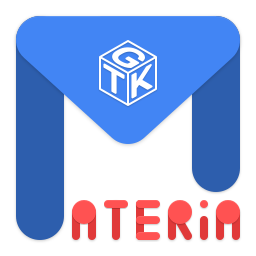
As variation we can change GNOME logo to GTK :laughing:
varlesh
on 28 Jan 2019
Maybe a bit overloaded? How about the M only but with split color like the Adapta logo.

 ghost
on 31 Jan 2019
ghost
on 31 Jan 2019
@varlesh Yeah, GTK logo version would be more neutral than the GNOME logo version :smiley: However, I have some concerns/issues about its logo design:
- The logo shape probably doesn't match any icon keyline shapes in the Material icon guidelines. I'd love to follow the Material icon guidelines as much as possible.
- The small GTK logo and text (ATERiA) could be squished with smaller sizes (e.g. 48x48, 32x32).
- In Materia, Red is not one of the main colors (though I can understand why you picked the color, from the viewpoint of aesthetic).
nana-4
on 1 Feb 2019
For the sake of argument, I made some logos based on the Material icon guidelines:
Horizontal rectangle shape (with subtle text?) like the design by @varlesh.
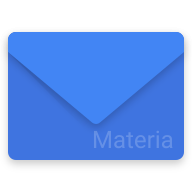
Another horizontal rectangle shape.

Circle shape (as @Ghostium suggested 🙂).

I'm an amateur of icon making, so maybe there is room for improvement on these logos.
Any thoughts / ideas?
nana-4
on 1 Feb 2019
- and 3. look good. :)
 ArchangeGabriel
on 1 Feb 2019
ArchangeGabriel
on 1 Feb 2019
why you both @varlesh and @nana-4 prefer to use envelope for the theme, which is far away from sending mails?
actionless
on 1 Feb 2019
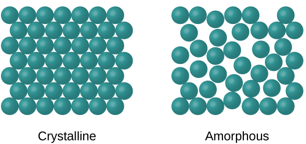
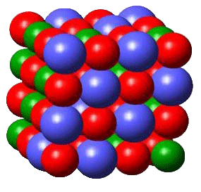
what about trying to portray word "matter" but in material design style:
for example, schematic image of "solid matter" could be used as idea/inspiration:


actionless
on 1 Feb 2019
I agree with actionless it should not look like an envelope.
With split color I ment something like this:
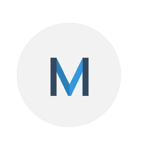
But proper made in Inkscape and with better colors and shadows like the Papirus icons. @varlesh could you please?
ghost
on 1 Feb 2019
what about such composition of the elements?
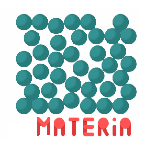
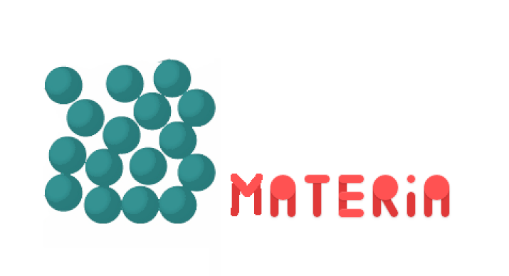
mb only change circles to blue color as on initial mockup and of-course re-draw them normally in material style
actionless
on 1 Feb 2019
later on idea with logo could be extended into having couple of SVG wallpapers which will be recolored by oomox and converted to png with resvg (as part of current change_color.sh script or make even a separate script to quickly generate wallpaper without regenerating the full theme)
actionless
on 1 Feb 2019
None of your propositions follow Material Design rules. And it’s not an envelope (even if it indeed looks like one), but the letter M.
ArchangeGabriel
on 1 Feb 2019
why you both @varlesh and @nana-4 prefer to use envelope for the theme, which is far away from sending mails?
what about trying to portray word "matter" but in material design style
I said I'd love to follow the Material icon guidelines as much as possible (because this theme is totally based on Material Design guidelines). According to the icon guidelines:
The tactile and physical quality of Material is reflected in the design of Material icons. Each icon is cut, folded, and lit as paper would be, but represented by simple graphic elements. The quality of Material is sturdy, with clean folds and crisp edges. Surfaces interact with light through subtle highlights and consistent shadows.
But I agree that my idea 1. looks too Gmail.
nana-4
on 1 Feb 2019
None of your propositions follow Material Design rules.
and of-course re-draw them [circles] normally in material style
And it’s not an envelope (even if it indeed looks like one)
no comments :-)
actionless
on 1 Feb 2019
why you both @varlesh and @nana-4 prefer to use envelope for the theme, which is far away from sending mails?
It's because Mateira encloses themes for _various_ DEs :)
However, my most favorite so far is my No. 3.
nana-4
on 1 Feb 2019
@actionless lol... my icons it's not envelope, it's M, but used forms (circles, triangle and lines)
varlesh
on 1 Feb 2019
@nana-4 yes, №3 very good... but maybe better change background to dark?
#282828 or #303030
Why dark background? Because moctly sites used white page and colors merged
varlesh
on 1 Feb 2019
Because moctly sites used white page and colors merged
I personally don't think that's a matter, because in Material Design, shadows are used as borders :)
For comparison, however, I made dark variations as well.



EDIT: Original source SVG is here.
nana-4
on 1 Feb 2019
still too much gmail (if first one was looking like Gmail Offline, this looking like "Inbox by Gmail"):

actionless
on 1 Feb 2019
@actionless Personally... disagree. They have different concepts ("M" inside circle vs. envelope) and different keyline shapes (circle vs. horizontal rectangle).
nana-4
on 1 Feb 2019

varlesh
on 1 Feb 2019
last one more precise, what about choosing the color shades in such way what M letter will be looking like a single stripe bended 3 times?
actionless
on 1 Feb 2019
with drop shadow

varlesh
on 1 Feb 2019
@varlesh Looks interesting 🧐 My only concern is that it may slightly deviate from the _keyline shape_ of the guidelines.
nana-4
on 1 Feb 2019
@nana-4 i'm not use guidelines ))) Your color and forms only...
SVG if needed:
Новый документ 1.2019_02_01_21_16_04.0.tar.gz
varlesh
on 1 Feb 2019
and also i would change the angle, since 45 degree angle is not looking too much natural for M letter (and could be a reason why it causing those envelope associations:  )
)
(ghostium's draft have both this and my previous concern addressed: https://github.com/nana-4/materia-theme/issues/351#issuecomment-459713013)
actionless
on 1 Feb 2019
@actionless You really hate envelopes :rofl:
varlesh
on 1 Feb 2019
@actionless Logos are symbol, so it is not necessarily needed that the letter M looks natural :)
FYI, these are the official Material Design logos:

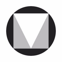
nana-4
on 1 Feb 2019
in official logo M shape is natural, exactly like in default github font for example:
M M M
actionless
on 1 Feb 2019
After some testing and reviewing, I decided to go with this logo design because:
- It passes the Material icon guidelines completely.
- It looks the most modern among the candidates to me.
- It is somewhat similar (but not exactly the same) to the official Material Design logo.
So I'm going to close this issue. Thank you all for your participation and feedback!
nana-4
on 9 Feb 2019
Related issues
 rahilwazir
·
4Comments
rahilwazir
·
4Comments
 TechnoSparks
·
3Comments
TechnoSparks
·
3Comments
 Philippe734
·
4Comments
Philippe734
·
4Comments
 torqueyy
·
3Comments
torqueyy
·
3Comments
 MischievousTomato
·
5Comments
MischievousTomato
·
5Comments