Mastodon: Wider panels by default, ability to resize panels horizontally
Mastodon has a modern clean and appealing interface. However there's one nagging problem I keep constantly being annoyed about: The extremely narrow panels! I wanted to ask the team to please consider a way to resize them, as well as a better scaling and alignment mechanism by default. Here's a screenshot of how I have mine configured:
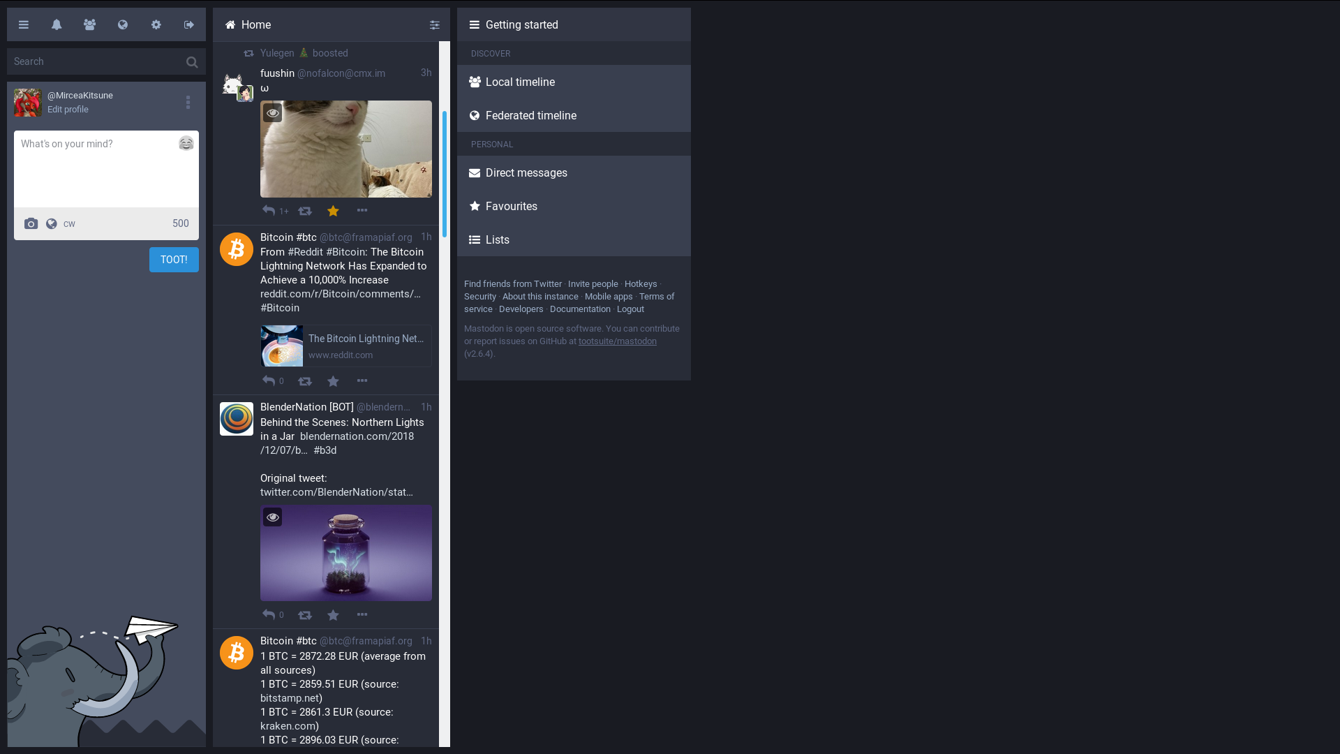
It's impossible not to ask why on a 1080p screen, half of the page sits empty and unused, which is not just impractical but also looks ugly. Sure: I could pin more panels, but many of us are used to browsing using one window and the multi-panel layout is often more confusing than helpful. That and I'd really like to see each toot in a wider space, with larger embedded images and the text not feeling so crushed.
My own suggestion: To the left and right we have the two predefined (non-customizable) panels, whereas in between is the space where various panels can be added and removed. The predefined panels could be positioned at the edges of the screen (all the way to the left and right) whereas the customizable ones would be centered and using all the available space in between them. This means that if you've only pinned one panel, it will use 100% of that width... if you've pinned two they will each use 50%... so on and so forth.
Whether my idea or a better one can be considered, please offer us a way to make those panels wider. Even permanently resizing them by clicking and dragging would be very helpful.
 MirceaKitsune
All 12 comments
I agree. This is also useful when viewing the Media section. I'm cheating and hacking the CSS atm but I also would find this handy?
 spaceottercode
on 9 Dec 2018
spaceottercode
on 9 Dec 2018
I agree. Even if it doesn't take up the entire horizontal space, it would be nice if these panels could be resizable and centered.
 Sircular
on 13 Dec 2018
Sircular
on 13 Dec 2018
Hi @MirceaKitsune I just noticed https://mastodon.art/@eishiya post a similar CSS based workaround that is suitable for desktop/laptops if that's your situation. It's a workaround so this feature is no less valuable.
spaceottercode
on 16 Dec 2018
I just found an instance called https://mastodon.host which offers a great example of what I'm suggesting. Its only issue is that the hardcoded panel to the right (Getting started) is also stretched, but other than that it's resizing the centered panels closely to how I wish Mastodon did it by default on all instances.
MirceaKitsune
on 31 Dec 2018
Something I just realized today, even if I've been doing it all along: Whenever I see an image in my timeline I find myself required to click and open it to be able to see it better. On Twitter I don't have this problem, as embedded images are shown at twice the size so I can fully understand them. This is quite an annoyance: I really hope the layout can be reworked to be a bit wider and solve this.
MirceaKitsune
on 8 Jan 2019
Also worth checking is Kevin Guertin's workaround (Mastodon : @[email protected] )
spaceottercode
on 9 Jan 2019
I personally use the Variable width (variation) userstyle with the stylus Firefox addon. It's the one with the most expandable columns. You can even have a single column that takes almost the whole screen (the left panel is still there but is always kept narrow). I also sometimes use the original Variable width userstyle for when I want a wide left panel but the columns have a limited width with this one.
All that said, it would be great to have some native options in the interface's preferences. Here's how I see it:

Note : I would suggest that the "Adaptive" option would still use a minimum width to prevent columns from getting too narrow. Also, the "Keep left panel fixed" option could use the "Left panel" value from the "Fixed" option to give extra control.
 ChameleonScales
on 22 Jan 2019
ChameleonScales
on 22 Jan 2019
Bonus note: I just noticed that both Variable width (variation) and Kevin Guertin's Full Image Preview and Wider Columns combine nicely when you check them both with the Stylus addon. So you can have limitlessly expandable columns and full image previews at the same time.
ChameleonScales
on 28 Jan 2019
Is there any reason not to put the code from that addon into vanilla Mastodon? With of course a few corrections, such as not removing or resizing the right panel. It looks pretty good to me for a default.
MirceaKitsune
on 28 Jan 2019
I came here because I was wondering the same thing...
 cnf
on 12 Apr 2019
cnf
on 12 Apr 2019
For convenience: Here is a screenshot from mastodon.host who already has this type of layout, which offers a good hint as to what I'm suggesting.
Apart from the right panel also being stretched which I think looks ugly, the pinable tabs behave closely to how I wish they did on all Mastodon instances. I believe there should be a minimum and maximum width, so that columns don't become ridiculously wide either if you have a big monitor. Otherwise make them a bit wider than now, center them on the screen instead of the current left-to-right alignment, and make it so they resize based on the number of columns you pin.

MirceaKitsune
on 13 Apr 2019
related: #5736, #8632
 k80w
on 11 May 2019
k80w
on 11 May 2019
Related issues
 phryk
·
3Comments
phryk
·
3Comments
 KellerFuchs
·
3Comments
KellerFuchs
·
3Comments
 thomaskuntzz
·
3Comments
thomaskuntzz
·
3Comments
 almafeta
·
3Comments
almafeta
·
3Comments
 psychicteeth
·
3Comments
psychicteeth
·
3Comments
Most helpful comment
For convenience: Here is a screenshot from mastodon.host who already has this type of layout, which offers a good hint as to what I'm suggesting.
Apart from the right panel also being stretched which I think looks ugly, the pinable tabs behave closely to how I wish they did on all Mastodon instances. I believe there should be a minimum and maximum width, so that columns don't become ridiculously wide either if you have a big monitor. Otherwise make them a bit wider than now, center them on the screen instead of the current left-to-right alignment, and make it so they resize based on the number of columns you pin.