Mastodon: Alternative layout for compact/tablet use cases
I had a bit of a quick play with CSS rules in Firefox and came up with this layout;
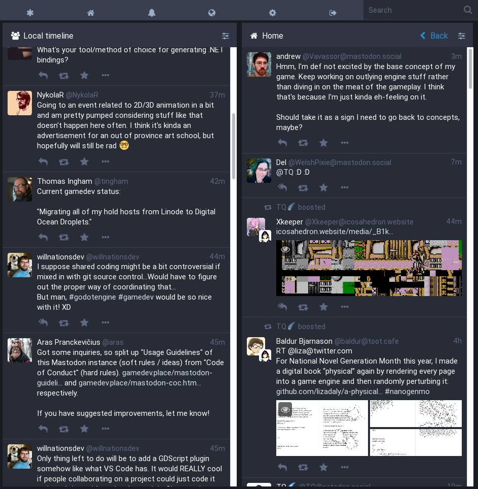
The users test/message box is hidden, and pops up above the columns. The columns have a style added in their html line that is style="width:calc(100% / column_count)" which seems to work well - just needs some padding adjustments.
The main reason I experimented with this is that I typically have the browser window open split screen with API ref and such open next to code, occasionally switching to mastodon. When I do switch to mastodon I notice that the layout is rather inefficient in the use of space - eg, if I have only two columns open, they are both very narrow (and so make reading hard), and the text entry area is not used very often so perhaps hiding that + making columns auto width would help?
Note: width:auto; doesn't work with the flex columns so the style="width:calc(100% / column_count) was required, and needs updating as columns are added/removed/updated.
The tab header bar needs adjusting too, to stop the buttons spacing right out.
What do you think? Worth doing? (I hope so. I apologise that I don't have time to do the work myself atm).
 flukejones
All 3 comments
If it's a CSS thing maybe it could be an option in settings for admins who want to offer that?
 Cassolotl
on 17 Nov 2017
Cassolotl
on 17 Nov 2017
Yeah this looks pretty good for a “compact layout” or a tablet layout imo
 wxcafe
on 19 Nov 2017
wxcafe
on 19 Nov 2017
God, we need this. The experience on a tablet is just third rate:
Columns shouldn’t be cut off. The UI should be as well considered as desktop / mobile are.
 matildepark
on 6 Apr 2018
matildepark
on 6 Apr 2018
Related issues
 hidrarga
·
3Comments
hidrarga
·
3Comments
 cumbiame
·
3Comments
cumbiame
·
3Comments
 lauramichet
·
3Comments
lauramichet
·
3Comments
 golbette
·
3Comments
golbette
·
3Comments
 almafeta
·
3Comments
almafeta
·
3Comments
Most helpful comment
God, we need this. The experience on a tablet is just third rate:

Columns shouldn’t be cut off. The UI should be as well considered as desktop / mobile are.