Mastodon: Light theme improvements needed
There are some parts of the new light theme that are too low contrast, so I'll post them here.
Tagging @Sylvhem, as requested. :)
~
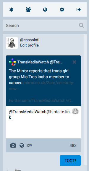
Links and X not light enough in reply UI:
~
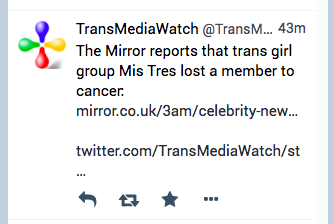
Links (tags, hashtags, URLs) are not a different enough colour compared to the rest of the text:
~
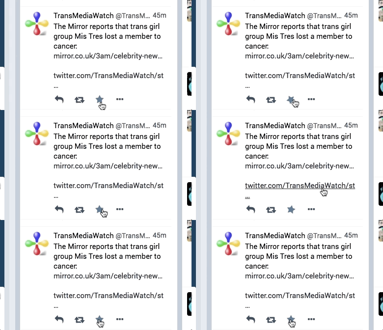
When you like something, the star spins but doesn't change colour - you have to click reply or reload the page to see it turn yellow:
~
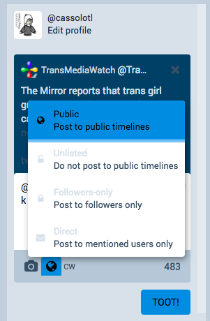
Unselected titles and icons in the privacy dropdown are too light:
~
As and if/when I find more I'll add them in new posts to this thread. :)
- [x] I searched or browsed the repo’s other issues to ensure this is not a duplicate.
- [ ] This bug happens on a tagged release and not on
master(If you're a user, don't worry about this).
All 11 comments
Noted, I'm taking care of that :).
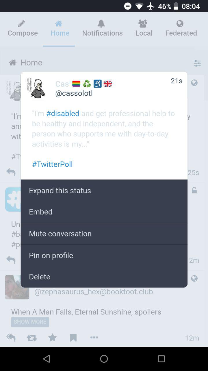
Not enough contrast in the toot text here:
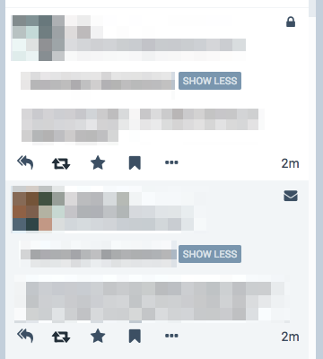
Not enough contrast between the backgrounds of DMs and normal toots:
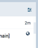
Not enough contrast on the scrollbars.
Here's a toot page:
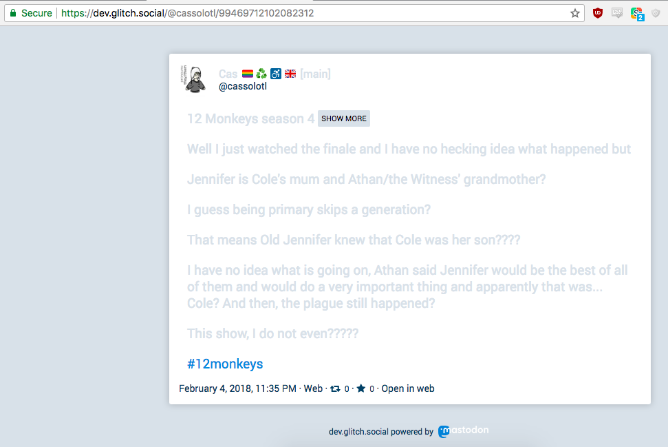
It's unreadable except for the hashtags and the Show More, which are both great. The hashtags are blue here, and I feel like link things (hashtags, @, URLs) should be blue in the web UI too!
Not enough contrast on the little arrow - should it be the same colour as the toot background?
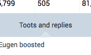
should it be the same colour as the toot background?
Yes, definitely
Personally I find that the light theme could use some more saturation to pump it up.
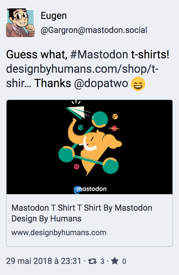
Didn't want to add a new issue, so here's my improvement proposal: better legibility for links.
Currently, links are not underlined, and not highly differentiated from regular text. It's a usability/accessibility problem. My proposal would be to change the color of the links.
Before:
After:
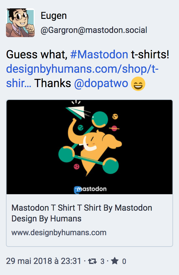
Another solution would be to add an underline.
@joachimesque I like this a lot! The links being indistinguishable from normal text makes the light theme unusable for me at the moment.
What about using mastodon's blue ?
Good idea @JaredLethal, in my screen capture I used the "Toot" button blue, but I don't know if it's the official Mastodon's blue.
Most helpful comment
Didn't want to add a new issue, so here's my improvement proposal: better legibility for links.
Currently, links are not underlined, and not highly differentiated from regular text. It's a usability/accessibility problem. My proposal would be to change the color of the links.
Before:

After:

Another solution would be to add an underline.