Mastodon: Accessibility issue with privacy/content warning controls in the tootbox
(This was originally a comment on #5824)
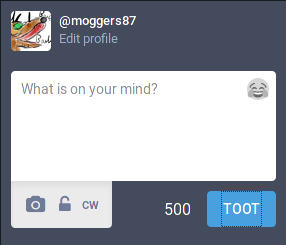
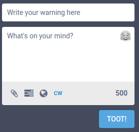
The privacy/content-warning buttons are not properly accessible - they can be selected via keyboard, but they don't offer much visual feedback. Compare with the emoji and "Toot" buttons:
Emoji selected:
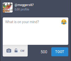
"Toot" selected:
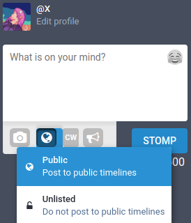
Privacy button selected (note the limited contrast between the buttons)
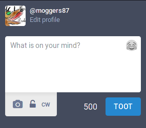
For those of you unfamiliar with keyboard control in browsers: click the textbox and hit tab a bunch of times, you'll first see the emoji button selected (if you press space or enter, you'll get the emoji picker pop up). If you hit tab a few more times you'll see the "Toot" button is selected - hitting space or enter here will post your toot.
- [x] I searched or browsed the repo’s other issues to ensure this is not a duplicate.
- [ ] This bug happens on a tagged release and not on
master(If you're a user, don't worry about this).
 moggers87
All 7 comments
These W3C document on colour contrast and on indicating keyboard focus might be worth a read too
moggers87
on 14 Dec 2017
If you have some form of User CSS available, you can make them more usable by using the following CSS. This will also add a background showing the available clicking area to the buttons as well.
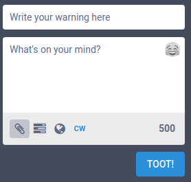
Focusing a button and then its active state:
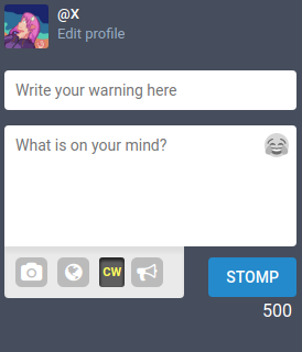
Toggled "CW" button:
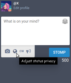
For posterity, the default look without this CSS:
.compose-form__buttons button {
    /* make the new toot buttons stand out too */
    background: rgba(0, 0, 0, .2);
    border-radius: .3em;
    color: #fff;
    margin-right: .5em;
}

.compose-form__buttons button.active {
    /* make the cw button more obvious when toggled */
    background: rgba(0, 0, 0, .6);
    color: #ff4;
    box-shadow: inset 0px 2px 3px 1px rgba(0, 0, 0, .6);
}

.compose-form__buttons button:hover, .compose-form__buttons button:focus {
    /* make all the buttons stand out when you hover over them */
    background: rgba(0, 0, 0, .4);
    color: #fff;
}
 Xkeeper0
on 12 Jan 2018
Xkeeper0
on 12 Jan 2018
Just a quick update: this issue now includes the "Toot" button as it has lost the dashed outline it had previously.
moggers87
on 24 Jul 2019
This issue has been automatically marked as stale because it has not had recent activity. It will be closed if no further activity occurs. Thank you for your contributions.
![stale[bot] picture](https://avatars3.githubusercontent.com/in/1724?v=4&s=40) stale[bot]
on 26 Oct 2019
stale[bot]
on 26 Oct 2019
This is still an issue.
moggers87
on 26 Oct 2019
Actually, that might not be true: I'm on two instances, one is running Mastodon V2.9.3 and the other is running Glitchsoc v3.0.1+glitch. The one running Glitchsoc appears to have solved this issue but I don't know it that's a Glitchsoc change or something that was fixed in V3.0.x
moggers87
on 29 Oct 2019
Left: Attach selected via keyboard. Right: None (though CW is enabled.)
It is not quite as egregious as before, but still not great. However, adding a poll reveals that the old problem never quite went away. (Note that in this, the appearance doesn't change regardless of which one is selected, even though "Add a choice" looks as if it might be focused)
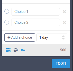
Both the "Add a choice" and "1 day" options do not have any visual indication of being selected. The "1 day" field also appears to be disabled, and uses a "spinner" (↕) instead of a dropdown (▼). Spinners are typically for incremental numerical values and not fixed-value dropdowns. The radio buttons are also selectable, despite being non-functional/for show.
Xkeeper0
on 29 Oct 2019
Related issues
 flukejones
·
3Comments
flukejones
·
3Comments
 thomaskuntzz
·
3Comments
thomaskuntzz
·
3Comments
 selfagency
·
3Comments
selfagency
·
3Comments
 svetlik
·
3Comments
svetlik
·
3Comments
 cumbiame
·
3Comments
cumbiame
·
3Comments