Mastodon: Please make it possible to force the single column view regardless of screen width
Due to a visual impairment, it's very difficult for me to use the multi-column view. In pre-2.0 versions of Mastodon, I could zoom in a reasonable amount and it would pop into single-column mode.
That behavior changed in the 2.0beta, such that zooming in the usual amount didn't work and instead gave a horizontal scroll bar, which is terrible. The amount I had to zoom in to get the single column view was /far/ too much to be usable and the unscrollable header took up a vast amount of the screen.
So some way to force the single column mode would be very useful.
Thank you.
- [x] I searched or browsed the repo’s other issues to ensure this is not a duplicate.
- [x] This bug happens on a tagged release and not on
master(If you're a user, don't worry about this).
 adamemerson
All 21 comments
For the time being, you can add a user style:
.column, .drawer {
  width: 100vw;
}
But yes, this issue has come up a few times (e.g. "how to make the columns wider than 330px") and it would be nice to have a consistent solution. Perhaps users could set their maximum desired width in the settings?
 nolanlawson
on 12 Oct 2017
nolanlawson
on 12 Oct 2017
Can this user style be added from the server end? I am not a front-end designer so I have no idea how to do this (my previous attempts to customize the UI have been... unwise), and I'm hesitant to upgrade to 2.0 as this would significantly impact one of our members.
 rtucker
on 12 Oct 2017
rtucker
on 12 Oct 2017
You can have custom user themes now: https://github.com/tootsuite/documentation/pull/421
nolanlawson
on 14 Oct 2017
@nolanlawson In testing via Firefox developer tools (paste into a new temporary stylesheet), that doesn't render the mobile UI, only forces horizontal scrolling, which is explicitly not desired.
It seems that single-column mode depends on window.innerWidth via isMobile...
In app/javascript/mastodon/features/ui/index.js:
<ColumnsAreaContainer ref={this.setColumnsAreaRef} singleColumn={isMobile(width)}>
CSS alone does not seem to cause the server to render what's missing.
Some preference-based addition might work, e.g. singleColumn=(isMobile(width) || forceSingleColumn). I'm not yet sure how to implement this, and it likely still needs to update the theme CSS, too.
For testing, I also tried overriding the window.innerWidth function via the dev-tools console and that failed, too. I might be doing it wrong.
delete window.innerWidth;
window.__defineGetter__('innerWidth',function(){
          return 600;
})
 digitalcircuit
on 18 Oct 2017
digitalcircuit
on 18 Oct 2017
@nolanlawson yeah, but only admins can add a custom theme, right?
At least I don't see any place to upload or change anything (2 different 2.0 instances)
 thiagomgd
on 18 Oct 2017
thiagomgd
on 18 Oct 2017
For the innerWidth hack, also you need to 1) fire resize event to update React state, and 2) override styles with Media Queries (see dae0af1fd2499a2eca2becbbec13356a27c4e81c) because it won't be affected by the innerWidth hack.
For example, I'm using the userscript like this to enable multi column in the narrow window, though you want to do the opposite.
https://gist.github.com/unarist/71067609416aed633cf74eddb6feb725#file-mastodon-add-2col-layout-user-js-L40
 unarist
on 19 Oct 2017
unarist
on 19 Oct 2017
I'm thinking about changing styles by setting class attribute like .ui-pc .ui-mobile from JS instead of Media Queries which is hard to change for each users. This will also fix flushing of inconsistent state on layout changing (e.g. https://mstdn.maud.io/@Otakan951/98915719323681165).
Then...something like this?

unarist
on 30 Oct 2017
Your suggestion looks great to me @unarist
nolanlawson
on 30 Oct 2017
@unarist That seems excellent from the technical perspective!
However, may I suggest going one step further for the UI?
If someone always wants single column layout (e.g. @adamemerson), or never wants it, they must set it to 0 px or 9999+ px, which isn't as friendly. There's also no easy way to reset to the defaults if you change it then forget the original value.
Would a HTML <select> with a few options work? E.g.
When to use single column layout: ________
- Automatic
- Always
- Never
- Custom
* This adds the pixel number textbox with the px wide or less explanation
With better strings, of course.
This is a bit closer to how some other services handle it, e.g. GMail offers a select menu for overriding Display density, and this allows people to use/avoid single column without having to pick an arbitrarily high or low pixel number.
digitalcircuit
on 31 Oct 2017
One important caveat about this fix is that it would affect _all_ web clients. So for instance if you use Mastodon on your 4K monitor at work, your 13-inch laptop at home, and in your mobile browser on your phone, then the same setting will apply to all three, which may not be what the user wants.
Is there some way we could add this as a UI feature (which doesn't persist across clients) without complicating the UI too much? If we did, arguably it could just be a single toggle ("force single-column mode") rather than a pixel breakpoint.
nolanlawson
on 31 Oct 2017
@nolanlawson per-device theme choices would be a great feature. There are times that I would like to use one theme on mobile and another on my laptop.
 scififyi
on 24 Nov 2017
scififyi
on 24 Nov 2017
Aside, the glitch.social Mastodon fork provides a device-specific option for this:

There's certainly room for debate over where the options should go, what else might be considered (maybe include a global 'Push notifications on this device' toggle?), etc, but I think device-specific layout overrides remain worthwhile considering. Most websites at least have a way to force the desktop version, e.g. Github's Desktop version link.
digitalcircuit
on 1 Feb 2018
Will this happen?
A lot of people (read: my parents and friends) get confused with current UI. I'm trying to get everyone off of FB and introduce them to Mastodon and currently this is the main "blocker".
 neo-anderson
on 23 Mar 2018
neo-anderson
on 23 Mar 2018
Is there any way to detect the length of the screen? if so, it would be much easier to implement, right? (not a dev myself)
 moshpirit
on 28 Mar 2018
moshpirit
on 28 Mar 2018
I find the current 4-column layout awkward to the point of not using the service.
The columns force the reader to scroll them very frequently instead of scrolling the whole page once in a while. It forces using the mouse wheel instead of space/page down.
It also wastes almost 50% of the screen space on a wide monitor.
 FedericoCeratto
on 17 Jul 2018
FedericoCeratto
on 17 Jul 2018
@FedericoCeratto Try the Pinafore (pinafore.social) frontend in the meantime before quitting Mastodon completely.
 STPKITT
on 18 Jul 2018
STPKITT
on 18 Jul 2018
Hello, quick tip: to view a single column in desktop try increase the zoom and resize the window untill you see a single column.
I would like to use a single centered column in desktop but for now i use this workaround (Linux+Firefox).

 AndreaMonzini
on 14 Sep 2018
AndreaMonzini
on 14 Sep 2018
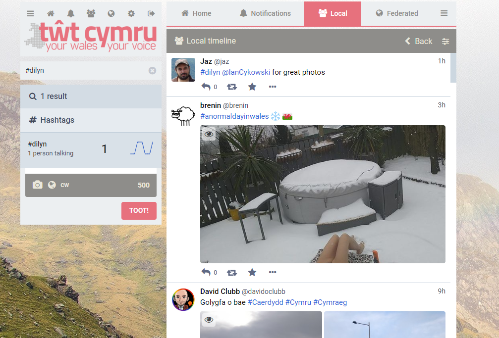
Would it help to switch to a single-column instance? toot.wales is one, I'm sure there are others. example:
 jazmichaelking
on 22 Jan 2019
jazmichaelking
on 22 Jan 2019
Is this closed with #10847?
 realityfabric
on 12 Jun 2019
realityfabric
on 12 Jun 2019
yep, thanks!
 nightpool
on 12 Jun 2019
nightpool
on 12 Jun 2019
This doesn't quite work for what I was hoping for. I would like a single column spanning the display from left to right. This thing gives a a column of toots flanked by a compose column on the left and an option thingy column on the right and making both go away requires way too much zooming in.
(The idea is to have a reasonably nice text size AND actually get a good number of words on the screen without having a bunch of other columns crowding in and forcing a shorter line length.)
adamemerson
on 15 Jun 2019
Related issues
 thomaskuntzz
·
3Comments
thomaskuntzz
·
3Comments
 lauramichet
·
3Comments
lauramichet
·
3Comments
 hugogameiro
·
3Comments
hugogameiro
·
3Comments
 flukejones
·
3Comments
flukejones
·
3Comments
 ghost
·
3Comments
ghost
·
3Comments
Most helpful comment
Will this happen?
A lot of people (read: my parents and friends) get confused with current UI. I'm trying to get everyone off of FB and introduce them to Mastodon and currently this is the main "blocker".