Mastodon: Content warnings automatically added to replies
When replying to a toot that has a content warning, a content warning is automatically added to the reply.
I understand that replies to sensitive content can be expected to also be sensitive, but it's rather confusing to have a content warning automatically added without user input or indication that one will be added.
I think this would be better handled instead at the receiver's UI end by not showing replies until the content warning is expanded. If this is considered to be a problem when boosts are taken into account, at least the UI should clearly indicate that a content warning will be added automatically
- [X] I searched or browsed the repo’s other issues to ensure this is not a duplicate.
 ghost
ghost
All 13 comments
Current behavior has a clear advantage though, in that by default it marks the entire thread in the same way, making it easy to continue ignoring a thread you're not interested in, or conversely following new responses to it if you are. Since CWs are intended for topics which not everyone wants to read about, this seems like a pretty good fit.
I also have to say I don't find the current behavior that confusing, but that's just me.
 msappir
on 9 Apr 2017
msappir
on 9 Apr 2017
The CW is quite visibly pre-filled. It happens on UI level, not server level. You are free to just toggle the CW button to remove it.
 Gargron
on 9 Apr 2017
Gargron
on 9 Apr 2017
While I agree with the mechanic of automatically marking replies with CWs, I think it could still be made clearer in the UI. When it happened to me the first time, I was also a bit confused until I realized what had happened.
 lutoma
on 11 Apr 2017
lutoma
on 11 Apr 2017
Many times I thought it copied the original toot and posted it instead of the reply, then I promptly deleted it so as not to embarrass myself.
Now, I finally looked more closely and realized this is what's happening. What a bad feature!
 MightyPork
on 24 Apr 2017
MightyPork
on 24 Apr 2017
@lutoma do you have any suggestions on ways to make the UI more clear?
 ashfurrow
on 25 Apr 2017
ashfurrow
on 25 Apr 2017
It sounds like adding cw's automatically is part of the desired feature set, though I agree it could be made more clear. Anyone have any suggestions?
ashfurrow
on 8 May 2017
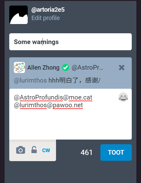
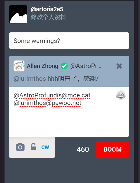
I'm no designer, but it'd help if the tootbox more clearly indicated that CW is on
mock-up with a random CW from the FTL

MightyPork
on 8 May 2017
+1 on reminding users that CW is on.
The red frame appears a bit intrusive here… Bolding the text in the warning input may be a good idea. Or should we make TOOT button red and replace TOOT with BOOM? That will take a bit of extra coding (as the same toot button element is shared), but might sound cool for those unafraid of big bombs.
Some terrible mockups:
 Artoria2e5
on 19 Sep 2017
Artoria2e5
on 19 Sep 2017
The CW is quite visibly pre-filled. It happens on UI level, not server level. You are free to just toggle the CW button to remove it.
I'm with Gargron on this one, you can see that the CW is filled.
@MightyPork I don't see what you're doing on your suggestion. You mean the green circle, or the red box? (I suppose the red box is just to mark your example)
And about the need of having this feature, I also agree with @msappir. A topic about Trump/Pewdiepie/right or left-wing politics/feminist/religion will probably have responses that also needs the same content warnings as the first toot
 thiagomgd
on 19 Sep 2017
thiagomgd
on 19 Sep 2017
I think MightyPork's point is using the red box to remind users that CW is on. I agree that pre-filling the CW for replies is a good thing, but a normal little box is a bit too easy to overlook when users really don't need it/should edit it. (You want to remove CWs that are used only for saving screen space and edit out ones that warns about a birdsite link.) Hence the suggestions for highlighting.
Artoria2e5
on 19 Sep 2017
I think the CW is often overlooked when replying because it’s so far away from the text being written or replied and not visually connected at all.
I think the CW field should instead be between the original toot and the composing field, so that people will more frequently think of updating (or removing) it when appropriate. Also, it’s much more logical to have the actual content of the toot visually connected to the toot than the reply, which can be separated by a thin (or not) margin.
 ariasuni
on 1 May 2018
ariasuni
on 1 May 2018
Now that #7508 was merged, CW on replies should be much clearer. Closing?
ariasuni
on 31 May 2018
I guess
Gargron
on 31 May 2018
Related issues
 renatolond
·
3Comments
renatolond
·
3Comments
 sorin-davidoi
·
3Comments
sorin-davidoi
·
3Comments
 flukejones
·
3Comments
flukejones
·
3Comments
 selfagency
·
3Comments
selfagency
·
3Comments
 golbette
·
3Comments
golbette
·
3Comments
Most helpful comment
The CW is quite visibly pre-filled. It happens on UI level, not server level. You are free to just toggle the CW button to remove it.