Markbind: Tool tips and popovers should be indicated by dotted lines, not dashed lines
v2.11.0
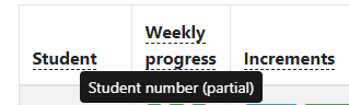
Problem: tooltips/popovers should be indicated by dotted underlines while dashed underlines are to be used for indicating modal windows.
 damithc
All 7 comments
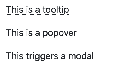
We already seem to use the underline dotted style for tooltips and popovers.
For triggers, we only use the dotted style for those that aren't click triggers.
Sorry, I just pulled the latest code. We can just set the style for the tooltips to dotted.
 yash-chowdhary
on 25 Feb 2020
yash-chowdhary
on 25 Feb 2020
By the way, modal links don't seem to show the hand icon when hovered over, which is important to indicate that the link is clickable.
damithc
on 9 Mar 2020
Are we differentiating the style by the type of content it supports (modal/tooltip/popover), or the type of trigger (hover/click)?
From a UX perspective it might make more sense to style elements by the type of trigger rather than the type of content. For example, a user should expect all underline dotted to be clickable and underline dashed to be hover-able.
 alyip98
on 12 Mar 2020
alyip98
on 12 Mar 2020
From a UX perspective it might make more sense to style elements by the type of trigger rather than the type of content. For example, a user should expect all underline dotted to be clickable and underline dashed to be hover-able.
Good point. I guess because I never change the default trigger type, I tend to equate the content type to the trigger type. The correct thing to do is to match the style to the trigger type; dots for hover and dash for click.
damithc
on 13 Mar 2020
From a UX perspective it might make more sense to style elements by the type of trigger rather than the type of content. For example, a user should expect all underline dotted to be clickable and underline dashed to be hover-able.
Good point. I guess because I never change the default trigger type, I tend to equate the content type to the trigger type. The correct thing to do is to match the style to the trigger type; dots for hover and dash for click.
This was already the case in previous markbind versions (hover had underline dotted and click had underline dashed), but during the migration to bootstrap-vue the correct styles were not set for click triggers.
 openorclose
on 13 Mar 2020
openorclose
on 13 Mar 2020
Reopening as the problem is still there.
damithc
on 24 Apr 2020
Reopening as the problem is still there.
Probably a regression, opened another PR to fix it.
openorclose
on 27 Apr 2020
Related issues
 yamgent
·
5Comments
damithc
·
4Comments
yamgent
·
5Comments
damithc
·
4Comments
 ang-zeyu
·
7Comments
ang-zeyu
·
7Comments
 Xenonym
·
3Comments
Xenonym
·
3Comments
 Chng-Zhi-Xuan
·
4Comments
Chng-Zhi-Xuan
·
4Comments