Maptool: Restyle Initiative Window and Select (Macro) Window to address Look and Feel and Usability issues
Describe the bug
The Initiative Window uses a JIDE button that doesn't jive with look and feel. The view also paints the elements with hardcoded colors for background and selection background. The buttons change function depending on what permissions the user has.

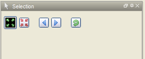
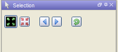
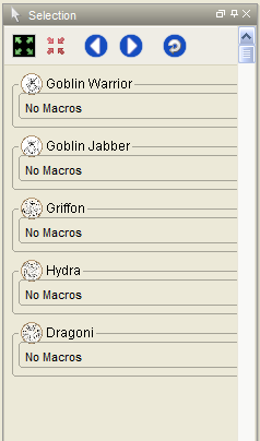
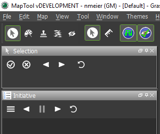
The Selection (Macro) Window has a floating 'toolbar' that doesn't match the look of the rest of MapTool either:
To Reproduce
Review initiative window.
Expected behavior
Restyled, cleaned-up, toolbars in dockable windows that offer toolbar/menu functions: Initiative and Selection (Macro).
Screenshots
see above
MapTool Info
- Version: 1.7.0 beta
Desktop (please complete the following information):
- All
Additional context
spun off from https://github.com/RPTools/maptool/issues/1635
 nmeier
All 42 comments
I think the suggestions you made on the other issue are good ones:
On the initiative window @mrkwnzl - it's using one of the worst L&F compatible components, the JIDESplitButton (which does some weird lnf unset/setting as well).
I'm tempted to replace it - that allows for normal components to control the fairly complex initiative panel. Would also go in direction of divorcing from JIDE if that's considered.
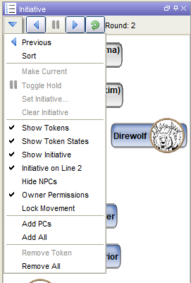
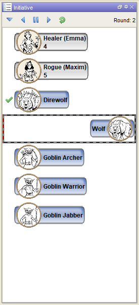
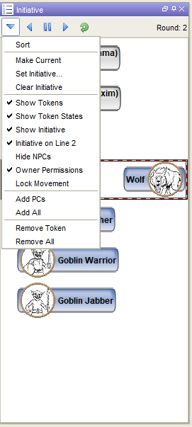
Simple looks - there's no button/menu combination in Swing so we could use a menu in a top toolbar-like panel. I've also changed how the selected (not current) item is indicated, instead of a hardcoded black border, reuse the selection border the other components use as well.
What do you guys think about that?
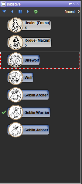
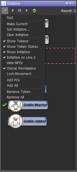
Dark
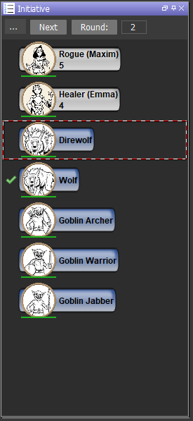
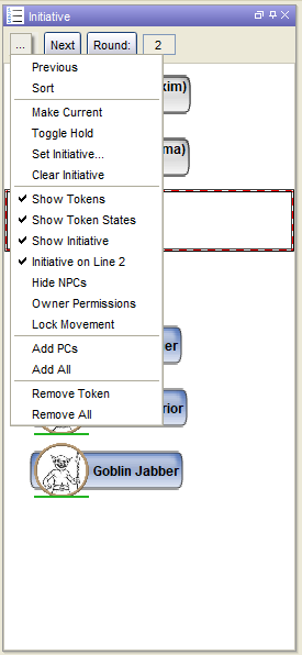
in default style, with menu opened
 Phergus
on 5 May 2020
Phergus
on 5 May 2020
Working on a design/implementation where the buttons don't change around and adhere to the lnf/theme. Reusing arrow images, adding one for hold.
Using the same 'selection border' as used elsewhere in maptools.
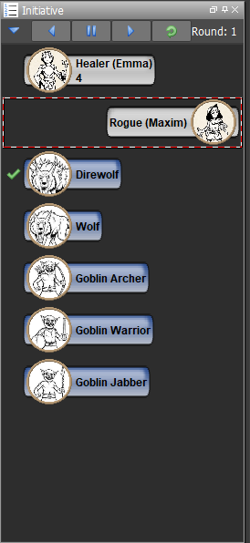
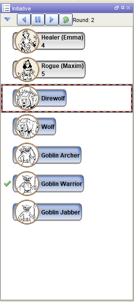
In the eye of the beholder of course. based on player's permission and selection of an item (we distinguish between currently selected token-initiative and the currently initiative-holding player) some of the buttons will be grayed out
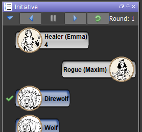
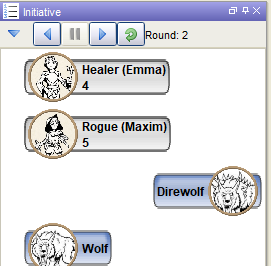
The menu is now a menu, not the JIDE split button
nmeier
on 5 May 2020
IMO, replacing the current text buttons with symbols is better.
Phergus
on 5 May 2020
current iteration
|  |
|  |
|
|  |
|  |
|
nmeier
on 6 May 2020
I just played around with it and I like it. It’s functional and easy to understand.
One tiny cosmetic change I’d propose was to add a few pixels as space between the current round number and the right border of the window. I always think it looks a bit nicer when the GUI elements have a bit of room to breathe.
 mrkwnzl
on 6 May 2020
mrkwnzl
on 6 May 2020
I'm not too keen on the change to use symbols, I find them harder to parse and remember what they represent.
How about a small text label under each symbol? If not, do they at least show a label when one hovers over them?
My interpretation of the icons used are (in order) Down (move initative to next combatant), Reverse (previous combatant gets initative?), Pause (pause combat), Play (restart combat), Undo (same as reverse?)
While the above is obviously wrong and I'd learn what each icon means once I've tried them, it does show a problem with icon-heavy guis. Icons aren't universal.
See for instance https://www.nngroup.com/articles/icon-usability/
 xdy
on 6 May 2020
xdy
on 6 May 2020
The buttons do have tooltips that explain what each one is.
The down arrow functions the same as it did in the previous UI to open the menu so no change there.
I could see changing the menu button to something else. Perhaps the hamburger symbol used in Android (3 stacked horizontal bars) or maybe an ellipsis.
Important thing here is that you no longer have to go to the menu for the most common actions.
It wouldn't bug me if the buttons were maybe 25-50% larger however.
Phergus
on 6 May 2020
add a few pixels as space between the current round number and the right border of the window
Agree, adding a bit of strut there
nmeier
on 6 May 2020
The icons are problematic, true.
Have to use something else for the menu - it does indeed look like 'down=next'.
Also not convinced the pause button conveys the right thing. It's a very specific function (hold state) - maybe it shouldn't even be on the toolbar.
The images for icons are from the "Selected" macro window - that "toolbar" could also be restyled. Most icons seem 16x16 but they don't use the full space. I'm wondering if we can leave the conversation on image icons to another issue. Obviously they don't scale and can clash with a look and feel - there's a whole other conversation possible on that.
nmeier
on 6 May 2020
@Phergus Yeah, the buttons work the same way, it's just that they are - to me - not the least bit intuitive.
Partially a matter of taste, and partially a matter of cognitive impairment on my side. I have a very low spatial visualization ability. Getting lost, even in places I 'know' is something I plan for, as I do it all the time...
It's not a showstopper by any means, just a reminder that people's minds work in different ways. Especially mine. :)
xdy
on 6 May 2020
current state compare to icon usability
| | |
|---|---|
| Icons make good targets: they are typically sized large enough to be easily touched in a finger-operated UI | don't think so |
| icons can be compact enough to allow toolbars, palettes, and so on to display many icons in a relatively small space | Yes |
| Icons are fast to recognize at a glance | A bit |
There is no need to translate icons | Close, have tool-tips though |
| Icons can be visually pleasing | hmm |
| the same icons and style are used in several places | Could use a holistic overhaul |
nmeier
on 6 May 2020
I wouldn’t mind text buttons (Previous, Hold, Next) and an ellipses for the menu, if that helps with accessibility. Preferably with the Previous, Next, and Hold buttons having the same width. My aesthetic sensibility might get offended otherwise.
mrkwnzl
on 6 May 2020
@xdy We already knew that. ;)
Feedback is good and appreciated. We do need to do what we can, with the resources we have, to address accessibility issues.
The whole UI icon images thing would be best handled in another conversation so we shouldn't stray too far along that path for the Initiative window.
I find text buttons ugly and they quickly become a cluttered mess. Colors can help but now we are having to be mindful of color vision issues. Keeping them the same size would be good but once the text is localized for other languages what happens?
Phergus
on 6 May 2020
Those are good points as well. UX development is hard...
mrkwnzl
on 6 May 2020
I'm going to be a dumb user here and emulate what I'm pretty sure my players would ask me (and honestly would have to test myself)
Where's the menu?
Oh there it is, I though the down triangle would move to next initiative.
Why isn't this the standard 3 barhamburgermenu everyone uses these days?
I wanted to hold but it skipped my initiative?
Well hold moves my token to the right so I pressed the right triangle...
What's the green icon do?
No idea, lets press it.
I haven't read most of the backlog in this issue but I did that on purpose, just my "perception" on the icons and I'm a long time user/developer.
With that said, I'm all for icons personally. Love em. Do these scream at me what they do for Init window? No. Would they probably make sense after using them a few times? sure. Could I figure it out pretty quickly? Ya, just press them and see what happens. There's only 4 of them!
My only change request would be the menu icon. The down triangle looks like it should just do one thing (like move a token down) and doesn't scream menu at all. Can we make it a hamburger instead?

 JamzTheMan
on 6 May 2020
JamzTheMan
on 6 May 2020
I find it odd that the Menu button was a down arrow before but suddenly everyone is confused by it. In any case, as I suggested before, switching to a hamburger button would be better.
The Reset button doesn't do anything for players of course. And all the others but the Menu are currently disabled for Players. The Reset button should also be disabled for players.
Should Players have access to Hold? They don't under the current UI.
I'm thinking folks need to actually look at the changes by running MapTool server and player clients.
Phergus
on 6 May 2020
Users be dumb. And honestly my gm's didnt know where the menu button was before honestly. I bring it up because visually it looks like the others which are buttons but is a menu item.
Players should have access to hold for their tokens i would think. And maybe even next init but I can see GMs wanting the control for that exclusively. But hold doesnt "do" anything so dont see the harm in opening that up?
Do we have grey disabled images for the buttons?
JamzTheMan
on 6 May 2020
We'll get a new menu hamburger thingy, no problem.
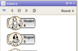
On the buttons and what's available - that's grey depending on who's looking. In best case with the players token selected they get hold/next enabled.
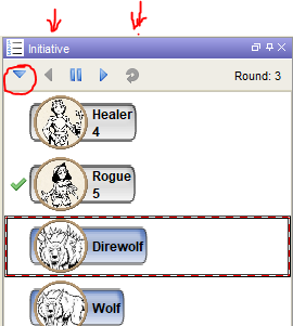
Could be that nothing's enabled: no GM, no owned token selected, or no owner permissions consulted, or not current player
nmeier
on 6 May 2020
The problem with the hamburger item as suggested is that it's black on transparent. It doesn't work with a dark lnf.
That's the other general problem with images for icons - ultimately one needs a colored 'circle?' background behind every image. Blue seems to be a prevalent button image color in Maptool atm.
suggestions coming
nmeier
on 6 May 2020
+1 for the hamburger menu (or as Phergus suggested, the ellipsis).
The icons at https://game-icons.net/tags/gui.html are only two colors. We could add code to apply colors from the theme and then use those. (The ones I was just looking at need to be inverted for our use, though.)
 Azhrei
on 6 May 2020
Azhrei
on 6 May 2020
Two issues with #1759 related to I18N:
1) The I18N sentences have a typo - it should be "initiative", not "initiate".
2) The "Next" button has two identical strings now - initPanel.menuButton and initPanel.next
 Merudo
on 6 May 2020
Merudo
on 6 May 2020
- The I18N sentences have a typo - it should be "initiative", not "initiate".
- The "Next" button has two identical strings now - initPanel.menuButton and initPanel.next
thanks, will correct
nmeier
on 6 May 2020
The icons at https://game-icons.net/tags/gui.html are only two colors. We could add code to apply colors from the theme and then use those. (The ones I was just looking at need to be inverted for our use, though.)
So those icons are pretty but they're 512x512, will need heavily scaling, One could do a trick to use the foreground color instead of black as per image to paint. That's a lot of work though imo.
If we can tune the images used in buttons a little bit that might be a sufficient step at this point
nmeier
on 7 May 2020
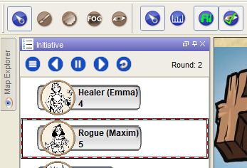
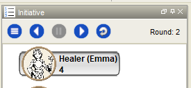
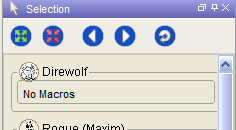
I've played with styled, slightly bigger images that match the blue of the top-level tool bar - same size as two images from Selected (Macro) Panel
Both in preview - how would that be? A temporary step until an image artist steps up and retools
|  |
|  |
|
nmeier
on 7 May 2020
Just going to point out that the game-icons.net icons are SVG and they can be any size you want them to be when download as PNG files.
Huh. There are buttons on the Selection window. While I guess I had seen them I've never even looked to see what they do. I don't use the Selection window much.
Those buttons look fine to me.
Phergus
on 7 May 2020
Just going to point out that the game-icons.net icons are SVG and they can be any size you want them to be when download as PNG files.
Huh, I hadn't noticed. Cool.
Those buttons look fine to me.
Agreed.
Azhrei
on 7 May 2020
I like it. +1
JamzTheMan
on 7 May 2020
Just going to point out that the game-icons.net icons are SVG and they can be any size you want them to be when download as PNG files.
I downloaded the png pack and I found only one set of icon size in that zip
At some point one would expect that all icons would simply be SVG rendered. No bitmap color problems, just render them with the foreground color. Something like this.
A more substantial change that could make things slower, too. Would love not to have to pixel peep anymore, would also address users who barely can see the buttons. Ah well.
nmeier
on 7 May 2020
I downloaded the png pack and I found only one set of icon size in that zip
I’m not sure about the packs, but you can basically change anything about each icon if you click on them to download them individually. Color, size, orientation, background shape and color, you can hide certain parts of the icons, and you can select the size of the PNG. Game-icons is a pretty powerful tool.
I also want to voice support for the icons. From the images, the Next and Previous Symbols could be a tad smaller within the blue circle, I think. They look too big in relation the the other icons and on lower resolution screens, the distance to the edge of the circle could be indiscernible. But I’d have to see it live.
mrkwnzl
on 7 May 2020
you can basically change anything about each icon if you click on them
Ahhh, ok, I see. Now I get why you're excited. Let me play with their generator ...
nmeier
on 7 May 2020
Are you still using jToggleButtons I assume? And liking the uniform look (changing selection style panels to match)
JamzTheMan
on 7 May 2020
I'm using a standard JToolbar with JButtons
nmeier
on 7 May 2020
Oh ya, they don't stay on really like the toolbar, nevermind (except maybe the menu when active)
JamzTheMan
on 7 May 2020
Get a PR in and I'll push out another beta tomorrow.
Phergus
on 7 May 2020
I'm going to further investigate the idea of using a good image library as suggested, then paint with the foreground color by swapping the colour out (which works well with a single color, svg generated image, scaled, w/alpha). This would allow for button symbols that match the LnF, and we'd be able to easily provide a couple of sizes for buttons (e.g. 22,32,48,64) - allowing users with high resolution to find those buttons.
For now I've made up the toolbar buttons as modifications of the current images (all 22x22 now, blue background matching the main toolbar, next/prev arrow reduced in size as per your suggestion @mrkwnzl ), to get some eyes on the behavior itself. Pull request coming.
|  |
|  |
|
nmeier
on 8 May 2020
Tested with different stock themes. Looks good to me.
Phergus
on 8 May 2020
Just FYI I have a nice way now to use the SVG images, exported to any size, using the alpha channel to render the resulting scaled images in any LnF appropriately (I figured that's the right way to handle icon assets rather than going SVG rendering).

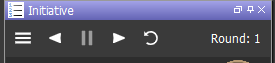
Question is: is going away from current colored images of concern for someone? Are all toolbar buttons ready for an overhaul? Bonus of possibly providing multiple scaled image sizes for any resolution is possible (would add another setting).
And what are the icons to consider from the set pointed out in this thread or elsewhere?
nmeier
on 9 May 2020
I think it looks a bit more modern, and it’s a good start for an overhaul of the icons. I’m a big fan of the game-icons.net aesthetic, so that’s always a plus in my book. I use those icons as tokens all the time, so that would fit nicely with my campaigns 😁
Question is: is going away from current colored images of concern for someone?
Not for me. In the long run, monochrome icons will probably still look good across multiply themes. So I think it‘s a good idea. I don’t know much about accessibility, though.
Bonus of possibly providing multiple scaled image sizes for any resolution is possible (would add another setting).
That would actually be really great. On my 2560×1600 display, the icons don’t look as great, as they get pixelated. On my second 1920×1080 display, they look good.
And what are the icons to consider […] ?
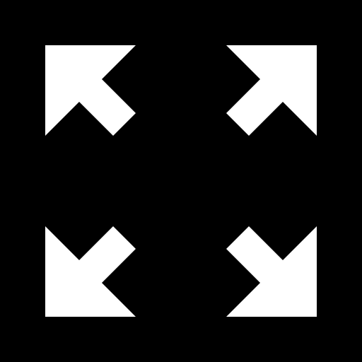
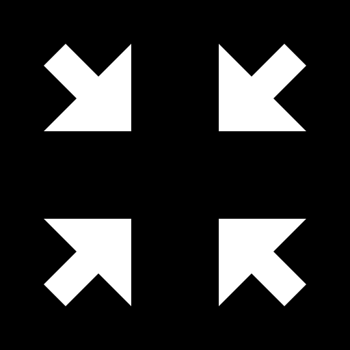
I think the “Select all” and “Select none” icons of the Selection window aren’t as meaningful as the current icons. Maybe these work better?


Or these, as they are essentially the current ones:
mrkwnzl
on 9 May 2020
There hasn't been a hard decision made about replacing the entire set of GUI icons and there is a lot of them. See more discussion of an icon set here: #921 and #1248 .
Didn't have a particular icon or set of icons from game-icons.net. Mostly just a pointer to a handy resource for images that could be used.
Having multiple sets in different color palettes or sizes would be nice. That is part of #1248.
The Select All/None buttons are less than clear. Had to hover over them to find out what they do. Not sure what would be good replacements. Rod Takehara did a partial replacement set and I believe it's attached to #921 .
Phergus
on 9 May 2020
Regarding accessibility: "single" color, high contrast icons with big chunky lines are a good idea. Avoid conveying vital information with fine lines where possible, they disappear with many vision issues. And always include tooltips, of course.
Bonus points for a ticky box to turn the entire UI to just text-based buttons but that would be a heroic effort :D
It would be best if one could select the two colors used for the background and foreground, because for some people a black background and white foreground (like game-icons.net uses) is good, for others the other way around is much better (myself included) and for quite a few people specific colors would be desireable. Many people with average vision might want something lower contrast, too, so go ahead and pick something aesthetic as the default if there's a way to twiddle with it.
 Syndaryl
on 9 May 2020
Syndaryl
on 9 May 2020
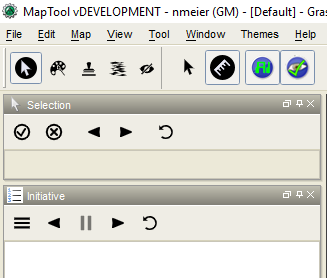
UI that can be styled live - love it, but it's a lot of work.
Also personally like flat, simple icons. The look and feel makes addressing the color contrast, visibility thing very easy. With a single icon you can get all effects: enabled/disabled, selected/deselected - no need to set up multiple images times number of themes.
|  |
|  |
|
Some of the tool specific sub-tool options are pretty elaborate right now - as you can see in the screenshot the AI/UseVBI buttons.
Maybe we can get there in stages - let's continue the conversation in #1248 . An icon pack and how to build it is interesting.
nmeier
on 9 May 2020
Tested. Initiative functions for the panel appear to be working as expected.
Phergus
on 12 May 2020
Related issues
 JakeVDTS
·
4Comments
Azhrei
·
9Comments
Merudo
·
4Comments
JakeVDTS
·
4Comments
Azhrei
·
9Comments
Merudo
·
4Comments
 dstein766
·
7Comments
dstein766
·
7Comments
 cwisniew
·
6Comments
cwisniew
·
6Comments
Most helpful comment
I'm going to further investigate the idea of using a good image library as suggested, then paint with the foreground color by swapping the colour out (which works well with a single color, svg generated image, scaled, w/alpha). This would allow for button symbols that match the LnF, and we'd be able to easily provide a couple of sizes for buttons (e.g. 22,32,48,64) - allowing users with high resolution to find those buttons.
For now I've made up the toolbar buttons as modifications of the current images (all 22x22 now, blue background matching the main toolbar, next/prev arrow reduced in size as per your suggestion @mrkwnzl ), to get some eyes on the behavior itself. Pull request coming.
| |
|  |
|