This may, seem silly, but in order for ManimCommunity to seem more official, I think we need to design on some sort of design or logo for our organization.
 safinsingh
All 29 comments
Not silly. Totally with you.
On Thu, May 28, 2020, 12:47 PM Safin Singh notifications@github.com wrote:
This may, seem silly, but in order for ManimCommunity to seem more
official, I think we need to design on some sort of design or logo for our
organization.—
You are receiving this because you are subscribed to this thread.
Reply to this email directly, view it on GitHub
https://github.com/ManimCommunity/manim/issues/106, or unsubscribe
https://github.com/notifications/unsubscribe-auth/AAILYAFKX2EKYATWWCTT75LRT2IQLANCNFSM4NNH7PIQ
.
 leotrs
on 28 May 2020
leotrs
on 28 May 2020
Do you need a professional #logo for your business?
Contact me anytime.
 sobirul
on 29 May 2020
sobirul
on 29 May 2020
We can't really have an icon before we know exactly what Manim is and how to represent it.
 yoshiask
on 29 May 2020
yoshiask
on 29 May 2020
Do you need a professional #logo for your business?
Contact me anytime.
@sobirul You're welcome to do it, but we can't promise monetary payment, sorry.
 raghavg123
on 29 May 2020
raghavg123
on 29 May 2020
Inspired by @kilacoda 's keyboard idea I've quickly put this together as a basic concept idea:
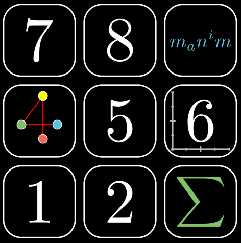
The point is to represent a numpad with a bunch of manim classes, because you know, math and numbers, and also numpad→keyboard→tool. If this becomes a favored idea we could work on it together, and as an added bonus with it being rendered in manim it could use a bunch of classes (while making sure it's not too noisy) which would also make it a candidate for testing picture output.
We can't really have an icon before we know exactly what Manim is and how to represent it.
Yeah. I at least do see manim as a tool for quite a few things math, and on a more basic level a gathering of classes.
 XorUnison
on 29 May 2020
XorUnison
on 29 May 2020
Sorry, but I think this may not be a good idea for the logo.
As a logo, it is best to be small and simple, not to include more connotations.
This logo is a bit large and has too much content.
Usually when we look at a logo, the logo is small, we can not clearly see the details, so I think it is not good to cover the logo with details.
 Tony031218
on 29 May 2020
Tony031218
on 29 May 2020
Yeah. As a user avatar it'd definitely perform horrible. I have designed my own X logo that way for a reason after all too. But we should also keep in mind where the logo is placed, and user avatar size, I doubt is within the specs.
Just to underline the point with the current logo visible on the main github page:

And that's capped from a 4K screen so on a FHD screen it'd look... yeah. The second example though actually looks surprisingly decent. On my screen anyway.
Avatar size definitely shouldn't be our standard but what it should be is a good question to raise. Like do we have any compelling reason to opt for a singular logo of 40x40 size? Even if for some reason we do, is there anything speaking against a detailed and a manually simpled down version? Where are we standing here?
For reference, in my opinion a logo about the size of what I posted is fine, although the kind of logo is still entirely up for debate. As it stands the place it's most important is the main GitHub page, for which we really don't need, nor actually even should go smaller. Using it as a repository avatar might be nice, which would basically mean "looks okay at 100x100", but I wouldn't call that mandatory either. With this being a python library it's also not like we need a small program logo either.
XorUnison
on 29 May 2020
Sorry, I'm poor in English, maybe I misunderstood you or you misunderstood me.
design on some sort of design or logo for our organization.
In my understanding, the "logo" mentioned in this issue refers to the org's logo (that is, the user's avatar). But what you are referring to may be the header image to be placed in the README of the repo.
Tony031218
on 29 May 2020
Right, but I think the header should include the logo in one way or another, and it should look nice there too. A logo tailored to user avatar sizes will inevitably fail at either looking nice or looking related.
We could go for something more abstract of course but that'd fail to capture the point of this tool.
XorUnison
on 29 May 2020
Well, since this was brought up as a point for a 1.0.0 release... Do we have any other serious pitches for a logo so far?
XorUnison
on 7 Jun 2020
On discord we were discussing a logo that spells "manim" where each letter would showcase a feature of the library. For example, the first "M" could be a sideways capital Sigma. The capital sigma could be used as avatar/thumbnail.
leotrs
on 8 Jun 2020
Right. But no image sample to go with it, do we?
XorUnison
on 8 Jun 2020

Would this one be considered?
safinsingh
on 8 Jun 2020
@safinsingh I like this idea! I would like to see a more fleshed-out version.
leotrs
on 8 Jun 2020
The one @safinsingh proposed would be great if we could figure out a way to round out the intersections.
 eulertour
on 8 Jun 2020
eulertour
on 8 Jun 2020
Here's the code for that if you guys need it (it uses 3b1b/manim so just change the import):
from manimlib.imports import *


class Logo(ThreeDScene):
    def construct(self):
        c = Cube()

        self.set_camera_orientation(phi=55 * DEGREES,
                                    theta=45 * DEGREES,
                                    distance=10)

        l1 = Line(start=np.array((-1, 1, 1)),
                  end=np.array((1, 1, 1)),
                  stroke_width=8)

        l2 = Line(start=np.array((-1, 1, 1)),
                  end=np.array((-1, 1, -1)),
                  stroke_width=8)

        l3 = Line(start=np.array((1, -1, 1)),
                  end=np.array((1, -1, -1)),
                  stroke_width=8)

        l4 = Line(start=np.array((1, 1, 1)),
                  end=np.array((1, -1, 1)),
                  stroke_width=8)

        self.wait(1)

        self.play(ShowCreation(c), run_time=3.5)

        self.play(ShowCreation(l1), ShowCreation(l2), ShowCreation(l3),
                  ShowCreation(l4))

        self.wait(1)
@XorUnison you recently were making a push for the logo. Could you please update this issue? Thanks.
leotrs
on 2 Aug 2020
My idea for a logo would be a mountain landscape, which is simulated by mathematical concepts.
For example:
mountains -> gaussian plots
clouds -> area of dots that are placed randomly with low opacity
Water -> svg_shape in blue
Waves -> parametric sin functions
House -> some lines with angles defined, the roof is made with a for loop
trees -> and "1" with a "\psi" ontop
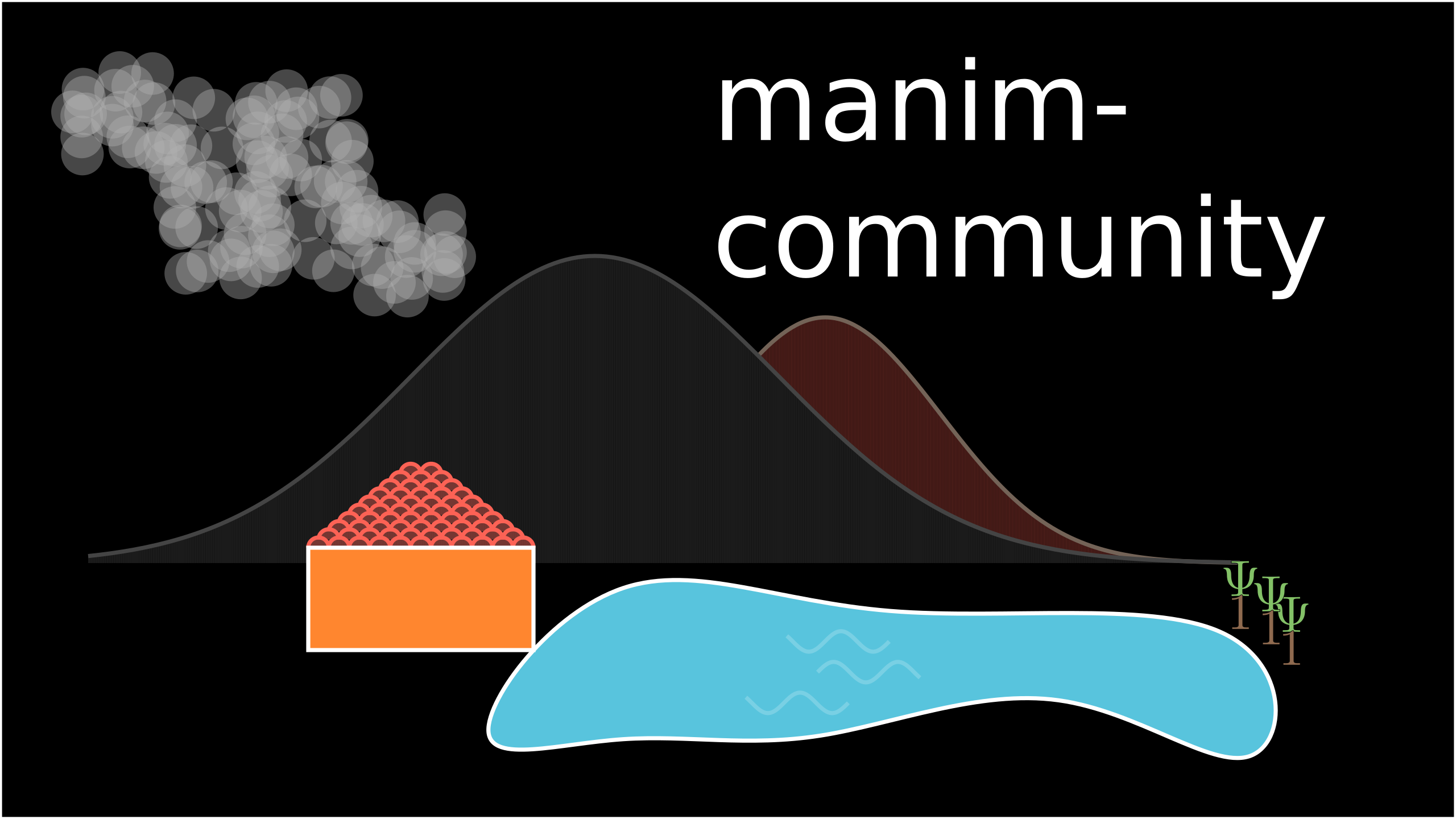
This is only a very early draft,
We could add here lots of mathematical eastereggs, and include some more functionality of manim that is used as an analogy to some other things you would see in a mountain landscape
Some other things that could be added :
- a fish that performs a random walk
- some formulas (e.g. the Gaussian curve formula)
- Something at the left-down corner (we can also remove the house)
Feel free to comment what you think about this.
I wont be dissatisfied when you dont like this idea.
And please feel free to make any suggestions, like on the color-themes, the shapes, and especially new ideas for eastereggs.
 kolibril13
on 19 Aug 2020
kolibril13
on 19 Aug 2020
The main idea here seems to be how to use mathematical objects to recreate a landscape, which is not one of the main use cases of manim.
leotrs
on 19 Aug 2020
which is not one of the main use cases of manim.
I see your point. But then, should the logo only consist out of mathematical shapes?
When I start to collect examples, I can bear this in mind and put kind of a collage together.
I agree with the point that a landscape might not be the best idea, but also I would like to have some kind of common theme in the logo, not only randomly placed objects. Probably a big "M", like @safinsingh posted, with some more mathematical contents?
kolibril13
on 20 Aug 2020
Given that we are in the middle of the logo competition, two questions:
- Is whatever suggestion wins the competition ultimately also supposed to replace the banner currently included in the readme?
- I'd like to slightly adapt the documentation theme (see https://manimce.readthedocs.io) so that we can include the logo for the first release. Any objections? I could prepare a PR for that so that we can simply replace the logo and merge as soon as we have it so that it would not delay the eventual first release.
 behackl
on 7 Oct 2020
behackl
on 7 Oct 2020
We haven't taken a collective decision about the banner, but my impression is that we will make a banner using the newly chosen logo. (So, the new logo would _not_ replace the banner but serve to make a new one.)
This makes a lot of sense. What you propose sounds good to me. Are you thinking of changing the color scheme? Because the colors of the logo will not necessarily be finalized until the very end. If you mean changing the layout instead of the colors, then by all means go right ahead.
leotrs
on 7 Oct 2020
- We haven't taken a collective decision about the banner, but my impression is that we will make a banner using the newly chosen logo. (So, the new logo would _not_ replace the banner but serve to make a new one.)
Okay, that seems reasonable. Would it make sense to accept proposals for banners during the second phase of the logo competition as well?
- This makes a lot of sense. What you propose sounds good to me. Are you thinking of changing the color scheme? Because the colors of the logo will not necessarily be finalized until the very end. If you mean changing the layout instead of the colors, then by all means go right ahead.
I was mainly thinking of adapting the theme in a way that allows including the logo on top of the sidebar, somewhere next to or at least near "manim documentation". :-)
behackl
on 7 Oct 2020
Okay, that seems reasonable. Would it make sense to accept proposals for banners during the second phase of the logo competition as well?
I don't know. In terms of graphic design, it should be possible to turn any logo into any kind of banner. Also, the logo would be featured in many more places than the banner, so I think the logo should come first. However, I'm not a graphic designer and we're not a community of graphic designers so what do I know?.
I was mainly thinking of adapting the theme in a way that allows including the logo on top of the sidebar, somewhere next to or at least near "manim documentation". :-)
Yeah that makes sense. It'd be great if you were able to figure out a recommended size of the logo, so that the submissions for the second round of voting will have that size in mind.
leotrs
on 7 Oct 2020
For the logo size, i think a squared logo will be the best and it should be usable in a circle context (like github user logos, they are circled square images) For the resolution, aiming for vectorized drawing is good i think (we can always vectorize by hand).
We could also make another contest, for the banner choice ^^. And of course, ask for banners that makes you recognize the logo. We could even rename the discord #logoCompetition channel into #graphicsDesign and ask for the communitiy for drawings whenever one is needed (for example, a 16:9 png required for some library contest, or whatever)
 MysaaJava
on 7 Oct 2020
MysaaJava
on 7 Oct 2020
Agreed, a square design that also works in circular context sounds good.
Personally, I would have liked to update the banner together with the logo (and before the first release), but I don't think the community will want to wait for another competition before we release. I guess its fine to update them separately.
I'll have a look at adapting the sidebar in the documentation as soon as this week (first week of teaching around here) is over and I have some more free time on my hands.
behackl
on 7 Oct 2020
Personally, I would have liked to update the banner together with the logo (and before the first release), but I don't think the community will want to wait for another competition before we release. I guess its fine to update them separately.
Maybe we can make the pr with the logo and a placeholder banner?
The placeholder banner could be the logo and the slogan "manim community", and can then be replaced as soon as there is a better banner
kolibril13
on 7 Oct 2020
Yes, i can make a placeholder banner inspired by the logo fast (it will not be high level design, but will serve as a banner for the time)
MysaaJava
on 8 Oct 2020
Seems finished. Closing.
safinsingh
on 22 Oct 2020
Related issues
 naveen521kk
·
5Comments
naveen521kk
·
5Comments
 PgBiel
·
5Comments
PgBiel
·
5Comments
 nilaybhatia
·
7Comments
nilaybhatia
·
7Comments
 Ammar34
·
6Comments
Ammar34
·
6Comments
 dakyion
·
8Comments
dakyion
·
8Comments
Most helpful comment
For the logo size, i think a squared logo will be the best and it should be usable in a circle context (like github user logos, they are circled square images) For the resolution, aiming for vectorized drawing is good i think (we can always vectorize by hand).
We could also make another contest, for the banner choice ^^. And of course, ask for banners that makes you recognize the logo. We could even rename the discord #logoCompetition channel into #graphicsDesign and ask for the communitiy for drawings whenever one is needed (for example, a 16:9 png required for some library contest, or whatever)