Magisk: Issue with the design of the new Magisk Manager
Hey topjohnwu,
Nice job on the new Magisk Manager, looks really nice.
I came across this issue some time back when I was flashing a mod.
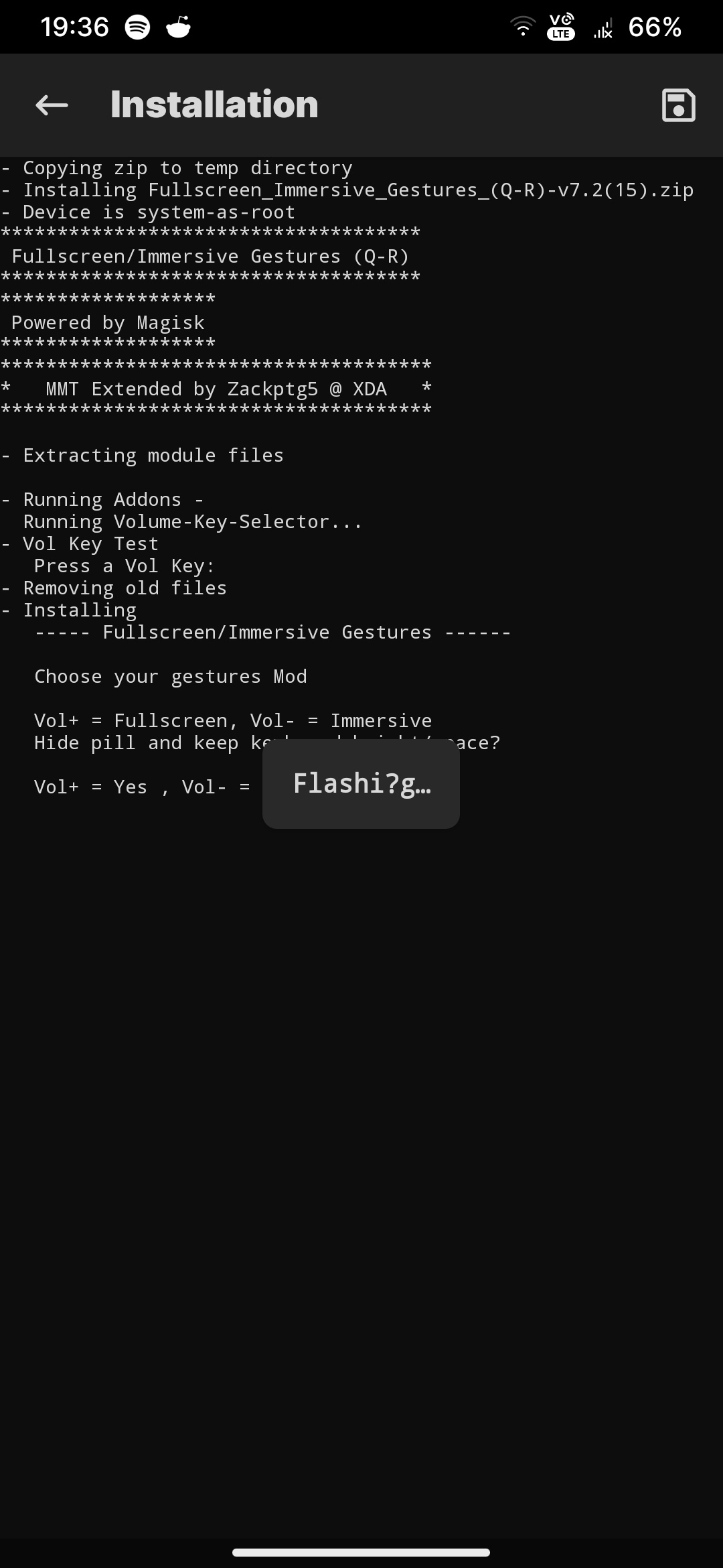
The 'Flashing' covers the text. Maybe you can reduce the opacity or move the 'Flashing' to a corner
Thank You
 xmxrtyx
All 4 comments
noticed the same thing. I don't think it needs to be over the console, there's plenty of space in the toolbar at the top. please move it.
 magicgoose
on 4 Oct 2020
magicgoose
on 4 Oct 2020
@diareuse can address this perhaps, since it's from his original redesign. A couple more options could be some overscroll so one can pull the text up to read it, or, when you tap and hold on it it could disappear temporarily.
 osm0sis
on 4 Oct 2020
osm0sis
on 4 Oct 2020
Good idea @osm0sis 👍 I'll try to whip up something like that 🙂
 diareuse
on 5 Oct 2020
diareuse
on 5 Oct 2020
Yeah, that's better. 😍 I like it to be on the took bar as of the older versions. It looks good there.
 Mikesew1320
on 12 Oct 2020
Mikesew1320
on 12 Oct 2020
Related issues
 Madis0
·
3Comments
Madis0
·
3Comments
 Ralozey
·
4Comments
Ralozey
·
4Comments
 guitardedhero
·
3Comments
guitardedhero
·
3Comments
 auanasgheps
·
4Comments
auanasgheps
·
4Comments
 Displax
·
4Comments
Displax
·
4Comments
Most helpful comment
Good idea @osm0sis 👍 I'll try to whip up something like that 🙂