Without stepping anyone on the toes, i really love the macpass app, but the macpass icon feels kind of outdated, would be nice if you could put some effort in updating the icon.
I am using a custom made icon, see preview here, feel free to use it if you like. Would be awesome if the designer at macpass could update the design.
Cheers
 zibelian
All 12 comments
I played with a flatter version two years ago (see here: https://twitter.com/MacPassApp/status/860175717895733248) and didn’t go through with it since I’m now convinced we are about to leave flat icon land and get back to a bit more depth and detail. I will however eventually modernize the current icon a bit.
 mstarke
on 20 Jul 2019
mstarke
on 20 Jul 2019
I played with a flatter version two years ago (see here: https://twitter.com/MacPassApp/status/860175717895733248) and didn’t go through with it since I’m now convinced we are about to leave flat icon land and get back to a bit more depth and detail. I will however eventually modernize the current icon a bit.
Nice icon, like it! I also believe that flat design is reaching the end, the trend is going towards more depth and detail again. Looking at the icon you did in 2017, i think it is really something in between flat and more depth and detail, i would say it is perfect icon for Macpass 2019. Would be nice if you could give the MacPass icon a new fresh look.
zibelian
on 20 Jul 2019
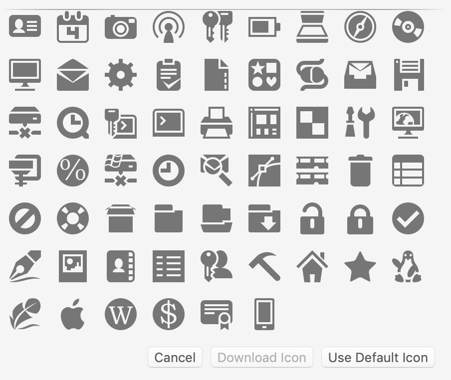
I don't get it about "download icon", it's disabled here:
 kud
on 23 Jul 2019
kud
on 23 Jul 2019
(oh, sorry you spoke about the icon of macpass itself, not the icon pack :x)
kud
on 23 Jul 2019
It’s disabled if no url is present.
mstarke
on 23 Jul 2019
It’s disabled if no url is present.
How cool is that!?
I've been using MacPass for so long and never knew this!
Couldn't this be the default behaviour? ie. as soon as you add or change the url the favicon is downloaded and updated
I'm going through my db now and updating every entry's icon :)
 cipnt
on 7 Oct 2019
cipnt
on 7 Oct 2019
I love it! My db is now colourful 😄
Unfortunately some are extremely pixelated.
Would it be better to use the 'apple-touch-icon' instead? Or as a first choice?
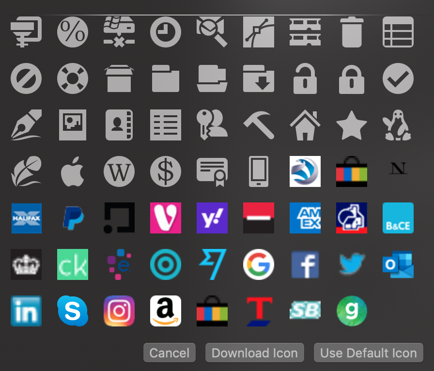
In the above screenshot Skype uses a 256x256px icon file and Twitter uses a 16x16px
Both however have a large 'apple-touch-icon'
Also, it seems this doesn't work if the URL redirects to another domain (ie an old link).
There are a few URLs which, for some reason, refuse to work.
My best guess is that this is because they don't have the favicon in the root like domain.com/favicon.ico, but they do have a <link rel="shortcut icon" href="/long/path/to/favicon.ico">
Here are some, in case someone can debug this
https://appleid.apple.com/#!&page=signin
https://monzo.com/
https://mail.protonmail.com/login
http://vimeo.com/log_in
https://www.myunidays.com/GB/en-GB/account/log-in
https://www.vodafone.co.uk/myvodafone/
cipnt
on 7 Oct 2019
Responding to the initial query
the macpass icon feels kind of outdated
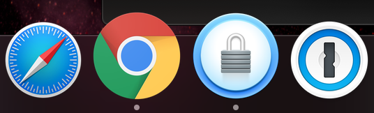
I personally think the icon looks rather nice and in line with other modern apps
cipnt
on 7 Oct 2019
Me too I think the icon is really cool. :)
kud
on 7 Oct 2019
One more voice to say that the current icon is beautiful and I'd say a flatter version isn't necessary at all! I'm glad we're leaving flat lands finally.
 veraverto
on 30 Oct 2019
veraverto
on 30 Oct 2019
Flatter is not even better.
It’s disabled if no url is present.
This is a thing, most users will find out some day or never. I think, it could be described better. Maybe with an info box, or a tip when you add a url to the field?
 ryanthara
on 1 Nov 2019
ryanthara
on 1 Nov 2019
I‘m closing this for now since there are no plans to change the icon anytime soon.
mstarke
on 25 Nov 2019
Related issues
 rathisarov
·
7Comments
rathisarov
·
7Comments
 bokysan
·
6Comments
bokysan
·
6Comments
 btxtiger
·
7Comments
btxtiger
·
7Comments
 magebarf
·
3Comments
magebarf
·
3Comments
 trimailov
·
7Comments
trimailov
·
7Comments
Most helpful comment
It’s disabled if no url is present.