Macpass: Define Human Interface Design guidelines
MacPass is nice software. It works well for me and many of the people you see submitting features, opening issues, and adding comments in this repository. But what may not be seen is basic users immediately discarding the app because the UI is inconsistent with other MacOS apps and other password managers. Perhaps basic users are not the target userbase, which is okay, but it would be nice to know where the design is headed in order to existing users to either switch to an alternative or create a UX-friendly version forked from the current codebase. Can we define Human Interface Guidelines for this app in order to establish the direction?
The MacOS Human Interface Guidelines are a popular reference for MacOS app development. This app follows some of those conventions, however based on comments in #832 and other issues it seems that the UI is deviating from obviousness and easy discoverability tin order to make regular usage easier for advanced users.
A ton of work went into this app. It's very usable as it is now and the UI is nice overall but could the app use some polishing. Examples of that are detailed below.
Disappearing data
With MacPass you're walking on a cliff. The purpose of the app is to store passwords. But they can disappear easily without you knowing. To provide a scenario of this imagine a user setting up the app for the first time. They create a database. They add entries. Eventually they need to add a note and they start typing notes for some of the entries. It plays out like this:
- Add an entry
- Add an entry
- Add a group
- Add an entry
- Add an entry
- Add an entry
- Add an entry
- Add an entry
- Add an entry
- Add an entry
- Add an entry
- Add an entry
- Write a note about it: "Doest'n work on the mobile website"
- Recognize the typo and ⌘z ⌘z ⌘z ⌘z
- Some of the recent entries they added are gone
- Add an entry
- Add an entry
- Add an entry
- They don't even know
- They close the app thinking everything okay
MacPass should be safeguarding user-entered data, either confirming or at least notifying them when something is getting thrown away. Well, not thrown away into the trash -- because the entries are not recoverable once the app is closed -- but destroyed.
What does this button do?
When you open the app you are presented with a form to unlock your database. The form isn't straightforward. It's strange that a "Password" checkbox is there.
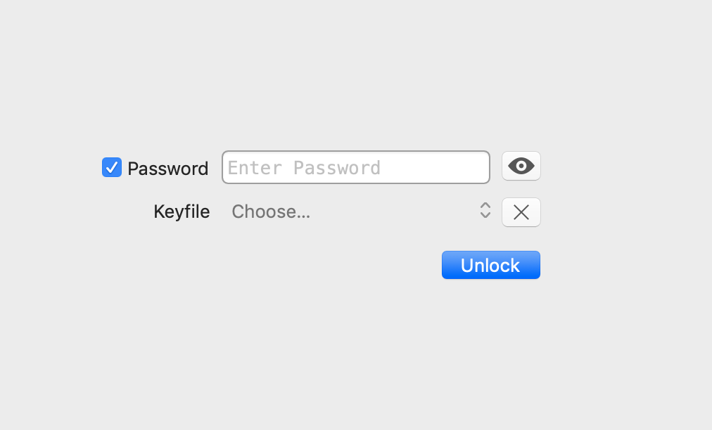
You have to uncheck the box to see the input field say "No password". If we change the label to "[x] This database does not have a password" the user doesn't have to play around with the form to understand what is going on. There's plenty of room to provide helper text and descriptive labels. It doesn't have to be elaborate, but the user should immediately be able to comprehend what's being shown.
Thank you for giving us a good password manager app. It's a nice open source one.
 uwqwxing886
All 5 comments
Thank you for your detailed feedback. What baffles me is that you say MacPass differs in its UX from other macOS apps as the intention is exactly the opposite - to be more in line with macOS behaviour.
The instant edit system is a conceptual error but works nice if you know what's happening. You're right that novice users might feel insecure and stop using MacPass because this insecurity is not addressed.
Regarding the password check box - this is in line with the other clients and your proposed solution is a better on to clarify what the checkbox does. On the other hand - this is something quite discoverable.
The undo/redo problem is a good point. I tried to introduce the undo/redo support to make the app behave better but with this transparent system have introduced a point of error. However. If the notes field has focus, the notes field uses its undo stack. Leaving the field and invoking undo does what you describe which might be harmful.
It's useful to think about a better way and identify places that might be enhanced for better UX.
 mstarke
on 5 Jan 2019
mstarke
on 5 Jan 2019
A good way is to test with "normal" user. Look at the computer of a normal user when they try to install it and use the app. https://en.wikipedia.org/wiki/Usability_testing
I agree for the password checkbox. For the password the label checkbox should be named somethings like "Do not require a password []" and be right under the password field.
 gagarine
on 5 Jan 2019
gagarine
on 5 Jan 2019
MacPass is a great app but the search function is not perfect. Obviously, this is all very subjective. However, in my opinion there are two problems with the search functionality:
The search box is too small. - You spent a lot of time searching passwords. (time wise, perhaps 80% of the time). Yet, the user interface, physically speaking, has only 2-3% of the pixels dedicated to this feature. 80% != 2%
It is not obvious it which folders you are searching. As a new user, I thought I was limiting search results by selecting different folders. This is not the case actually.
If you want to accommodate for concern #1 you'd probably need to make a user interface that is modal. One interface for searching, and one interface for results.
 michaelfresco
on 17 Jan 2020
michaelfresco
on 17 Jan 2020
I've extracted 1. into #1025
mstarke
on 21 Jan 2020
Additional #1026 and #1027
mstarke
on 21 Jan 2020
Related issues
 markushausammann
·
3Comments
markushausammann
·
3Comments
 Winter84
·
6Comments
Winter84
·
6Comments
 martinl
·
6Comments
gagarine
·
4Comments
martinl
·
6Comments
gagarine
·
4Comments
 btxtiger
·
7Comments
btxtiger
·
7Comments
Most helpful comment
Additional #1026 and #1027