Lutris: Inconsistent spacing between options in 'Configuration"
Observed in Lutris Beta 2.
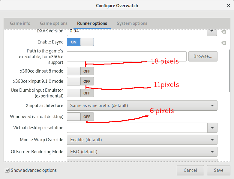
I will use this portion of configuration menu as an example, but please note that this occurs throughout whole configuration menu:
 tannisroot
👍1
All 4 comments
Personally, I think bigger spacing between options is more appealing.
tannisroot
on 5 Jan 2019
I think 12 pixels would be good. Also, the text for "Path to the game's executable, for x360ce support" should be reduced by moving part of the information (for x360ce support) to a tooltip.
 AlexanderRavenheart
on 5 Jan 2019
AlexanderRavenheart
on 5 Jan 2019
👍1
6 is the recommended spacing between elements and 18 between sections:

 TingPing
on 5 Jan 2019
TingPing
on 5 Jan 2019
👍2
This is caused by the labels going over 2 lines, I've reduced this by increasing the label width but it still happens in some case an cannot really be avoided.
 strycore
on 8 Jan 2019
strycore
on 8 Jan 2019
Was this page helpful?
0 / 5 - 0 ratings
Related issues
 CartoonFan
·
4Comments
CartoonFan
·
4Comments
 SrBrahma
·
3Comments
SrBrahma
·
3Comments
 Keyhaku
·
3Comments
tannisroot
·
3Comments
tannisroot
·
4Comments
Keyhaku
·
3Comments
tannisroot
·
3Comments
tannisroot
·
4Comments
Most helpful comment
6 is the recommended spacing between elements and 18 between sections: