Lmms: Remove down arrows from main toolbar and increase icon sizes
The main toolbar in LMMS has two icons that contain little grey down arrows in them.
"Create new project from template"
"Recently opened projects"
To me these little graphical arrows cause those icons to be smaller, are not needed and could be removed.
Then the icon graphics can be increased in size to match the other toolbar button icons sizes.
The "Create new project" & "Create new project from template"
Can get increased paper icon width to fill out toolbar button
and
"Recently opened projects" clock icon can be increased in size as well.
Again, may not be something other users care about, but little things like this could clean up the look of LMMS, especially in main toolbar where they are always visible.
May sound foolish but give it a chance and see how it looks.
 sound8
All 4 comments
Those buttons open dropdowns, which is why there's an arrow. Removing it is out of the question IMO, this is a standard and helpful UI practice. The new project icons are already the same size, and widening them would make it less clear what they are (roughly A4 sized paper). I would guess that the clock icon is small because it's reused from elsewhere, but regardless it could be increased in size without removing the arrow.
 Spekular
on 29 Oct 2020
Spekular
on 29 Oct 2020
Come on you are going to make me fight you about two little arrows?
I wasn't really expecting someone to disagree with this.
Don't make me waste my time creating a graphical example, because once I bust out Gimp you are going to be begging for someone to remove these arrows! :)
No but seriously you really feel that strongly that they are needed?
The drop down menus will show up either way, it is not like someone is going to be surprised that a menu appears without warning :)
I agree paper icons can stay same width that is fine (just make sure they are centered in the button), but deleting the two down arrows and increasing size of clock icon should be considered.
Obviously just a matter of opinion, the thing is as with most posts if someone disagrees issue never gets applied.
I will convince you dammit! :)
sound8
on 31 Oct 2020
Using GIMP to prove that arrows in dropdowns are bad feels a bit silly if you ask me.

Perhaps you could use Paint.NET instead:

Or Inkscape:
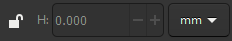
Krita?

Or even Blender?
Regular old Paint?

I'll repeat myself: Arrows to indicate a dropdown are good, standard UI. I would absolutely be surprised to find that two buttons in the toolbar open a menu and the others don't, given zero visual indication that this would be the case.
Spekular
on 31 Oct 2020
Closing as this is intended behavior, at least for now. Note, we're receptive to change and the UI will undergo many changes as we focus towards our interface goal #1911.
 tresf
on 11 Nov 2020
tresf
on 11 Nov 2020
Related issues
 PaulBatchelor
·
4Comments
PaulBatchelor
·
4Comments
 victor00101
·
3Comments
victor00101
·
3Comments
 SecondFlight
·
3Comments
Spekular
·
4Comments
SecondFlight
·
3Comments
Spekular
·
4Comments
 Gabrielxd195
·
3Comments
Gabrielxd195
·
3Comments
Most helpful comment
Using GIMP to prove that arrows in dropdowns are bad feels a bit silly if you ask me.


Perhaps you could use Paint.NET instead:
Or Inkscape:
Krita?
Or even Blender?
Regular old Paint?
I'll repeat myself: Arrows to indicate a dropdown are good, standard UI. I would absolutely be surprised to find that two buttons in the toolbar open a menu and the others don't, given zero visual indication that this would be the case.