Lila: Display captured pieces in analysis board
It would be nice if the captured pieces were displayed in the analysis board. This should apply both to the analysis board of correspondence chess and the analysis board of a shorter time controls.
 pmav99
All 16 comments
Real time games have no analysis board.
 ornicar
on 8 Jan 2015
ornicar
on 8 Jan 2015
I meant the board that you get when you click on the "Analysis" button after a game has finished.
pmav99
on 8 Jan 2015
Could you elaborate a bit?
pmav99
on 9 Jan 2015
I couldn't find a way to integrate it nicely in the analysis UI.
ornicar
on 9 Jan 2015
Thank you for your response. To be honest, I was thinking of something similar to the Real Time board, i.e. to decrease the size of the variations panel and display the captured pieces on the top and the bottom of it.
All in all, what I am suggesting, is to go from this analysis board:

to something more similar to this:

pmav99
on 9 Jan 2015
That's what I meant by "nicely". It isn't.
ornicar
on 9 Jan 2015
I don't really get your definition of "nice"... If the design with the captured pieces is good enough for the "play" board, I can't understand why it is not good enough for the analysis board.
pmav99
on 13 Jan 2015
The main thing is that we don't want to massively reduce the size of the move list, _especially_ in analysis mode. A lot of players do not use the various functions of analysis mode, they just go there for the expanded move list.
You need to find a solution that (a) does not reduce the size of the move display and (b) does not appear completely different from the standard display (for reasons of user experience and discoverability) i.e. the two captured piece displays must be in a similar location across both analysis and game view.
 ghost
on 13 Jan 2015
ghost
on 13 Jan 2015
How about here?


 Unihedro
on 17 Aug 2015
Unihedro
on 17 Aug 2015
Honestly, it's normally a UI no-no to move elements around like that, but I think it's acceptable since so many people ask for it.
Then again. Would a reduced move list be that bad? I think it would be bad at minimum zoom perhaps, where everything looks kind of cluttered on my screen (but it's much better on my old low res screen). Most players don't err in the first 10 moves, so if you must, you could do it like the way pmav suggested. People really want this, afterall.
ghost
on 17 Aug 2015
Idea 2: Provide "moves" tab and "captured pieces / notes" tab to switch between.
Unihedro
on 17 Aug 2015
with the reformed analysis page layout for the plates in crazyhouse, it's probably possible (and reasonable) to replicate the cemetery for showing captured pieces with it
Unihedro
on 20 Jan 2016
Biggest missing feature of Lichess for me. Please consider adding to the roadmap!
 hammer
on 7 Oct 2017
hammer
on 7 Oct 2017
There has been no activity on this issue for 2 years. It will be automatically closed in 2 weeks.
If the issue is still relevant, please briefly explain (or remove the label). Feel free to reopen at any time.
![stale[bot] picture](https://avatars3.githubusercontent.com/in/1724?v=4&s=40) stale[bot]
on 14 Dec 2019
stale[bot]
on 14 Dec 2019
A must-have feature! A material difference should be there.
 borishere
on 8 Jun 2020
borishere
on 8 Jun 2020
I couldn't find a way to integrate it nicely in the analysis UI.
An option to just have a number (like +2 or 0) behind each move (showing the material balance) would be very helpful to me (similar to how it is shown with Stockfish local analysis), like this:
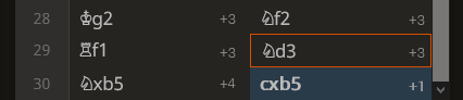
If that is too much clutter, only showing it for the current game position (with red rectangle) and the current position would be enough.
 Wiering
on 2 Jul 2020
Wiering
on 2 Jul 2020
Related issues
 nojoking
·
3Comments
nojoking
·
3Comments
 niklasf
·
4Comments
niklasf
·
4Comments
 goggle
·
4Comments
goggle
·
4Comments
 Assios
·
3Comments
nojoking
·
4Comments
Assios
·
3Comments
nojoking
·
4Comments
Most helpful comment
A must-have feature! A material difference should be there.