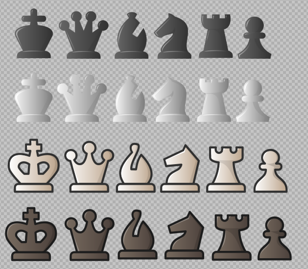
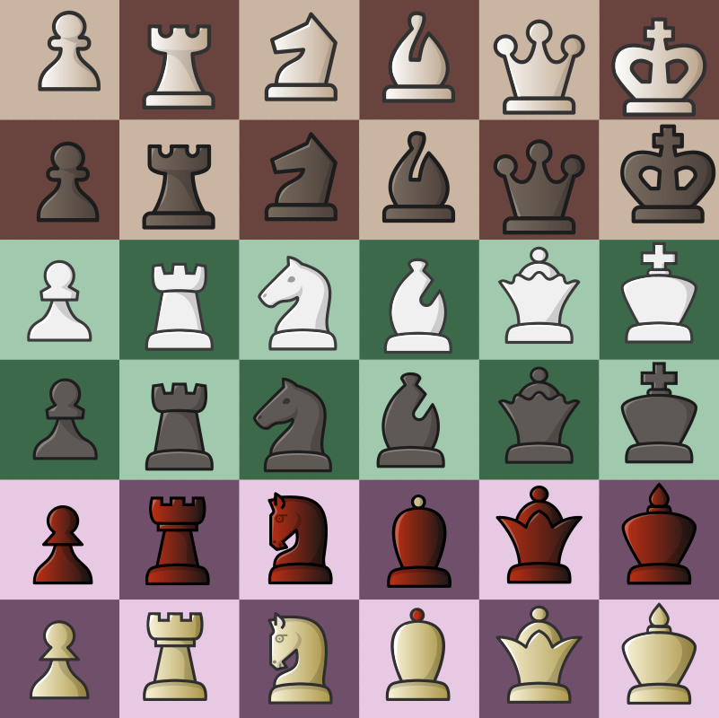
Let's use this issue for the updates on all piece sets /cc @sadsnake1
 ornicar
All 89 comments
 ghost
on 1 Dec 2019
ghost
on 1 Dec 2019
I do. Have I already invited you to the lichess discord? https://discord.gg/dGVZjS We could have real-time chats there, and you'd meet more members of the community.
ornicar
on 1 Dec 2019
ghost
on 1 Dec 2019
ghost
on 1 Dec 2019
I personally much prefer the old knights in the staunty set
 Arcovion
on 2 Dec 2019
Arcovion
on 2 Dec 2019
I also miss the knight with a twisted ear. It was really unique and cute.
ornicar
on 2 Dec 2019
@sadsnake1 I think it might be better if you could change the outline color for the black Dubrovny pieces so that the black King and Queen would appear more distinct

 icp1994
on 2 Dec 2019
icp1994
on 2 Dec 2019
sets.zip
-fixed the knight in staunty and outline and color in dubrovny
ghost
on 2 Dec 2019
The german knight did not quite fit with the set, it had a good design but it is more beautiful in 3d, so I finally found the perfect design for the knights in the staunty set.

ghost
on 2 Dec 2019
We forgot to update the outdated cursor icons that come up in the board editor. They're pixelated and old...
 Cristian-A
on 4 Dec 2019
Cristian-A
on 4 Dec 2019
No they're fine.
ornicar
on 4 Dec 2019
last tweaks
ghost
on 4 Dec 2019
 ghost
on 4 Dec 2019
ghost
on 4 Dec 2019
-added highlights to gioco
-final knight for staunty.
-final knight for cardinal.
ghost
on 5 Dec 2019
s+g+c+m.zip
-fixes + gradient for staunty
also, please dont add libra, it's very substandard
ghost
on 6 Dec 2019
I think Libra's an excellent set, I can see only one major flaw which is the piece leg, which should be symmetrical. I recommend making it extend just slightly on either side. Here's a very quick mockup:

The only other thing I'd look at is that the Bishop looks a bit too big compared to the other pieces. The Bishop will be next to the King and Queen in the starting position, so it's jarring to see that piece be so much more prominent in comparison. Admittedly there is no easy fix for this, but that's the only real issue
 superuser-does
on 6 Dec 2019
superuser-does
on 6 Dec 2019
Gioco was my least favourite of your pieces but it's massive risen in my estimation with the latest update, and I think it's a first-class set now. I have to be honest though, the knight still bothers me, it looks like its neck has been dislocated! I'm also not sure if the sharp edges of the knights fit that well with the rest of the pieces, which are slightly more rounded.
Please consider revising the knight slightly. I think you should still keep it simple so without an eye, etc and with the same gradient/highlight style, it's just the basic shape of that one piece that needs changing.
superuser-does
on 6 Dec 2019
Fresca is my favourite and I'd like to propose this set as the default peice set of lichess. Let's move on from cburnett once and for all.
 f7n
on 6 Dec 2019
ghost
on 6 Dec 2019
f7n
on 6 Dec 2019
ghost
on 6 Dec 2019
@superuser-does
I think that the original (1st) knight is the best for the set. What knight do you think will do best?

ghost
on 6 Dec 2019
5th is great @sadsnake1
f7n
on 6 Dec 2019
I think that the original (1st) knight is the best for the set. What knight do you think will do best?
3rd and 6th knight look the best among those, imo.
 JimiRecard
on 6 Dec 2019
JimiRecard
on 6 Dec 2019
Also, would you consider revising the staunty queen? That's the only piece preventing me from using the set, which is a shame since I really like the knights.
The thing is I don't get the sense of danger from the queen that I get from other sets, probably because I'm used to pointy queens. The current staunty queen does not get my attention compared to the other pieces. It does not look "aggressive" enough, if that makes sense.
I get the same issue with the dubrovny queen. Also the dubrovny bishop looks a bit like a toilet unclogger. I think it could use a gap.
JimiRecard
on 6 Dec 2019
FYI you can edit comments @JimiRecard
f7n
on 6 Dec 2019
@f7n thanks! Didn't know that!
JimiRecard
on 6 Dec 2019
-changed the gradient, enlarged the knight
@JimiRecard if you have any ideas on how to make the queen more agressive, let me know. I made staunty to look like the standard staunton chess set. Also dubrovny is a carcicature of dubrovnik set. So, if you have any ideas or sketches post them here and we will work it out.
ghost
on 6 Dec 2019
@sadsnake1 I have one feedback about the dubrovny set. The rooks, especially their middle parts, looks really thinner compared to the other pieces.
icp1994
on 6 Dec 2019
@sadsnake1, I have an idea, but I'm terrible at drawing.
It should have the same base as the other pieces. From the base, there should be an even number of "spikes" coming out (either 4 or 6 works). Behind the spikes, the "dome" of the crown should be visible, with that characteristic ball at the center. I think the spikes should not end with balls, but pointy, like the ones in the staunton set do.
I realize from that description that you can think of the current queen. The difference in my idea is that the dome would be much closer to the base, and the spikes would stretch much further, passing the dome. Also, the junction of the spikes would be much closer to the base. I'm picturing spikes like the ones in the maestro set.
Let me know if you can visualize that. I can make a terrible sketch, if you want.
For the dubrovny sets I realize the bishop does not have a gap in the real life set as the staunton does, so I take back my previous suggestion.
Once again, thank you for your work. It's really hard to design 2D chess pieces, and you designed 8 sets that look great. I'm sure I'm not the only Lichess user that appreciate your work. Congrats!
JimiRecard
on 6 Dec 2019
dubrovny.zip
-made dubrovny more like staunty
@JimiRecard please make me that terrible sketch, because i can't visualize it.
maybe this queen is more agressive than the original, still the original is best suited for the overall set

ghost
on 6 Dec 2019
@sadsnake1 I'll try to make the sketch. Any software you suggest?
I do like that new queen, also.
JimiRecard
on 6 Dec 2019

ornicar
on 7 Dec 2019
@ornicar sorry for the error
-added highlights to dubrovny (sleek set now)
-changed the pawn of maestro
d+m.zip
@JimiRecard I tried making a queen from your sketch but it does not look good and it does not look "staunton".
ghost
on 7 Dec 2019
 ghost
on 7 Dec 2019
ghost
on 7 Dec 2019
@ornicar can you please update lichess.dev with the all the new pieces and updates to check for errors and such?
ghost
on 7 Dec 2019
 Cristian-A
on 7 Dec 2019
Cristian-A
on 7 Dec 2019
-added effects to libra set

ghost
on 7 Dec 2019
Not sure about the new libra - it might be better to split it into two sets? This is a very different set to what you had before. On the other hand, I agree that the previous isn't a super strong set, and it hasn't been deployed to lichess.org yet.
As for the new version, I mostly like it aside from the king, who feels a bit squashed. Also, the gradient is a bit strong on the black pieces IMO, but overall an improvement.
superuser-does
on 7 Dec 2019
I think we should try to have fewer sets that are very different one from another. I'm concerned about overchoice issues
ornicar
on 7 Dec 2019
The sets are deployed on https://lichess.dev
ornicar
on 7 Dec 2019
@ornicar Thank you! Also Thank you @superuser-does for your support.
Here is the last update.
ghost
on 7 Dec 2019
@ornicar can you please redeploy the update sets?
ghost
on 8 Dec 2019
So, this is how the sets should look now

Ornicar, you don't have to be concerned about overchoice, because Staunty and Dubrovny should be similar, because they are sisters, they both come from the house of Staunton.
Libra and Gioco are very different now, Gioco has a more wood feel and Libra is more metalic/jelly feel. One is more, let's say canonical and one is more free from regulations.
d+l.zip - (last update) this is my last set ornicar. I will not create anymore sets.
ghost
on 8 Dec 2019
Also i would not post anymore updates or change anything, maybe just some sizes, but I think now that all sets look perfectly how they should when I had visioned them in the first place.
ghost
on 8 Dec 2019
-fixed some size problems in libra and dubrovny
-color in dubrovny
d+l.zip

ghost
on 9 Dec 2019
Right now, on lichess.org, the sets that must be updated to the last and final version are:
-Maestro
-Tatiana
-Staunty
-Dubrovny
-Libra
I compiled here the final version for all of the above:
m+t+s+d+l.zip
I've tripled check them!!!
Thank you all for your support and I hope you will enjoy these sets as much as I do!
ghost
on 9 Dec 2019
Thanks for your great work.
Not sure how comfortable you are with this, but I believe that as you're super confident (I am!) with their final look, it might be a good time to run them through the validator.
Inkscape and other programs produce poor code a lot of the time, which forces the web browser into 'quirks mode' that can cause some slow-down. It's not a big deal but it can add up.
There's probably a more programmatic way of doing it compared to uploading to the W3C's service, but offline linters seem to be few and far between, and I'm not sure if I should trust them. Either way, it might still need us to edit dozens of files one by one...
This is an intimidating and pretty awful task if you haven't hand-edited SVG markup before, so let me know if you'd rather that I look into this instead @sadsnake1. Thanks.
superuser-does
on 9 Dec 2019
Thank you for your support @superuser-does !
I do not yet understand what this validator does, but if you know that this will make the site run faster, please do it, because right now I don't have the necessary time nor the knowledge. I just created these sets in inkscape and that's all I know.
So, please do what you think is best!
ghost
on 9 Dec 2019
@sadsnake1 There's a bug report for the Maestro set on post 219 here, the pawns of the two sides are different sizes.
superuser-does
on 10 Dec 2019
-fix the mastero pawns
-made dubrovny Q a bit smaller
-fix king in cardinal
ghost
on 10 Dec 2019
gioco.zip
-changed the K, to the original idea of gioco, to be more in line with the set and that libra can be more different than gioco

ghost
on 12 Dec 2019

Could you please avoid making them look like the chess.com pieces?
ornicar
on 12 Dec 2019
But, that's the whole point! Making a better set.
Also that king is very common in tattoos and such, is not an original chess.com idea.
ghost
on 12 Dec 2019
The point is to make original sets, not copycats.
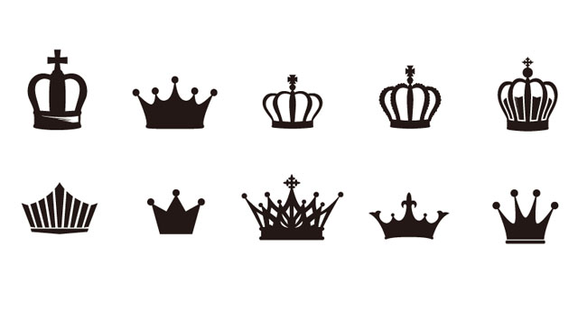
Can you share pictures of said tatoos and such?
ornicar
on 12 Dec 2019
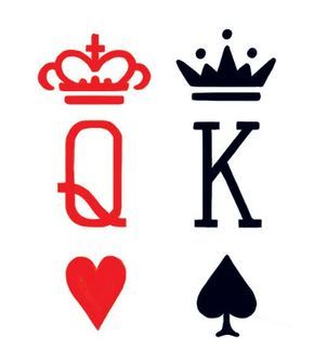
Here they are. The chess.com one is a simplified version of some tattoos ( below examples - english crown) and also is made entirely from ( actually their entire default set) the cheq/regular chess font, which one is a freeware and one is adobe licensed made by John Renner in 1989.


ghost
on 12 Dec 2019
Also, I'm not trying to create copycats, that was a joke, but this new king , imo, works really well with the set
ghost
on 12 Dec 2019
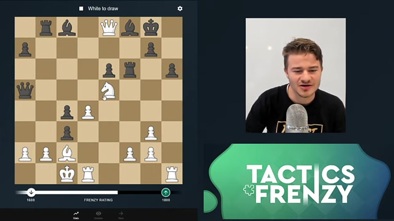
Here is another example from Tactics Frenzy, a Magnus Carlsen sponsored app
ghost
on 12 Dec 2019
More example from various chess apps
https://images.app.goo.gl/jiQSLDLiYG3uTh9C7
https://images.app.goo.gl/nzpaYQiUbH5DXAaw8
So, the form of the king is not original. There aren't really that many ways to depict a king in 2d.
If you look at the gioco set, all the pieces are autenthic and original. But I still think that the K should be heart shaped, so that the king should be way more imposant than the rest of the pieces.
ghost
on 13 Dec 2019
- added a line for R in dubrovny
- made the Q a bit smaller in staunty
- gioco has the better K
- changed libra to a new style ( no outline )
ghost
on 15 Dec 2019
Staunty
-increased a bit the R
- decreased the Q a bit
-increased a bit the B (also i made it a bit more "fat" - to resemble more a staunton bishop)
-made the N more L shaped ( and I neutralized his emotions )
Dubrovny
-added a line to the R which I forgot to add in the first place
Gioco
-only changed the K ( if you dont agree with this, then don't update it)
Libra
- please remove it completely (it's not good enough and resembles to much gioco)
The sets should look like this ( they are not aligned in the screenshot)
I consider this update as final and the issue can be closed.
Edit: if the lichess team decides to keep libra, I added a fine outline to the set for clarity.
ghost
on 17 Dec 2019
Heh, I planned to comment that I didn't like the last update to Libra without an outline. I agree it's a lot like Gioco. Not sure if it's right to remove it though, depends on how many people use it surely?
superuser-does
on 17 Dec 2019
@superuser-does I don't think Libra was ever in production...only lived in lichess.dev server!
icp1994
on 17 Dec 2019
@superuser-does I don't think Libra was ever in production...only lived in lichess.dev server!
Haha yes, you're quite right actually! I used lichess.dev to preview the pieces in practice before they got pushed to prod and haven't checked in a while. So it should be no harm removing I suppose.
I still think the original design had some value and was unique, see the version here. It's up to @sadsnake1 if they wish to iterate on that style. It wasn't complete in the part I linked but could be worked on... it just can't converge with the other sets, haha.
superuser-does
on 17 Dec 2019
@superuser-does : I'm sorry but I think that my "artistic fever" has come to an end. Also I don't have much time right now to remake the libra set. I tried to make these sets as best as I could and I hope maybe, someday, the default set would be one of mine.
God bless!
ghost
on 17 Dec 2019
@ornicar
Please don't forget to update the piece sets when you have the necessary time.
Thank you!
ghost
on 23 Dec 2019
@ornicar @lichess-team
Happy holidays to you and your families and thank you for your dedication and work for the chess community!
ghost
on 25 Dec 2019
As discussed, here are all the sets . Thank you!
And also I would remove libra completely, because it's not a very good set.
ghost
on 28 Dec 2019
Pieces are up on https://lichess.dev/analysis. Please check that all is good then I'll send them to production.
Thanks!
ornicar
on 28 Dec 2019
Pieces are good! This issue can be closed!
Thank you also!
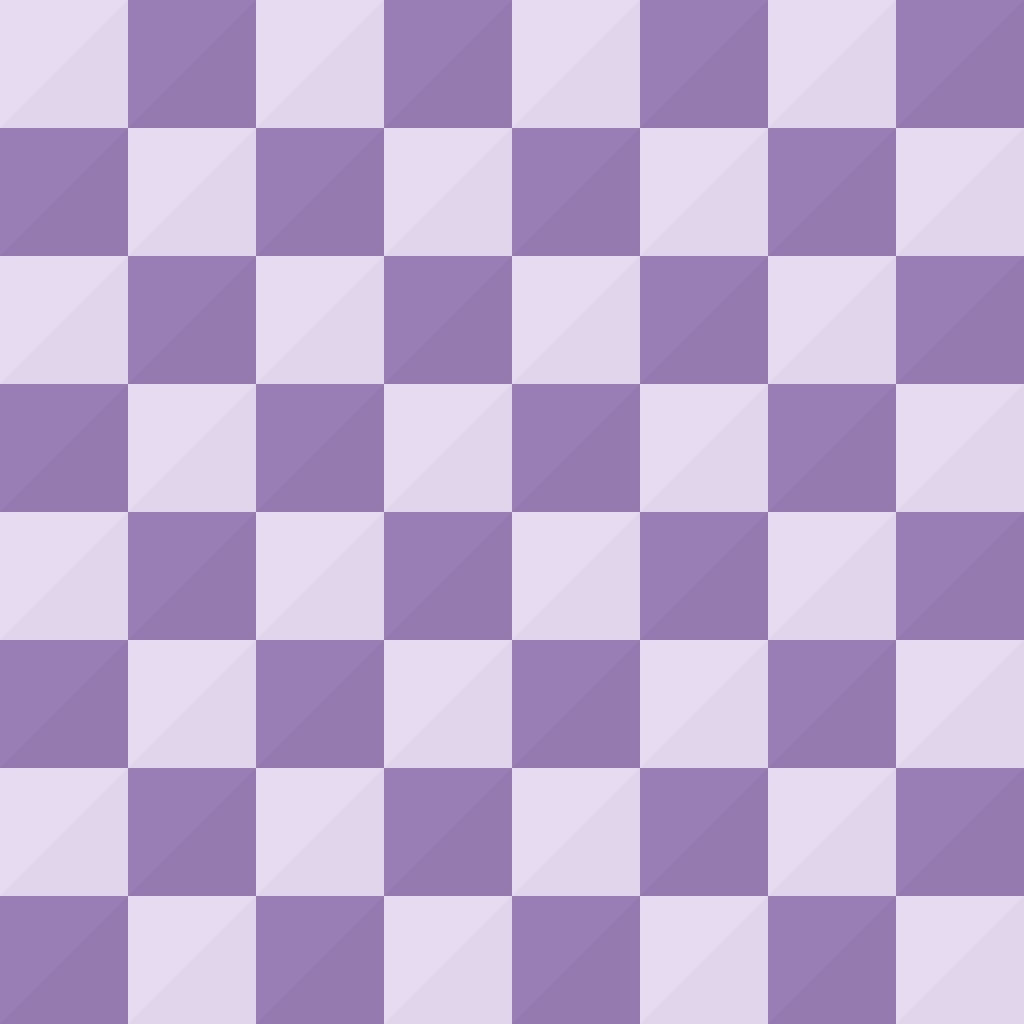
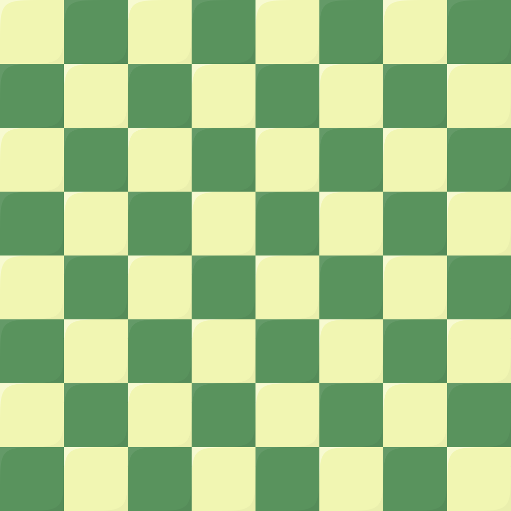
Also please update the greenish board, the effect are, imo, too strong. Also, I would change the orangish board, imo, is too bright and not very friendly. I would change it would this purplish board.
ghost
on 28 Dec 2019
I remade libra into something new- the Governor set. Hope you like it!
Also the purple board does not show up on lichess.org.
Also, if you choose to accept this set and put it on lichess, please rename it to staunty and the old staunty to libra, because this set is more in line with the staunton set and the names should have consistency.
ghost
on 29 Dec 2019
It looks like a better version of the staunty set. Should we just replace it? I don't think we need to keep the previous staunty set as libra, it's better to have fewer sets that are very different from one another.
ornicar
on 29 Dec 2019
Yes, just update the staunty set with this. Good Point! Thank you!
ghost
on 29 Dec 2019
they're up and the purple board is fixed
ornicar
on 29 Dec 2019
I just saw them in action and I made a mistake, this is a very serious set, but it does not resemble the old staunty which was naive, happy, bubbly.
Please consider adding the old staunty too.
ghost
on 29 Dec 2019
-made the dark pieces a bit lighter
staunty.zip
ghost
on 29 Dec 2019
I don't want to keep the 2 versions of staunty, they look too similar. It's hard but we must make a choice, so it's easier for the user to make their choice.
ornicar
on 29 Dec 2019
Darn! I really like them both, but I much prefer the old staunty. I vote for the old staunty!
ghost
on 29 Dec 2019
OK then. Can we now consider that we had a great run, and that we're done with changing piece sets?
ornicar
on 29 Dec 2019
Yes! Consider it a deal!
ghost
on 29 Dec 2019
The old staunty is found in all-sets.zip. The one up on lichess.org is an old version.
Thanks!
ghost
on 29 Dec 2019
I'm just curious is the final iteration of gioco King will be with or without the holes?
icp1994
on 29 Dec 2019
@icp1994 without holes. Rn all sets are updated to the last and final version.
ghost
on 29 Dec 2019
Really really? ;)
If so, I will now go ahead and find a way to easily evaluate the SVG code to ensure it's fully compliant.
No more changes from here on out please, unless people report issues (e.g. black and white pieces being different sizes). Thanks!
superuser-does
on 31 Dec 2019
@superuser-does no more update, I promise!
@ornicar can you please tell me, for my curiosity, how many players use my sets and what is the most popular set on lichess and what board is the most popular?
ghost
on 2 Jan 2020
lichess-rs0:SECONDARY> db.pref.aggregate({$sortByCount:'$pieceSet'})
{ "_id" : "cburnett", "count" : 1204896 }
{ "_id" : "merida", "count" : 141384 }
{ "_id" : "alpha", "count" : 67702 }
{ "_id" : null, "count" : 49985 }
{ "_id" : "fantasy", "count" : 22305 }
{ "_id" : "companion", "count" : 11926 }
{ "_id" : "chessnut", "count" : 10751 }
{ "_id" : "chess7", "count" : 10424 }
{ "_id" : "pirouetti", "count" : 10408 }
{ "_id" : "kosal", "count" : 5374 }
{ "_id" : "reillycraig", "count" : 5131 }
{ "_id" : "leipzig", "count" : 3344 }
{ "_id" : "riohacha", "count" : 3254 }
{ "_id" : "spatial", "count" : 2564 }
{ "_id" : "maestro", "count" : 2391 }
{ "_id" : "cardinal", "count" : 1688 }
{ "_id" : "fresca", "count" : 1523 }
{ "_id" : "pixel", "count" : 1441 }
{ "_id" : "california", "count" : 1379 }
{ "_id" : "shapes", "count" : 1374 }
{ "_id" : "gioco", "count" : 857 }
{ "_id" : "letter", "count" : 616 }
{ "_id" : "tatiana", "count" : 591 }
{ "_id" : "staunty", "count" : 588 }
{ "_id" : "dubrovny", "count" : 196 }
{ "_id" : "icpieces", "count" : 182 }
{ "_id" : "libra", "count" : 43 }
lichess-rs0:SECONDARY> db.pref.aggregate({$sortByCount:'$theme'})
{ "_id" : "brown", "count" : 1061825 }
{ "_id" : "blue", "count" : 82181 }
{ "_id" : "wood", "count" : 62367 }
{ "_id" : "maple", "count" : 57173 }
{ "_id" : "green", "count" : 48951 }
{ "_id" : "wood3", "count" : 47684 }
{ "_id" : "blue3", "count" : 45501 }
{ "_id" : "metal", "count" : 30416 }
{ "_id" : null, "count" : 24247 }
{ "_id" : "purple", "count" : 16178 }
{ "_id" : "grey", "count" : 14686 }
{ "_id" : "blue2", "count" : 13858 }
{ "_id" : "canvas", "count" : 12487 }
{ "_id" : "olive", "count" : 12461 }
{ "_id" : "marble", "count" : 10544 }
{ "_id" : "wood2", "count" : 9721 }
{ "_id" : "leather", "count" : 9009 }
{ "_id" : "green-plastic", "count" : 975 }
{ "_id" : "newspaper", "count" : 917 }
{ "_id" : "pink", "count" : 597 }
{ "_id" : "ic", "count" : 209 }
{ "_id" : "green-glass", "count" : 131 }
{ "_id" : "yellow", "count" : 118 }
{ "_id" : "purple-diag", "count" : 80 }
It would be nice if you cand post again that table just to see how many players use what set and to compare if in these 5 months player changed their mind on their favorite set.
ghost
on 8 May 2020
db.pref.aggregate({$sortByCount:'$theme'})
{ "_id" : "brown", "count" : 1260869 }
{ "_id" : "blue", "count" : 91041 }
{ "_id" : "wood", "count" : 68438 }
{ "_id" : "maple", "count" : 65737 }
{ "_id" : "green", "count" : 53847 }
{ "_id" : "blue3", "count" : 52940 }
{ "_id" : "wood3", "count" : 52317 }
{ "_id" : "metal", "count" : 34837 }
{ "_id" : null, "count" : 24731 }
{ "_id" : "purple", "count" : 17592 }
{ "_id" : "grey", "count" : 16761 }
{ "_id" : "blue2", "count" : 15993 }
{ "_id" : "olive", "count" : 13699 }
{ "_id" : "canvas", "count" : 13585 }
{ "_id" : "wood4", "count" : 13471 }
{ "_id" : "marble", "count" : 11722 }
{ "_id" : "wood2", "count" : 11096 }
{ "_id" : "leather", "count" : 10158 }
{ "_id" : "green-plastic", "count" : 4670 }
{ "_id" : "blue-marble", "count" : 4023 }
{ "_id" : "maple2", "count" : 3460 }
{ "_id" : "pink", "count" : 2881 }
{ "_id" : "purple-diag", "count" : 1991 }
{ "_id" : "newspaper", "count" : 1917 }
{ "_id" : "ic", "count" : 1784 }
db.pref.aggregate({$sortByCount:'$pieceSet'})
{ "_id" : "cburnett", "count" : 1427634 }
{ "_id" : "merida", "count" : 164790 }
{ "_id" : "alpha", "count" : 76237 }
{ "_id" : null, "count" : 50422 }
{ "_id" : "fantasy", "count" : 24667 }
{ "_id" : "companion", "count" : 13519 }
{ "_id" : "chessnut", "count" : 11709 }
{ "_id" : "chess7", "count" : 11372 }
{ "_id" : "pirouetti", "count" : 11356 }
{ "_id" : "kosal", "count" : 7540 }
{ "_id" : "maestro", "count" : 7424 }
{ "_id" : "reillycraig", "count" : 5609 }
{ "_id" : "leipzig", "count" : 5005 }
{ "_id" : "cardinal", "count" : 4694 }
{ "_id" : "fresca", "count" : 4110 }
{ "_id" : "riohacha", "count" : 3843 }
{ "_id" : "pixel", "count" : 3390 }
{ "_id" : "california", "count" : 3321 }
{ "_id" : "spatial", "count" : 2765 }
{ "_id" : "staunty", "count" : 2059 }
{ "_id" : "gioco", "count" : 1863 }
{ "_id" : "icpieces", "count" : 1636 }
{ "_id" : "tatiana", "count" : 1553 }
{ "_id" : "shapes", "count" : 1530 }
{ "_id" : "dubrovny", "count" : 977 }
{ "_id" : "letter", "count" : 714 }
Thank you!
ghost
on 9 May 2020
I like the green and semi white theme but the only problem I have is that
because the white square are not entirely white at some point I get tired
of looking at it. It'll be nice to have a green with really white squares
as in the real otb boards
On Fri, May 8, 2020, 7:46 PM sadsnake1 notifications@github.com wrote:
Thank you!
—
You are receiving this because you are subscribed to this thread.
Reply to this email directly, view it on GitHub
https://github.com/ornicar/lila/issues/5707#issuecomment-626066137, or
unsubscribe
https://github.com/notifications/unsubscribe-auth/AARR7YHWJ3QDIPH7GPAHQPLRQSKVZANCNFSM4JTMG66A
.
 thewhisperinyourears
on 9 May 2020
thewhisperinyourears
on 9 May 2020
Related issues
 serversideapps
·
3Comments
serversideapps
·
3Comments
 marmistrz
·
3Comments
marmistrz
·
3Comments
 nojoking
·
4Comments
Cristian-A
·
3Comments
nojoking
·
4Comments
Cristian-A
·
3Comments
 DVRazor
·
3Comments
DVRazor
·
3Comments
Most helpful comment
@superuser-does : I'm sorry but I think that my "artistic fever" has come to an end. Also I don't have much time right now to remake the libra set. I tried to make these sets as best as I could and I hope maybe, someday, the default set would be one of mine.
God bless!