
i would go with the lilac color and with 2 knights
 ghost
ghost
All 73 comments

ghost
on 25 Nov 2019
i think the last 2 knights are pure gold. its either 1 knight or 1 white and 1 black knight.
ghost
on 25 Nov 2019

ghost
on 25 Nov 2019

ghost
on 25 Nov 2019

ghost
on 25 Nov 2019

ghost
on 25 Nov 2019
i think this one hits all the button
-squareish
-simple and slick
-easy to remember
-hidden ( Li ) in his face
-knight with a proud father-figure
ghost
on 25 Nov 2019
I've written about this before, this is my personal take on what would be required for a new logo and my views don't represent Lichess as a whole.
- Must be a knight only, without other chess pieces, or visual elements like a chess board
- Must be legible and look good at 16×16 pixels, which is favicon size (these are the icons you see on browser tabs). I recommend using the crop tool before minimising down to 16px².
- Should work as a font-icon. This means it must be able to work as an outline only - either as white-on-black as well as black-on-white for dark theme users.
- Must be 2D, it can't have a 3D perspective. It doesn't have to be a totally flat sketch, but the amount of 'depth' must be very limited. It also can't have shadows.
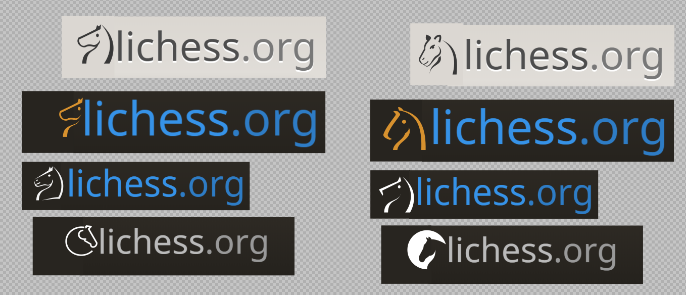
- Think about how it fits on the site. Lichess doesn't display the logo on every page. It says 'lichess.org', but this could change - especially if lichess gets the .com extension (and redirects it to .org 😉). We could then put the knight logo to its left. Likewise, consider how it'd look as an Android/iOS app icon next to dozens of other apps on a player's phone or tablet.
 superuser-does
on 26 Nov 2019
superuser-does
on 26 Nov 2019
Commenting on the actual suggestions now: I think these are very strong. I wouldn't go for the knights with the flat mouths, I believe Lichess as a whole has a more curvy look. The various arrangements you made near the top are also brilliant, like with the knight and a bigger outline of the same knight behind, but slightly modified and in a very specific colour palette. This is some seriously advanced thinking, especially if you narrow down towards a single design.
In fact makes me curious if you have a design/publishing background as I've seen this kind of thing before - different ways the same logo base can be used. Impressive stuff. Of course, this is easiest to do with a simple and straightforward logo (think of Google Search and their frequent 'Google Doodles'). A more complex logo is harder to modify.
I'm not sure how good these would look at favicon size, but keep going! You seem to be very familiar with vector now, but you can always sketch ideas in a raster program like Photoshop or The GIMP, whichever is easiest, and convert to vector later.
superuser-does
on 26 Nov 2019
@superuser-does I am structural engineer :)) I design just for hobby, some days are very full for me ,some are not. Thank you for your support.
Here are more variants. If the lichess team likes one, then we can interate further on that one design.

ghost
on 26 Nov 2019
ghost
on 26 Nov 2019
Great stuff, @sadsnake1, very impressive indeed.
Looking at these logo I realize that I enjoy plain shapes more than line drawings. Lines often look weird when put next to text.
Another example of a logo that I like is the starcraft teamliquid logo.
By the way if we choose a new logo, it will very likely replace the huge cburnett knight on homepage: https://lichess.org/
 ornicar
on 26 Nov 2019
ornicar
on 26 Nov 2019
The team liquid is a competitive esport team, so the logo must be something agressive( spartan shield with a serios knight). Also that logo is made to be big, like a banner, it is not made to be portable
But look at the firms that are working with people or selling product or services. Their logos are friendly, colorfull and simple.
Also, please tell me which of those knights do you like. How serious looking should be the knight and also the background ( circle, square, shield, etc.) and colors
ghost
on 26 Nov 2019
I like the plain ones mostly.

simple and plain. Not sure about the lilac.

very nice try with the circle

again I appreciate the plain-ness and disc. Can the knight be simplified further?
It would be easier to talk about the designs if they had a unique name or number.
ornicar
on 26 Nov 2019
Note: as we all know chess knights on a board look to the left, but in my opinion we don't need to respect that in a logo. I don't mind knights looking to the right. It's actually more instinctive for most left-to-right readers.
ornicar
on 26 Nov 2019

ghost
on 26 Nov 2019
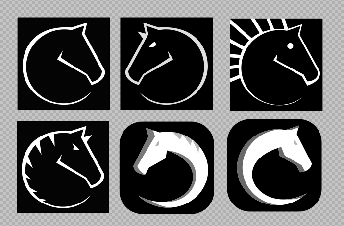
I compiled here all designs for easier discussions

ghost
on 26 Nov 2019
Really good. The circular knight was the one that caught my eye as well, the one with just the outline. It's not totally common but the shape is interesting, yet still fits with the clean, basic lines throughout Lichess's design. I'd go so far as to say that it's great, but unique enough to make it ideal for a logo. You won't find a set like this (and that's okay, the logo doesn't have to be playable as a set).
I also think it's interesting that many designs work _without_ eyes and nose. Or with. They're both okay and worth exploring :)
In terms of an Android/iOS app icon, it would be a bit tougher with a basic shape that relies on having no fill. It's also hard for the favicon. If we look at GitHub's favicon, it encloses the outline for Octocat (see it in full form here) in a dark circle. The same goes for other single-colour logos, like Slack's and Reddit's.
I can't speak for iOS, but at least on Android, you have a choice of bubble, square images, rounded squares, or just the image the app provides. Currently Lichess just uses the cburnett knight, and it's the biggest looking icon of them all! I quite like that myself, though I appreciate it's subjective. Here's how that looks on my phone.
So the last one Thibault pointed out is cool. but I prefer a more involved design so it looks more striking on mobile. There can always be a separate, simpler version for e.g. for the lobby background, Thanks again!
superuser-does
on 27 Nov 2019
The circular knight is the best choice. For the lobby background is perfect. Maybe it can spin slowly when searching for a match, like a loading aperture. I will make some iterations, having in mind that will also has to be a full fledged logo for the app.
ghost
on 27 Nov 2019
ghost
on 27 Nov 2019

i would go with one with the last two knights. Period
ghost
on 28 Nov 2019
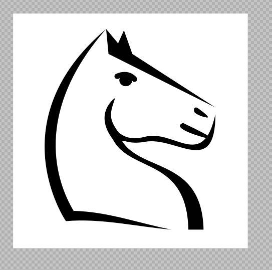
This baby right here is the answer. Familiar knight, friendly, not easy to forget, close to cburnett, can be spinned like a watch, can be a minimalist app icon, a favicon, etc.
ghost
on 28 Nov 2019
Man, that's great work you're doing here. Gonna discuss it with the team now.
ornicar
on 28 Nov 2019
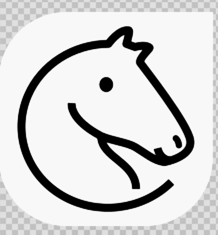
So far this one is our favourite:

Simple, memorable, elegant. We also like the similar:

But we think maybe it's better when the curved line becomes thinner at the end.
That last one you posted is very cute, too much maybe, seems childish to me. Some of us love it but it's not my personal favourite.
More generally the 6 proposals in https://github.com/ornicar/lila/issues/5680#issuecomment-559242016 are very strong.
If you're inspired to try more variations, we'd love to see them.
Here's a few things the team hacked while brainstorming:


ornicar
on 28 Nov 2019
for giggles:

ornicar
on 28 Nov 2019
I should add that we have team members across different timezones, and most of them have not seen these logos yet. So this is provisional feedback.
ornicar
on 28 Nov 2019
I work with people everyday and I know when somebody just made a decision. that logo is the best choice for lichess and I would like to ask you something in return for my work it is a simple thing : changing the icons for blitz and bullet modes to match their names. it's just something that poped into my eyes when I first entered the site. I can also provide you better alternatives for the rest of the icons.
ghost
on 28 Nov 2019

ghost
on 28 Nov 2019
hey @ornicar would it be feasible for your team to finalize on 4 (or some number) logos and then put them up for a vote on the lichess home page?! That poll should be fun to watch :)
 icp1994
on 28 Nov 2019
ghost
on 28 Nov 2019
icp1994
on 28 Nov 2019
ghost
on 28 Nov 2019

ghost
on 28 Nov 2019
OK let's move forward with this. Can we get SVG for these:
^ B1 and D2
^ A1 and A2
^ A1
We'll try them out on the test server.
Regarding the bullet icon: I hear you. Can we finish dealing with the logo first? Then we'll discuss it.
Regarding the piece sets: I thought about showcasing them in the same blogpost that we'll make if/when we pick a new logo.
ornicar
on 30 Nov 2019
Here are the svgs.
personally i will go with nr. 4 (see zip).
Regarding the rest, yes the priority is the logo.
ghost
on 30 Nov 2019
I saw the logo on lichess.dev, my opinion is to make it 10% smaller, so it wouldn't touch the margins of the lobby screen
ghost
on 1 Dec 2019
The current cburnett knight has no margin. We'll try with margins as well.
ornicar
on 1 Dec 2019
The new logo isn't discernable at all at favicon size. The lines are way too thin; it just looks like a slightly rotated letter e. The following three logos are significantly better (provided that the first one is corrected to a perfect circle):

The latter two would look fantastic on swag store items.
 priem19
on 2 Dec 2019
priem19
on 2 Dec 2019
There seems to be a gray border around the logo


Browser:
Microsoft Edge 44.18362.449.0
Microsoft EdgeHTML 18.18363
 awsumbill
on 2 Dec 2019
awsumbill
on 2 Dec 2019
This does not seem to happen on Chrome.
I tried on Chrome 80.0.3984.0
awsumbill
on 3 Dec 2019
@awsumbill can't reproduce.

 kspalaiologos
on 3 Dec 2019
kspalaiologos
on 3 Dec 2019
The same, can't reproduce on latest W10.

This will soon be a moot point anyway due to ChrEdge.
superuser-does
on 3 Dec 2019
That's quite odd, look at mine

Specs:
Windows version:

Edge version:

Display settings:

Browser info:
https://whatismybrowser.com/w/ZREQJ9K
awsumbill
on 3 Dec 2019
Love the new logo! It'd make an excellent loading icon, if need be :)
Loading spin GIF

 ZacharyTalis
on 3 Dec 2019
ZacharyTalis
on 3 Dec 2019
New Logo TO-DO:
- [x] [Slideshow](https://lichess.cdn.prismic.io/lichess%2F758a8bb6-c1c5-4982-9c6b-6fcebeea424f_2018-03-04-lichess-press-kit.pdf)
- [x] [Streamer Kit](https://lichess.cdn.prismic.io/lichess%2F4d265163-437b-4c15-9870-fc2eb24c19d9_2018-04-28-streamer-kit.zip)
- [x] [Press Kit](https://lichess.cdn.prismic.io/lichess%2Fedc97f60-5574-482f-bbf0-74be6946eb08_2018-03-04-lichess-press-kit.zip)
- [x] [Swag Store](https://shop.spreadshirt.com/lichess-org)
- [x] [README](https://github.com/ornicar/lila/blob/master/README.md) screenshots need to be updated with the current logo
- [x] The Facebook and ...
- [x] ... Twitter background picture, the one with the titled arena picture, needs to be updated with the new logo
- [x] ~The "lichess at the end" part of the pinned tweet needs to be updated with the new logo.~
- [x] [YouTube](https://www.youtube.com/channel/UCr6RfQga70yMM9-nuzAYTsA) background picture needs to be updated
- [x] lichess Twitch icon
- [x] [Mobile app](https://lichess.org/mobile) icons
- [x] [lichobile](https://github.com/veloce/lichobile)
- [x] [Android Store](https://play.google.com/store/apps/details?id=org.lichess.mobileapp)
- [x] [Apple Store](https://itunes.apple.com/us/app/lichess-free-online-chess/id968371784)
- [x] [API Docs](https://lichess.org/api) icon
- [x] [API](https://lichess.org/api) tab icon
- [x] [Database](https://database.lichess.org/) tab icon
- [x] [OAuth authorisation page](https://user-images.githubusercontent.com/47586568/70163645-0fcc6d00-167d-11ea-8d5a-b45bcd9cddf3.png) (https://github.com/ornicar/lichess-oauth-server/pull/1)
- [x] [Notifications](https://user-images.githubusercontent.com/47586568/70163853-6043ca80-167d-11ea-8860-30f17da06639.png)
- [x] OpenGraph (
og) images - when you embed on chat and social media like WhatsApp, Discord, Facebook, Twitter, etc) - [x] Lichess email account
- [x] [Crowdin translations](https://crowdin.com/project/lichess)
- [x] [Crowdin profile](https://crowdin.com/profile/lichess)
Double-check:
- [x] Test mask-icon color (pinned tabs in Safari)
- [x] Test android splash screen color
- [x] Apple touch icon
- [x] Push notifications
- [x] Discord open source (https://github.com/discordapp/discord-open-source/pull/193)
Third-party:
- [ ] [lichess widgets](https://rubenwardy.com/lichess_widgets/) (https://github.com/rubenwardy/lichess_widgets/issues/2)
- [ ] [Open Hub](https://www.openhub.net/p/lichess) page - seems dormant, but people actually look at this. Someone needs to take ownership of the page and clean it up.
- [x] [/r/lichess](https://reddit.com/r/lichess) subreddit - not directly controlled by lichess (@niklasf: Contacted moderator)
- [x] AndOTP icon (https://github.com/andOTP/andOTP/issues/355)
- [ ] [Wikidata](https://www.wikidata.org/wiki/Q19831807) and then Wikipedia page for each language - should be uploaded separately instead of overwriting the old image, as it's a fundamentally different logo.
If any else sees an outdated icon feel free to add on.
awsumbill
on 3 Dec 2019
Hope you don't mind me using my collaborator access for this - I added all the other ones I could think of!
superuser-does
on 4 Dec 2019
@superuser-does Here's one you could update or close: https://github.com/discordapp/discord-open-source/pull/193
 niklasf
on 4 Dec 2019
niklasf
on 4 Dec 2019
Thanks for editing @superuser-does and @niklasf
awsumbill
on 4 Dec 2019
Just a tought. The logo on the lobby screen should be scaled down by 10-20%, so it would be even less invasive and to be even more transparent. Also, maybe we can change all knights in the all the sets to look to the right, just to show that lichess is something else.
ghost
on 5 Dec 2019
Maybe a bit to late, but here are some more iterations...

ghost
on 5 Dec 2019
Notifications haven't been fixed yet.
Tried on both Edge and Chrome and cleared cache beforehand.


awsumbill
on 5 Dec 2019
@sadsnake1 I really like the second one, it looks more like a real knight than the current one.
awsumbill
on 5 Dec 2019
16² 32²


I still think the first two are significantly better.
priem19
on 5 Dec 2019
I too am partial to the second one, but it doesn't look nearly as good when you scale it down, as shown by priem19. So on the whole I think the logo we chose is ideal. Still a cool idea that would have also made for a good logo, but not as good IMHO.
superuser-does
on 5 Dec 2019
Okay, a middle ground, what if the outside of the horse is transparent, so it ends up looking like:

(Black = transparent)
PS I'm only talking about changing the favicon here, because that's the only thing that looks absolutely horrible to me now.
priem19
on 5 Dec 2019
👍 for the plain shape favicon logo
Having a variation of the same logo, with a plain shape version and one with a line drawing might be a good idea to use one or the other depending on the context of display.
For instance the line drawing logo looks very pretty on the home page behind the quick setup buttons, but it does not look pretty as a favicon. Exemple on Chrome/OSX:

I assume that would be the same for the push notification logo on mobile.
We are actually using a plain shape version of the old logo, for android push notifs, because android kind of requires it:

 veloce
on 6 Dec 2019
veloce
on 6 Dec 2019
Can someone please suggest me some good combination of a chessboard and its pieces to make an app with. It can be any combination that goes well with one another.
 theashggl
on 6 Dec 2019
theashggl
on 6 Dec 2019

If this design is suitable I can make it to have the wings of the patreons or to make new patron icon entirely.
ghost
on 7 Dec 2019
Can someone please suggest me some good combination of a chessboard and its pieces to make an app with. It can be any combination that goes well with one another.
@theashggl Anything with a rook. It's just a tower, and that gives an image of stability, reliability, strength. All things both chess players and software users like. I have a giant rook paperweight, mostly for decoration, and I think it looks great.
It can just be a rook, prominently in the centre and a chessboard. The chessboard might look better on the rook's feet from a diagonal angle. The 'camera' would be looking at the middle of the rook, so the board is at the bottom of the image. I think that would make for a great logo, though I appreciate that it's difficult to describe in words. In any case, I hope that helps.
superuser-does
on 7 Dec 2019
More ideas.

ghost
on 10 Dec 2019
Woohoo! Does this mean that Lichess has opened the process again?
My first comments on the above winged designs:
I see you are going for a certain "cute", "playful", almost "childish" look. I do not believe this is the right way (especially since I have seen that almost monumental, majestic Freedom Knight you posted 4 days ago), but you may disagree, so be sure to read my comments in this light.
If I understand correctly, with these designs you tried to eliminate the Swan Suspicion. You did this by making the wings very iconic: these logos are read like words, i.e. these logos work on the conceptual level of content. I would like to see a logo that works more on the experienced level of form. What I mean by this: the designs above are too cerebral. They say: this is a wing and this is a knight and together they are a winged knight. The sum is not more than the parts. A design should operate through the forces within, i.e. it should be graphically strong enough to stand without any need for the cerebral explanation. Your design from 4 days ago had some of that.
As an illustration of my above remark, I will repost this link to a Roger Excoffon iteration that I also posted on Lichess: www.typogabor.com/Media/Excoffon/Excoffon_DSC4373.jpg
Obviously, this Excoffon design is too much infested with life to be suitable for the almost clinical appearance of Lichess. But see how this logo stands by its internal forces alone. The wings here don't have to be wings, the horse here doesn't have to be a horse. It's all about the life in the stroke.The Excoffon design might give a clue on how to avoid the Swan Suspicion in a different way: see how the wings point straight upward. It also has some nice squarish head stylizations that might be inspiring.
In an ideal world you would take your freedom knight from 4 days ago and make it look less like a chess piece (because that is too cerebral, too obvious), while still having it somehow feel like or remind of a chess piece and not just some horse. Whether this is possible, I do not know. But for me that is the ideal.
I would strongly urge to use only black. No gradients, no highlights, no outlines. I know many logos are done that way nowadays, but that doesn't make them good. None of the logos above are timeless and it is because you use too many of these superficialities and niceties of technique. It suffices to let yourself be inspired by the "Great Designers" that everyone knows: Excoffon, Rand, Aicher, Martens, Bierut, Kalman, etc. instead of by the crappy design that is being done for so many apps nowadays.
I am extremely busy this month. I will see if I can add some designs so that I not only criticize but also do something. But I can't promise.
Keep up your good work!
 UnChienDEspace
on 11 Dec 2019
UnChienDEspace
on 11 Dec 2019
Woohoo! Does this mean that Lichess has opened the process again?
No.
But new designs are fun, and can maybe be used later on, for example on lichess.org/swag
ornicar
on 11 Dec 2019
Just dropping a convenient link here to the checklist, as there are still some items remaining:
https://github.com/ornicar/lila/issues/5680#issuecomment-561353128
superuser-does
on 22 Dec 2019
COPYING.md states that the new logo is nonfree. This means that it cannot be uploaded to Wikimedia Commons and thus not be used on Wikipedia or Wikidata (The English Wikipedia is an exception because of Fair Use in the US). It would be great if you released it under the Creative Commons BY-SA 4.0 license.
 Ordoviz
on 23 May 2020
Ordoviz
on 23 May 2020
Just for fun a more horse-like knight so that you can create logos with the filling being more prominent (also added a small gradient). Similar enough not to confuse users and still simple and elegant (and more "round", i.e. the mouth of the knight is not a straigth line at the top and bottom is closer to the center). Maybe you like it (left is the original logo for comparison).

 DeepKling
on 7 Jun 2020
DeepKling
on 7 Jun 2020
Cool
Maybe the line from ear to nose could taper a bit more towards the nose (so that the line becomes less heavy)? Or maybe it could even be (a bit more) straight again? Or maybe the s-curve of that line just needs to be a bit more exaggerated (so that the nose becomes sharper)?
The reason I say this is because though I like it it still looks a bit too puffy.
But the jaw line is definitely better, more elegant and low enough so that the white spaces of the neck vs the head are better balanced. (What happens if you let the jaw drop all the way to the center?)
[*Ear may need tapering – or different form ear altogether.
*I am not an expert with bezier curves, but I feel that the point placement on the back of the neck (the left circle shape), is off; the curve feels a little forced, but I could be hallucinating.
*the logo is not perfectly on the circle; it is actually off quite a lot]
UnChienDEspace
on 7 Jun 2020
OK, i redrew it starting with a circle and reshaped everything a bit, this is how it looks now.
 DeepKling
on 7 Jun 2020
DeepKling
on 7 Jun 2020
I took the liberty of further working on your logo as well.
- I drew a circular grid; fixed the logo to perfect circle shape;
- Fixed the anchor points; deleted unnecessary ones and placing the right ones at the horizontal and vertical extrema;
- Dropped the jaw all the way to the centre.
I will attach the .svg file so anyone willing to work on the logo can start off with a good underlying construction.

Obviously the above are only rough outlines.

The grid I am working on.
The file with the grid.
About your edits: the circle shape def makes it better. The ear is not correct I think. The straight line for the top of the head, I am not sure of.
I am struggling with this line myself. It seems that the original logo (with the squarish looong face) and your previous version (with the circle head) are much more distinctive; As you can see, what I came up with looks much like yours, and it looks generic.
Design, it's hard!
UnChienDEspace
on 7 Jun 2020
@ornicar
Maybe you will like this improved logo;
- it is now perfectly circular, with correct anchor point placement;
- the white space of the head was slightly increased;
- tapered the stoke going into the ear;
- fixed quirky anchor point at nostril.
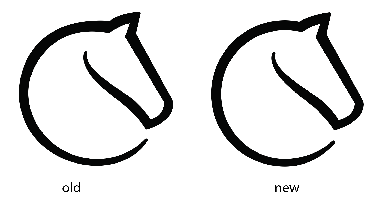
UnChienDEspace
on 7 Jun 2020
@UnChienDEspace It might just be an optical illusion but just curious, was thickness increased at all in your version?
At a glance that's the main difference I can personally tell.
superuser-does
on 8 Jun 2020
@superuser-does
At some places the "improved" stroke is thicker; at some other places it is thinner. I did less tapering on my version, starting only from the botten half of the circle, whereas the old logo is tapering at every point on the circle.
This could all be discussed, and there's much still to improve. But for me personally, the new version is already better because the circle doesn't look as wobbly anymore.
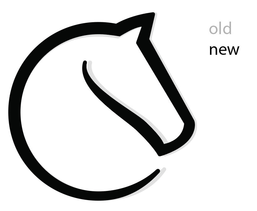
Red is new, grey is old:

UnChienDEspace
on 8 Jun 2020
I may or may not take time to do this myself.

UnChienDEspace
on 8 Jun 2020
I like small iterative changes. Note that being a perfect circle is not a goal, see https://digitalsynopsis.com/design/google-logo-geometry/
ornicar
on 8 Jun 2020
Cool! & true, the goal should always be to have it _optically_ look like a circle. I suspect some vertical compressing may even be needed after the other issues are fixed.
UnChienDEspace
on 8 Jun 2020
Actually I think the red-blue-yellow-green google logo is a little bad taste anyway - it always was ;-) (some say you should not argue about taste, but there is good and bad taste :-) ). I didn't like the "not so circular" G, too, because it is still too circular imho, but at least you can recognise it. Back to lichess :-) .
While my coloured designs look a bit "firefoxish", I like the curve of the knights mouth in the centre, looking a tad like the old pepsi logo with the curved line in the center (just rotated). And I like that you can't really tell if it is the mouth or the base of the knight. One could change the ears... they are not perfect for sure.
DeepKling
on 8 Jun 2020
Related issues
 Assios
·
3Comments
Assios
·
3Comments
 nojoking
·
3Comments
niklasf
·
3Comments
nojoking
·
3Comments
niklasf
·
3Comments
 Cristian-A
·
3Comments
Cristian-A
·
3Comments
 ddugovic
·
4Comments
ddugovic
·
4Comments
Most helpful comment
I compiled here all designs for easier discussions