Light-client: Improve the transfer screen
Description
After #1212 the transfer screen looks quite cluttered. We should go the next step to improve it.
Maybe building on top of the ideas we have collected/discussed within #571 and #586
Acceptance criteria
- Looks nicer
Tasks
- [ ]
 christianbrb
All 10 comments
Maybe going into the direction of the card design https://github.com/raiden-network/light-client/issues/571#issuecomment-557081967 or aligning with the new WebUI design.
christianbrb
on 11 Jun 2020
Meeting with @sashseurat and @taleldayekh
- Improving the transfer area
- Changing the menu (top screen)
- Going with the WebUI Redesign
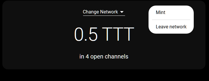
- Removing the address bar
christianbrb
on 15 Jun 2020
@christianbrb Here is a click-dummy draft ready for review:
https://www.figma.com/file/3UX5wudtGolsdh5QVyuoTS/LC-Header?node-id=0%3A1
Let me know when you'd like to have a talk about it, to explain some details.
 sashseurat
on 16 Jun 2020
sashseurat
on 16 Jun 2020
@sashseurat Great, thanks :) Looks nice!
Some smaller remarks:
- The turquoise looks different. Maybe it is due to the fact, that the font color is typically white
- I would out scope the channel integration on the screen for now. This might be too much work close to main net. Could you add it to the menu. For future implementation I have created #1716.
- I am not sure about the net (Goerli) being very prominent on the top of the screen.
- I like the deposit icons we have used before.
- I am not sure about the bell (notification icon).
@taleldayekh What are your thoughts?
christianbrb
on 17 Jun 2020
@sashseurat I just had a brief discussion with @taleldayekh
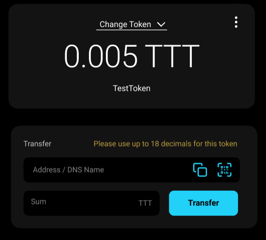
In the first iteration of the improvement, we would like to focus on the token and transfer part of the screen. I am going to create a separate issue to change the header in the future.
@taleldayekh is going to approach @sashseurat to finetune the details of the two parts.
christianbrb
on 17 Jun 2020
Issue to change the header of the dApp -> #1717
christianbrb
on 17 Jun 2020
@sashseurat I just had a brief discussion with @taleldayekh
In the first iteration of the improvement, we would like to focus on the token and transfer part of the screen. I am going to create a separate issue to change the header in the future.
@taleldayekh is going to approach @sashseurat to finetune the details of the two parts.
That looks really nice :D
 kelsos
on 17 Jun 2020
kelsos
on 17 Jun 2020
@sashseurat Great, thanks :) Looks nice!
Some smaller remarks:
- The turquoise looks different. Maybe it is due to the fact, that the font color is typically white
- I would out scope the channel integration on the screen for now. This might be too much work close to main net. Could you add it to the menu. For future implementation I have created #1716.
- I am not sure about the net (Goerli) being very prominent on the top of the screen.
- I like the deposit icons we have used before.
- I am not sure about the bell (notification icon).
The icons I used are placeholders for whatever icons are in the light client, as it doesn't make sense to spend the time on importing the exact icons that exist in the light client into Figma :)
sashseurat
on 22 Jun 2020
FYI:
The "Please use up to ...." text is conditional and should only be displayed if user inputs wrongly.
sashseurat
on 22 Jun 2020
Also the prototype shows the old Transfer component structure if you drag it :)
sashseurat
on 22 Jun 2020
Related issues
christianbrb
·
5Comments
christianbrb
·
3Comments
 agatsoh
·
3Comments
agatsoh
·
3Comments
 taleldayekh
·
4Comments
christianbrb
·
5Comments
taleldayekh
·
4Comments
christianbrb
·
5Comments