Libertinus: Letterlike symbols including slash has wrong form in Libertinus Serif
The following characters should be upright rather than slanted in Libertinus Serif Italic:
℀ (U+2100), ℁ (U+2101), ℅ (U+2105), ℆ (U+2106).
See: #112
 KrasnayaPloshchad
All 14 comments
Is it safe to assume you meant "Libertinus Serif" (not Italic) in the above report?
 alerque
on 8 Dec 2017
alerque
on 8 Dec 2017
Yes.
KrasnayaPloshchad
on 8 Dec 2017
I am not sure about this issue: in these glyphs, Regular IS different from Italic (which is more slanted) and Bold IS different from Bold Italic (which is also more slanted). So, it seems a design choice of the originals upstream.
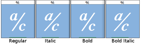
It might be a questionable choice, with two possible points coming to my mind:
1) for the choice of cursive forms in all fonts (upright and italic)
2) for Regular and Bold (and their italics as well) having the same weight
but it is not clear to me how these glyphs should actually look and/or how to correct the current situation.
Can anyone elaborate?
 mgavioli
on 20 Feb 2018
mgavioli
on 20 Feb 2018
I think we need to compare this with other fonts and see if there is a common style we should follow, otherwise close this and keep things like they are.
 khaledhosny
on 21 Feb 2018
khaledhosny
on 21 Feb 2018
These glyphs seem quite rare: I looked into a dozen of fonts, serif and sans, either open source (Raleway, for instance) and from reputed foundries (several Caslon and Century Schoolbook) and none contains them.
Perhaps, we are on our own in this. Looking into the Sans, I see the same pattern:
- Regular, Italic and Bold all have cursive forms (1-storey 'a' and so on)
- all have the same weight
- Italic is slightly more slanted than the other two
It looks like a design choice to me. It can be changed of course, but I for one have no idea how.
One possibility would be to use the components referenced by the small letters in the U+24D0 - U+24E9 range ("circled Latin small letters", which look reasonably the same as the main letters), and compose those glyphs; I am not sure the result would look better, though.
Perhaps, I'll make a few test glyphs...
mgavioli
on 23 Feb 2018
A quick and dirty hack, using whatever building blocks are already available in each font:
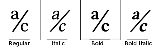
It mostly uses the ordfeminine and the MODIFIER LETTER SMALL C if defined or a c scaled to 2/3 if not; it can be improved of course, but it follows the same style and weight variation of the main glyphs of each font. I'll leave to other to evaluate if it is a better road than the current one or not.
mgavioli
on 23 Feb 2018
@mgavioli Did you look into fonts that are known for multilingual publishing? Brill for instance comes to mind. Scratch that Brill doesn't seem to have those glyphs either. _Searching..._ Okay this is going to be a sorter list than I expected. Mind you I don't actually have that many fonts kicking around, just some workhorses, but I'm still surprised by the dirth.
Besides Libertinus, these fonts from my system have all those glyphs:
- DejaVu Sans
- FreeSans
- FreeSerif
- Symbola
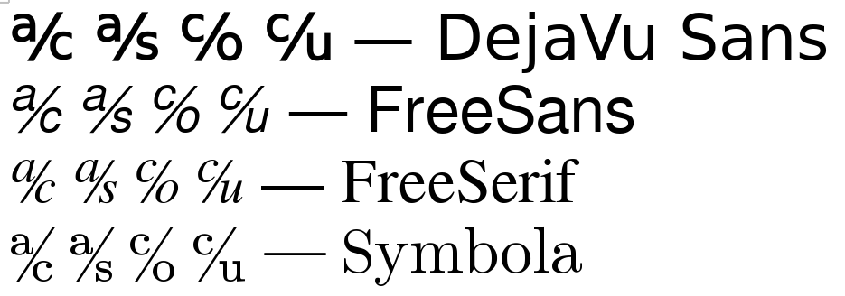
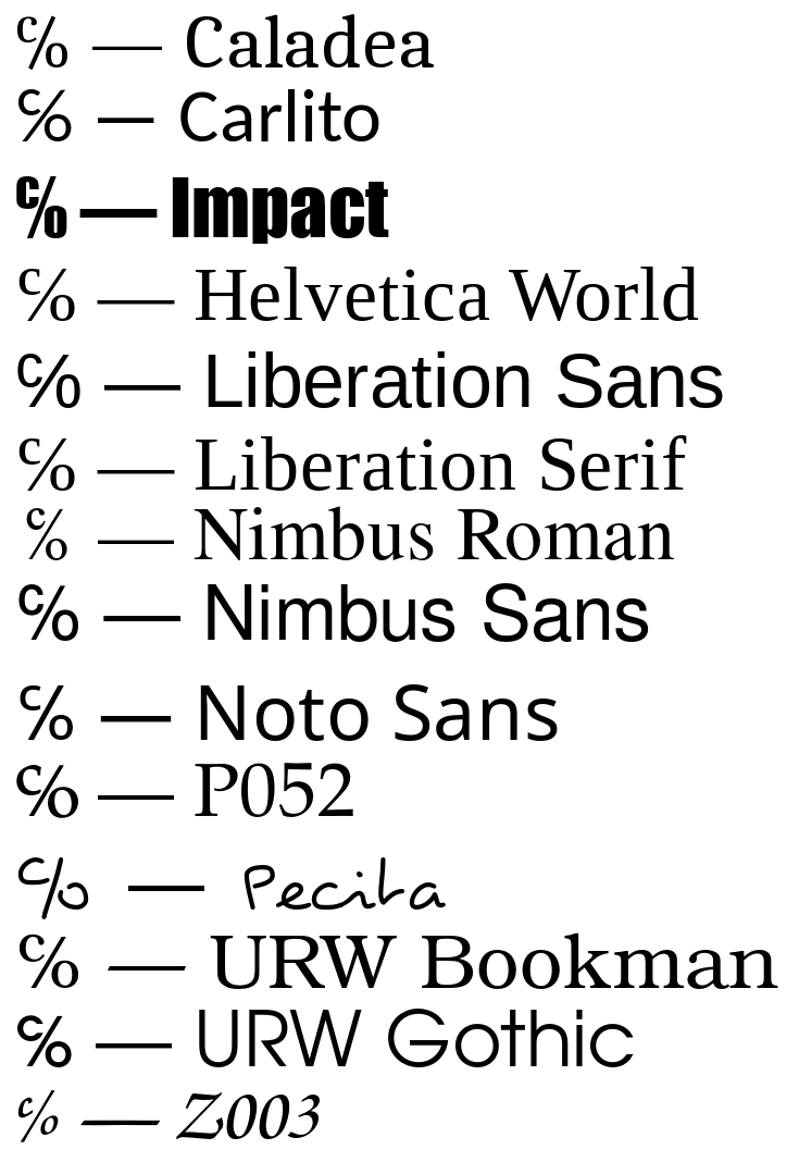
These have just the ℅ glyph: (Note even Github's font stack is showing me this glyph in a different face than the other three!)
- Caladea
- Carlito
- Impact
- Helvetica World
- Liberation Sans
- Liberation Serif
- Nimbus Roman
- Nimbus Sans
- Noto Sans
- P052
- Pecita
- URW Bookman
- URW Gothic
- Z003
alerque
on 23 Feb 2018
Anybody know a quick and dirty shell command for asking whether a font face has a glyph? I'll hack together a SILE document that shows all fonts + variations for comparison.
alerque
on 23 Feb 2018
Anybody know a quick and dirty shell command for asking whether a font face has a glyph?
$ fc-list :charset=2100
$ fc-list :charset=2100
On my system (fc-list / fontconfig version 2.11.0), I get this reply to the above command line:
Unable to parse the pattern
And fc-list patterns seem to be documented nowhere...
mgavioli
on 24 Feb 2018
Thanks @khaledhosny. Now tell me why the fontconfig weight parameter is roughly ⅕ what harfbuzz weights map to? _‹hiss splutter›_ Nevermind I probably don't want to know.
Armed with that command I setup a document to get type samples from every font family, weight, and style that has a set of code points. (Minus a handful of trouble fonts from my system.)
\begin{document}
\font[size=20pt]
\set[parameter=document.parindent,value=0]
\begin{script}
local testchars = { 2100, 2101, 2105, 2106 }
local teststring = ""
for key, charcode in pairs(testchars) do
    local char = SU.utf8charfromcodepoint("U+"..charcode)
    teststring = teststring .. char
end
local charset = table.concat(testchars, ",")
local fclist = io.popen("fc-list :charset=" .. charset .. " family | cut -d, -f1 | sort -u | grep -v Linux | grep -v Misc | grep -v MUTT | grep -v Unifont")
local sample = function (style, weight)
    style = style or "Roman"
    weight = weight or 400
    SILE.call("hbox")
    SILE.call("hfill")
    SILE.call("font", { style = style, weight = weight }, { style .. " " .. teststring })
    SILE.call("break");
end
for font in fclist:lines() do
    SILE.call("font", { family = font }, function ()
        SILE.typesetter:typeset(font .. " — ")
        local weights = io.popen("fc-list :family='" .. font .. "' weight")
        for weight in weights:lines() do
            weight = tonumber(weight:match(":weight=(.*)"))
            local osweight  = weight * 5
            local styles = io.popen("fc-list :family='" .. font .. "':weight=" .. weight .. " style")
            for style in styles:lines() do
                style = style:match(":style=([^,]*)")
                sample(style, osweight)
            end
        end
        weights:close()
    end)
    SILE.call("par")
    SILE.call("medskip")
end
fclist:close()
\end{script}
\end{document}
Here's the PDF output from one of my systems (not the same on I tested on the other day). I'll probably develop this a little more to get a layout that's actually more useful for comparisons.
alerque
on 24 Feb 2018
On my system (fc-list / fontconfig version 2.11.0), I get this reply to the above command line: Unable to parse the pattern
I have fontconfig 2.12.6. I don't know what your issue is, just thought I'd mention it.
And fc-list patterns seem to be documented nowhere...
I agree. I just hack together that document generator by randomly trying various syntax possibilities and values and eventually came up with something. The man 3 FcPatternFormat page has a little bit of help on fancy syntax things you can do, but it doesn't give the possible values, combinations, or any useful examples.
alerque
on 24 Feb 2018
I think @mgavioli solution is good enough (the italic ordfeminine a glyph needs to be made true italic, but that is a different issue).
khaledhosny
on 25 Feb 2018
The PR should be complete and ready to merge now.
mgavioli
on 5 Mar 2018
Related issues
 Doc73
·
6Comments
Doc73
·
6Comments
 iandoug
·
8Comments
iandoug
·
8Comments
 aksr
·
6Comments
KrasnayaPloshchad
·
6Comments
KrasnayaPloshchad
·
5Comments
aksr
·
6Comments
KrasnayaPloshchad
·
6Comments
KrasnayaPloshchad
·
5Comments
Most helpful comment
A quick and dirty hack, using whatever building blocks are already available in each font:
It mostly uses the
ordfeminineand theMODIFIER LETTER SMALL Cif defined or acscaled to 2/3 if not; it can be improved of course, but it follows the same style and weight variation of the main glyphs of each font. I'll leave to other to evaluate if it is a better road than the current one or not.