Lemmy: Proposal to redesign the lemmy logo to appel to a larger audience
my logo idea is here
https://dev.lemmy.ml/post/36934
it is the mouse whiskers in a minimalistic style, somthing that many sites are adopting
I am willing to redesign it, as I feel like the lines might be a bit too... thin?
 boehs
boehs
All 5 comments
I'm not a fan of that personally, its way too minimalist. Would be better to keep the mouse mascot.
 Nutomic
on 6 Jul 2020
Nutomic
on 6 Jul 2020
I do agree that a more clean / minimalistic logo is needed to appeal to a larger audience, but I'm not a fan of it either. Maybe at some point lemmy should make a new logo contest to find a more modern one ?
 mtoniott
on 10 Jul 2020
mtoniott
on 10 Jul 2020
I tried things by trying to make a cleaner version of the current logo. It is I think a bit better but still not perfect.


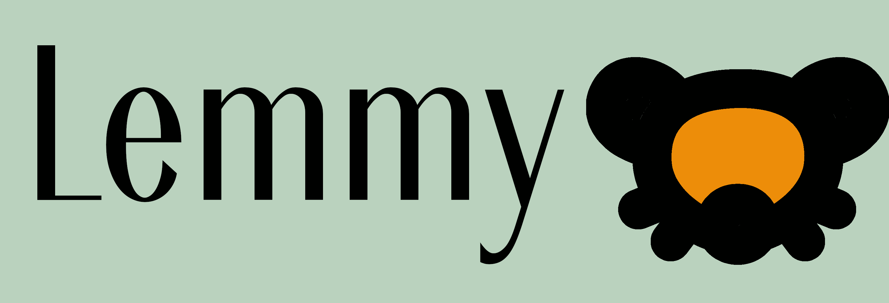
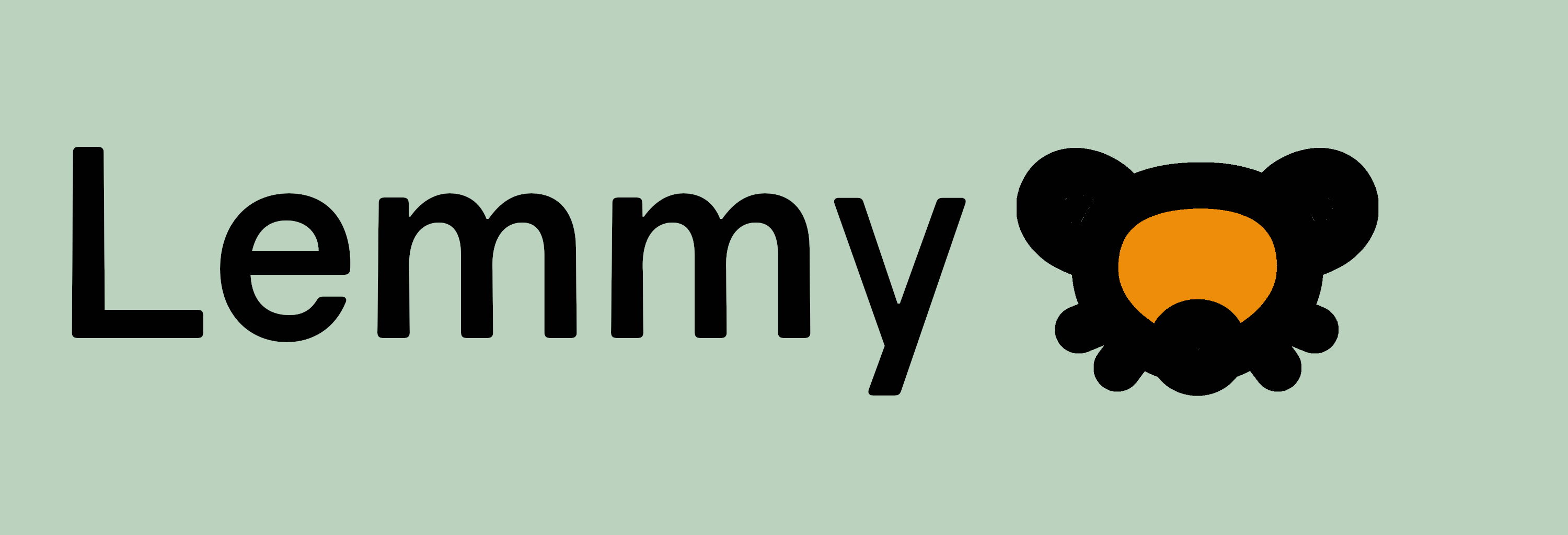
(fonts are Ardeco and gravity, one is under SIL OFL 1.1 and the other under CC-BY-4.0). (colors are those used on dev.lemmy.ml frontend to stay consistent).
If the community likes one of them I can do a .svg version.
mtoniott
on 10 Jul 2020
I like it, but not the orange, maybe transparency would work better there
boehs
on 16 Jul 2020
I think Lemmy's current logo is stronger and more recognizable than your proposal. I am also of the opinion a logo should be timeless. I don't think jumping on a minimalist design trend is a very good idea. That said, Lemmy's logo is already pretty minimalist. It's honestly fine.
Do be careful to not get sued by Disney. They're pretty aggressive when it comes to protecting their Disney ears.
 Datdus
on 25 Jul 2020
Datdus
on 25 Jul 2020
Related issues
Nutomic
·
4Comments
Nutomic
·
5Comments
 chovy
·
3Comments
chovy
·
3Comments
 DimensionalScoop
·
6Comments
DimensionalScoop
·
6Comments
 StaticallyTypedRice
·
6Comments
StaticallyTypedRice
·
6Comments
Most helpful comment
I'm not a fan of that personally, its way too minimalist. Would be better to keep the mouse mascot.