Current Behavior
There are a lot of things in the meshery page that might need to be changed.
- Go to the meshery page - https://layer5.io/meshery
- Scroll down the page & see.
Screenshot

In reference to the screenshot above, we can refine the following marked items.
- Align the contents
Baseline, Measure, and Assesscard properly (align-center). - Fix the padding of the embed YouTube video in center.
- In the
Communitysection, those icons needs to be properly scaled & aligned. - I think the
Fork me on Githubribbon doesn't look good onCommunity&Service Mesh Performance Specificationsection. We may remove one from the community section. - The svg in the subscribe section needs to be magnified a little bit.
@leecalcote @chandrashritii
Contributor Resources
The layer5 repo contains two websites. The current generation and the next-generation of the layer5.io site.
If the layer5-ng label is absent on this issue, then this issue pertains to the current generation of the layer5.io website, which uses Jekyll and GitHub Pages. Site content is found under the master branch.
If the layer5-ng label is present on this issue, then this issue pertains to the next-generation of the layer5.io website, which uses Gatsby, Strapi, and GitHub Pages. Site content is found under the layer5-ng branch.
 Neilblaze
All 3 comments
These are all good highlights (things that need fixing), @Neilblaze.
 leecalcote
on 14 Aug 2020
leecalcote
on 14 Aug 2020
Yeah. I think it'll be better if we disintegrate these issues into small parts & create FTO issues.
What say? @chandrashritii @leecalcote
Neilblaze
on 14 Aug 2020
Just now another thing just stroke my mind. If we look closely, this ↓ can also be fixed.
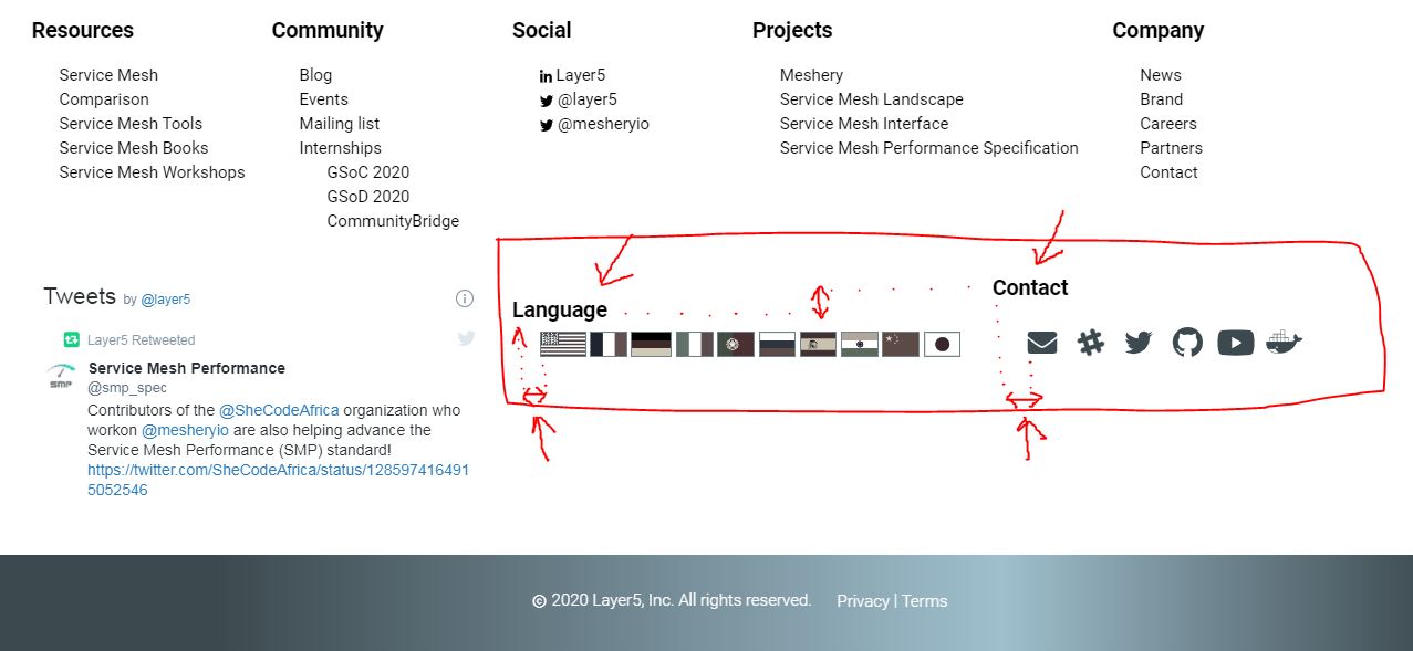
- We can align
Language&Contacton same level. - Properly position
Language&Contactwith respect to their corresponding svg's
Neilblaze
on 14 Aug 2020
Related issues
 chandrashritii
·
4Comments
chandrashritii
·
4Comments
 snitin315
·
4Comments
leecalcote
·
4Comments
leecalcote
·
4Comments
leecalcote
·
3Comments
snitin315
·
4Comments
leecalcote
·
4Comments
leecalcote
·
4Comments
leecalcote
·
3Comments
Most helpful comment
These are all good highlights (things that need fixing), @Neilblaze.