Layer5: [Community] Layer5 Community Meetings table not mobile responsive
This table (https://layer5.io/community#meetings) is not configured to be responsive in a mobile view.
It needs to be responsive. There are existing styles in the site that can be used to make it responsive.
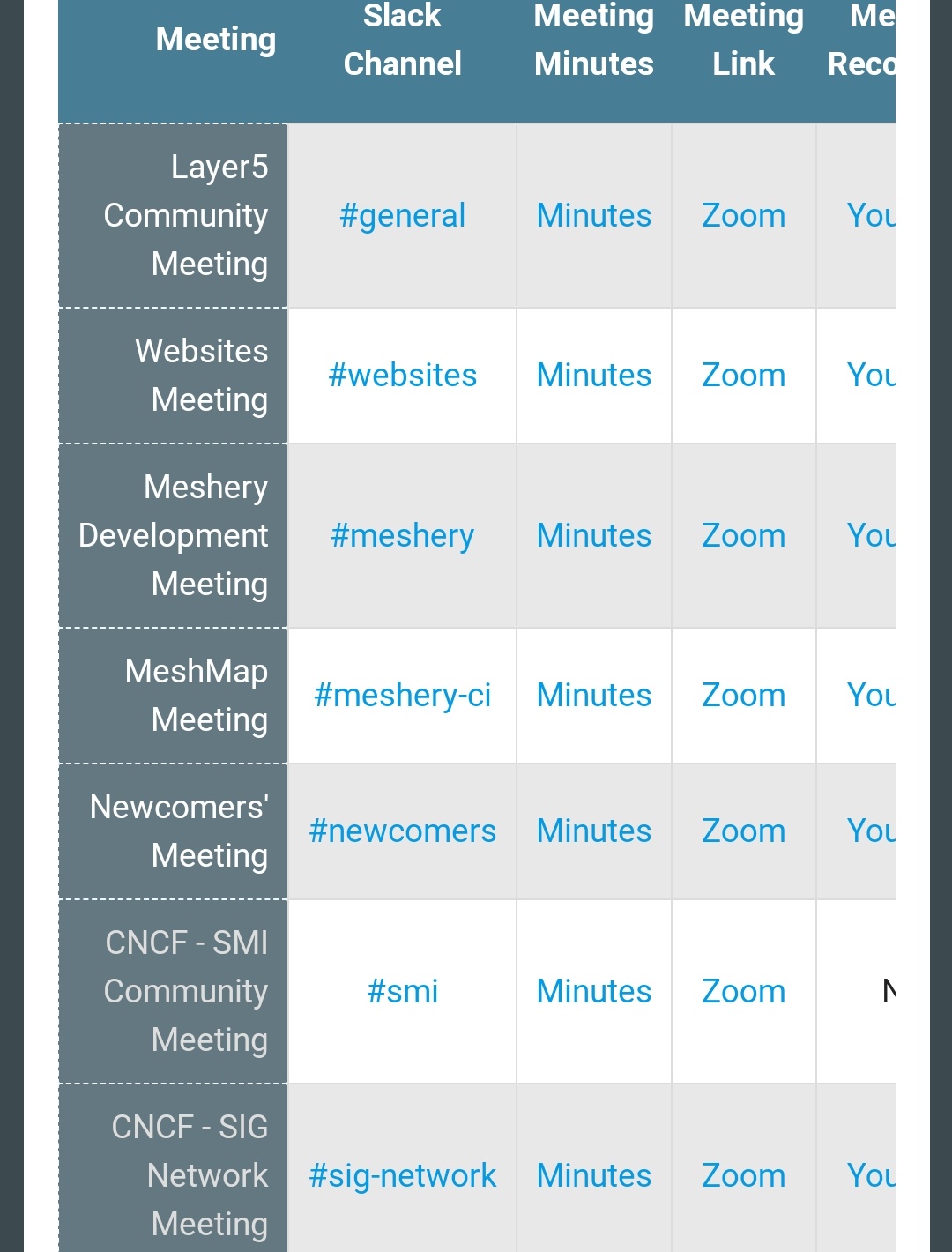
One issue with the table in mobile view.
_Originally posted by @Nikhil-Ladha in https://github.com/layer5io/layer5/pull/764#issuecomment-694638322_
 leecalcote
All 4 comments
@clementkng would you like to take this up?
 chandrashritii
on 18 Sep 2020
chandrashritii
on 18 Sep 2020
@chandrashritii Yes, thank you! Interested in helping out any way I can 🙂
 clementkng
on 18 Sep 2020
clementkng
on 18 Sep 2020
Hi @chandrashritii to make this table responsive, do you think it's enough to make all the options accessible by horizontal scroll ie by either changing the overflow-x property to auto or utilizing the "responsive-table" class (which introduces its own styling that will need to be overridden) or should I try to make a custom media rule to shrink the table? Asking you because you introduced the table.
clementkng
on 22 Sep 2020
I think it would be better to introduce a horizontal scroll, rather than shrinking the table that way the data will be more visible.
 Nikhil-Ladha
on 22 Sep 2020
Nikhil-Ladha
on 22 Sep 2020
Related issues
 Aniruddha-Shriwant
·
3Comments
leecalcote
·
3Comments
Aniruddha-Shriwant
·
3Comments
leecalcote
·
3Comments
 navendu-pottekkat
·
4Comments
navendu-pottekkat
·
4Comments
 NupurThakur27
·
3Comments
leecalcote
·
4Comments
NupurThakur27
·
3Comments
leecalcote
·
4Comments