Kiwix-android: Difficult to read low contrast text with low brightness on phone
Describe the bug
In dark mode.
When viewing the text of zim tags in the library and the text of buttons in dialogs the text is very low contrast and is difficult to see when the brightness of the phone is low.
Expected behavior
The contrast of all text should be high so that it is easy to read. Even in dark mode.
Steps to reproduce the behavior:
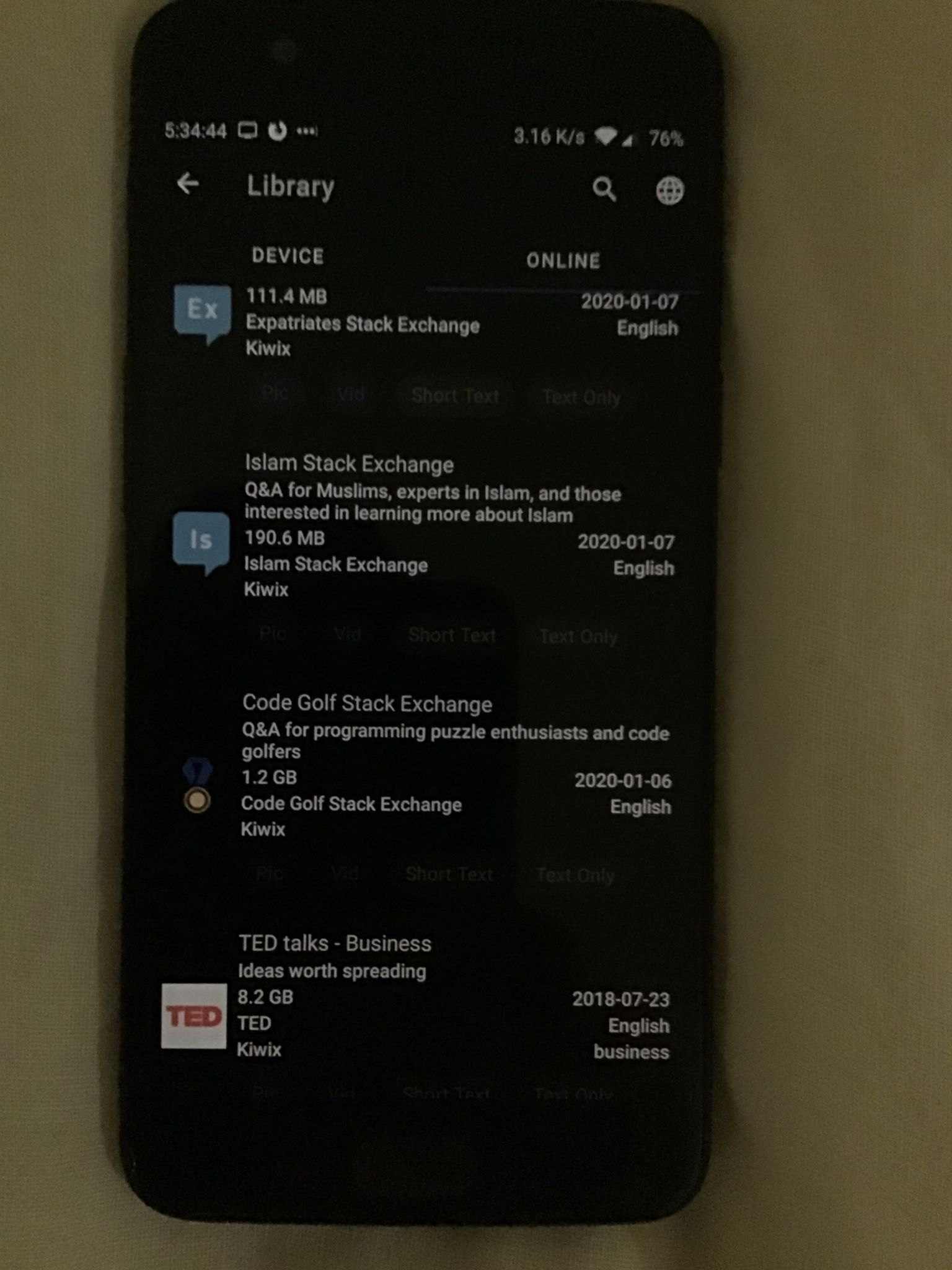
- Enter library
- Look at the tags on the device or online zim files.
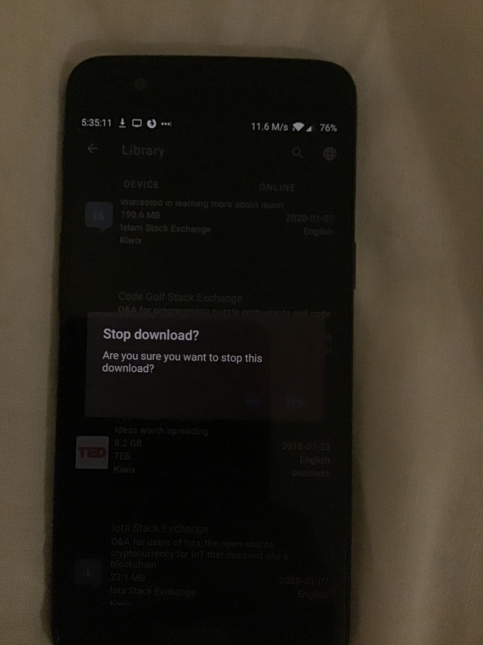
- Go to the online tab in the library.
- Start downloading a file.
- Click the stop button. This dialogs buttons text is low contrast.
Screenshots
Pictures instead of screenshots as screenshots does not show brightness level.
 Frans-Lukas
All 6 comments
Hello! @Frans-Lukas
You correctly pointed out that the stop downlaod button in dark mode is sometimes hard to see.
Although the contrast of all the text cannot be increased further I guess as the background is already black and the text color is white.
For the text you may try the High-contrast text feature under the Accessibility in Android Settings
Also please specify the version of app (environement) you are using, I suggest you trying the same in latest version available at Google Play Store.
 4shutosh
on 31 Jan 2020
4shutosh
on 31 Jan 2020
@macgills Feedback welcome. The tags are really not visible on these pictures. Even if on my Google Pixel2 the contrast level is acceptable. I think something should be done here, probably by increasing at least the lightness of the font.
 kelson42
on 31 Jan 2020
kelson42
on 31 Jan 2020
You correctly pointed out that the stop downlaod button in dark mode is sometimes hard to see.
Although the contrast of all the text cannot be increased further I guess as the background is already black and the text color is white.
@4shutosh I meant the dialog buttons seen in picture 2. ('No' and 'Yes' of the dialaog. Blueish in color) as well as the tags that are gray in color from picture 1. Here is the version info:
- Version of Kiwix Android : 3.1.3 Build: 6230103
- Device : Oneplus 5
Frans-Lukas
on 31 Jan 2020
You correctly pointed out that the stop downlaod button in dark mode is sometimes hard to see.
Although the contrast of all the text cannot be increased further I guess as the background is already black and the text color is white.@4shutosh I meant the dialog buttons seen in picture 2. ('No' and 'Yes' of the dialaog. Blueish in color) as well as the tags that are gray in color from picture 1. Here is the version info:
- Version of Kiwix Android : 3.1.3 Build: 6230103
- Device : Oneplus 5
:laughing: I was really unable to see them !
The colors should be arranged accordingly for better visibility.
Do you want to work on this issue?
Otherwise I am interested in working on this one.
4shutosh
on 31 Jan 2020
Hehe, yeah it is difficult to see! Go ahead and fix it as I can't do much this weekend.
Frans-Lukas
on 31 Jan 2020
Under values-night/color.xml we can change the tone of our primaryColor @color/blue800 and that would affect the night mode blue color.
The disabled text color would probably require a selector be written for the color to supply a different alpha in selected.
If there is someone with experience in graphic design who could make a style guide based on the material design priniciples, that would be immensely helpful to the project
 macgills
on 3 Feb 2020
macgills
on 3 Feb 2020
Related issues
kelson42
·
5Comments
 danielzgtg
·
4Comments
danielzgtg
·
4Comments
danielzgtg
·
4Comments
danielzgtg
·
4Comments
 RaiLokesh
·
4Comments
RaiLokesh
·
4Comments
 abdulwd
·
4Comments
abdulwd
·
4Comments