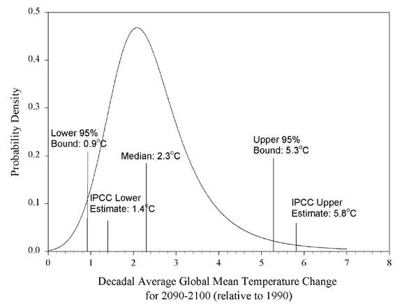
The idea is that, for a given query, to build a bell curve.
The X-axis would be the metric value (time) and Y-axis is relative frequency (or reversed if that makes more sense).
I'm not looking for a perfect bell curve, but two queries on the same filter (one for percentiles and one with a range aggregation based on the histogram) could do it nicely.
All 7 comments
This would be a really powerful feature! I'd love to be able to see what my response time distribution would be.
It would be even better if you could overlay multiple queries (so compare the performance distribution curve of one data center vs another for example)
How would this be different to using a bar chart with time-based ranges on the X-Axis and 'count of documents' on the Y-Axis?
It would always be a bell curve, but the x axis scale would vary with what the percentiles were.
Also, this is not for count, but for the evaluation of a metric.
The "Bell Curve" AKA probability density function differs from a Count aggregate over Histogram buckets, because the Y axis shows relative frequencies instead of absolute counts, e.g.:
 .
.
This is very useful if you need to compare distributions via Split Lines, but the absolute counts are orders of magnitude different, so one series squashes the other:

The log scale often is not enough.
For a summary of statistical properties of the data, we could also consider the boxplot alternative. It shows similar metrics, but makes less explicit of an assumption that the data is normally distributed. If you'd agree, I would close this one in favor of https://github.com/elastic/kibana/issues/4157 then.
@thomasneirynck the box plot would be really helpful but really all that is needed to to divide each bucket by the total values seen in the whole chart. This would just make the Y axis a percentile of the total instead of a raw count.
Is this related to the Cumulative Distribution function? https://github.com/elastic/kibana/issues/3905
Most helpful comment
@thomasneirynck the box plot would be really helpful but really all that is needed to to divide each bucket by the total values seen in the whole chart. This would just make the Y axis a percentile of the total instead of a raw count.