Kibana: [APM] use local filters for JVMs
Describe the feature:
It should be possible to filter down to a specific JVM.
The overview page shows charts including all JVMs - this makes it easy for users to find outliers and spot spikes. To further investing these spikes it should be possible to filter down to a specific JVM.
More information can be found in the design issue:
https://github.com/elastic/kibana/issues/41349
Marvel prototype: https://marvelapp.com/63fejha
@felixbarny @nehaduggal @roncohen please help me with verifying which metrics are crucial to show for this use case.
 katrin-freihofner
All 17 comments
Pinging @elastic/apm-ui
 elasticmachine
on 9 Aug 2019
elasticmachine
on 9 Aug 2019
As @felixbarny and @sqren found some issues with the proposed design we are back to the drawing board:
The idea here is to show the max and average over all JVMs in the charts. Additionally to the charts there is a table listing all JVMs and and their metrics. The overview tab could show totals, the other tabs are for further investigating specific metrics like CPU, Memory...
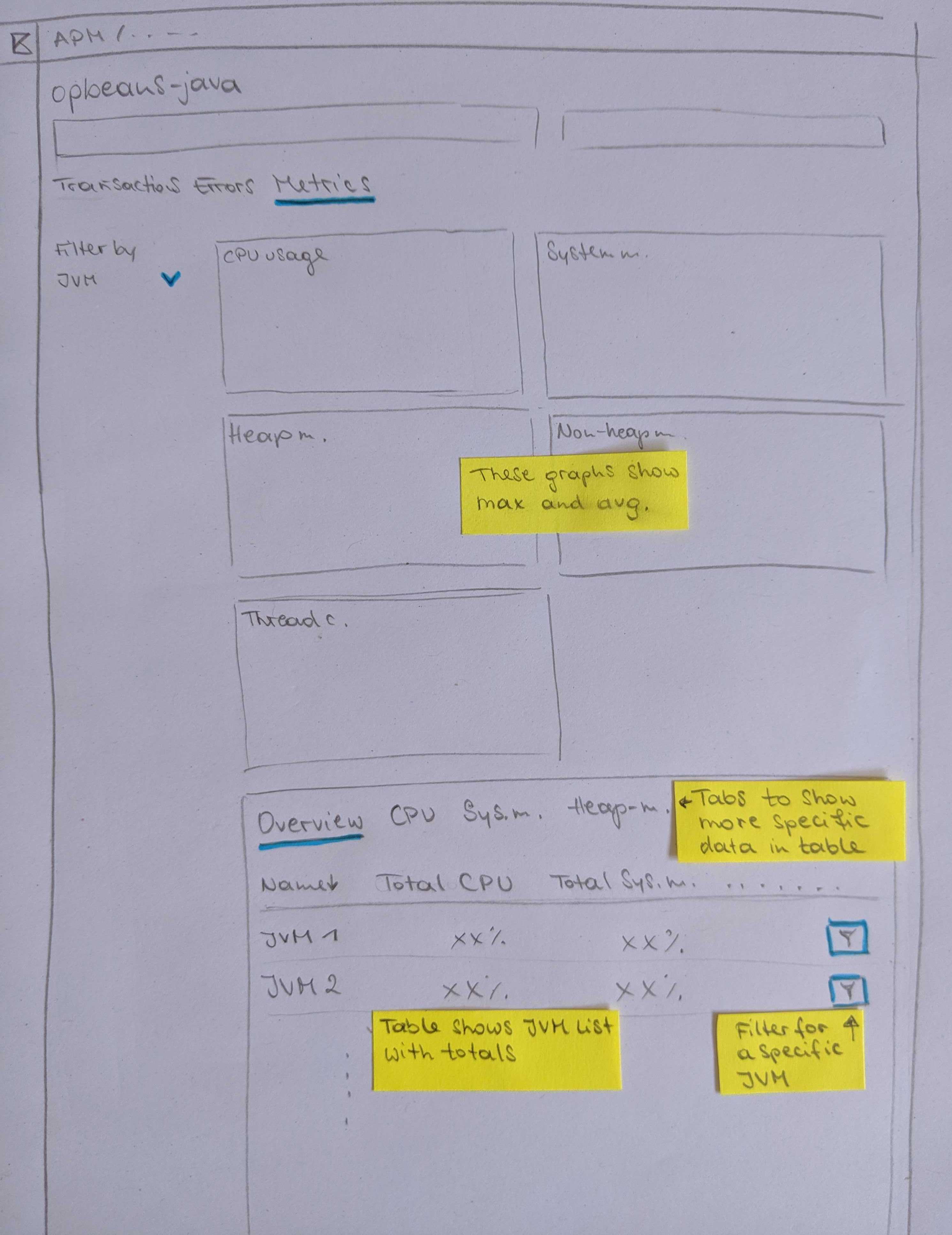
This view could be filtered by JVM:
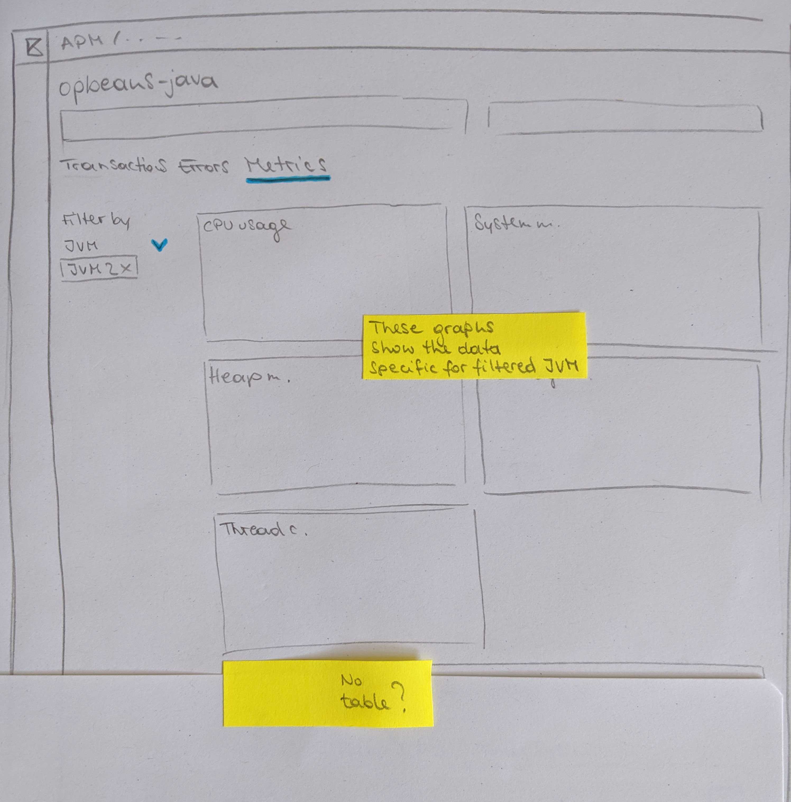
I'm not sure yet about how to trigger the filter -> I would suggest to indicate that with a filter icon.
I did not include the meta data (Container ID, Host...) in this proposal.
katrin-freihofner
on 9 Aug 2019
Love the pen and paper prototype 🙂
/cc @eyalkoren
 felixbarny
on 9 Aug 2019
felixbarny
on 9 Aug 2019
👍 The combination of the max/average aggregation graphs and table for specific JVMs in one view looks good and I believe the drill down (filtering) to single JVMs is a must.
One question though- what is a JVM? Is it identified by ephemeral_id? If so- what do we do with JVM restarts, where the ephemeral ID changes?
Is it a combination of host and env? If so- this combination is not guaranteed to be unique for single JVMs, are we OK with that? Do we think host names (or even container ID) are meaningful enough, so that they can be a meaningful filtering criteria?
Once again I raise the suggestion of allowing an agent_id configuration, which will be under the responsibility of the user to be unique and meaningful. It should be easy to implement and will provide a way to overcome all scenarios where our auto discovered data and existing filters are not good enough.
 eyalkoren
on 11 Aug 2019
eyalkoren
on 11 Aug 2019
The JVM ID would be consistent across restarts. It's not trivial to come up with a good id which works for all cases but there are some options. For a generic application, we can use $host/$service/$environment. For web applications, we can use $host/$service/$port, where $port would be the javax.servlet.ServletRequest#getLocalPort of the first served request.
felixbarny
on 12 Aug 2019
First javax.servlet.ServletRequest#getLocalPort is not something you can rely on as a servlet container may expose several ports (even the simple example of a port for HTTP and one for HTTPS). There are also some proxying scenarios where I am not sure if this port is meaningful.
Also, $host/$service/$environment are not a guarantee for uniqueness. We already talked with a customer that described their use of several instances of the same service in production for redundancy purposes.
I am all in favour in attempting to automatically discovering unique and meaningful agent IDs and use them by default, but whenever this fails, our metrics will be much less usable. So all I am saying is- since it is so easy to add, let's add this optional configuration that people can use when our discovered IDs are not good enough.
eyalkoren
on 12 Aug 2019
We should probably show a warning in the UI if there are multiple PIDs for the same JVM ID reporting metrics at the same time. And yes, having an option to manually override the agent id seems useful.
felixbarny
on 12 Aug 2019
+1 to having a config option to allow customers to name their JVMs.
I don't think having both the charts and the table in one view works. Theres too many nav items and the table existing below the charts/fold will make it hard for discovery. Also, having that many nav items will make the search and filter interactions on that page really complex. We should either pick charts or a table to show the aggregated view of those metrics across JVMs.
 nehaduggal
on 12 Aug 2019
nehaduggal
on 12 Aug 2019
We should either pick charts or a table to show the aggregated view of those metrics across JVMs.
I find it hard to choose and would prefer havingm both because they each have pros/cons:
Charts:
- 👍 can show how a metrics behaves over time
- 👎 cannot be used for discovering worst performing jvms since it would require a line chart per jvm which doesn't scale (there could be 100s of jvms)
Table
- 👍 can be used for discovering worst performing jvms by allowing the user to sort jvms by a certain metric.
- 👎 can only show the average value for a metric for the selected time period
Theres too many nav items and the table existing below the charts/fold will make it hard for discovery
We also talked about not having the table on the page with the charts but allow the user to click through to a "CPU page" and a "Memory page".
The "CPU Page" would only show a single chart for CPU, and below it a table with CPU metrics. This would probably not be below the fold, and there would only be few columns in the table.
 sqren
on 12 Aug 2019
sqren
on 12 Aug 2019
I think the landing page for anything should be one you would keep open if you monitor something, without having to toggle through too much, and therefore they fit together. The graphs are great visual indication that something may be wrong, but for multiple JVMs they provide no indication of where to look and the table completes that. Besides, GC and memory, GC and CPU - they are all influencing each other, so they make sense together.
@sqren if we decide to add an optional agent_id field- can it be included in the predefined filters, even though it is optional?
eyalkoren
on 13 Aug 2019
People scroll! We should not be worried about that. We should rather focus on the reasons why users are on this page and what they want to achieve. The charts are great visual indicators and make it much easier to process the information. Do we have a real world example of one of these charts with 100+ lines?
Would the table show aggregated values over the time selected in the date picker?
katrin-freihofner
on 13 Aug 2019
People scroll!
If all table columns are sortable, people would even have to scroll too much in most cases
Do we have a real world example of one of these charts with 100+ lines?
Do you mean if we have real data you can test with? then no (but we can probably produce such). If you mean- is this a real problem that there will be lots of JVMs per service- then yes.
Would the table show aggregated values over the time selected in the date picker?
Good question! Not very useful to show averages of 24 hours or a week...
Can we make a distinction between static sessions and dynamic ones (ie when auto-refresh is on) or a distinction between views of "Last ..." and "From ... to ...":

?
When "From ... to ..." views are selected- it would make sense to use aggregated data.
When "live views" (ie auto-refreshed) are used it makes sense to show some kind of current state in the table and over-time data in graphs, something like Mac's Activity Monitor:

or Window's Task Manager
eyalkoren
on 13 Aug 2019
The charts are great visual indicators and make it much easier to process the information. Do we have a real world example of one of these charts with 100+ lines?
To be clear: the problem with too many line charts would only happen if we decide to not have tables and instead use charts for discovering bad performing jvms. Since the number of jvms per service is unbounded and it is realistic that users have have many of them, I can see it becoming a problem. But as we talked about this problem can be solved by doing the discoverability via tables.
If all table columns are sortable, people would even have to scroll too much in most cases
We could just show the top 10 jvms. Then people wouldn't have to scroll those.
Would the table show aggregated values over the time selected in the date picker?
Yes. We could show max/p95 values which might be better than just an average.
@eyalkoren That idea is interesting but I think it is out of the scope for what we are doing now. It would have implications elsewhere in APM UI and most (if not all) other plugins treat the time range from the time picker consistently across Kibana. Changing this behaviour therefore require a bit more thinking, and I'd like to postpone that if we can.
sqren
on 13 Aug 2019
@sqren there are certainly indications that I am not aware of, just threw an idea of what would seem useful for me.
You added the table in order to provide more fine-grained troubleshooting info, but if my time range is 24 hours or more, I assume average, max or p95 will all be useless in many cases for pinpointing a CPU or memory problem...
eyalkoren
on 13 Aug 2019
The power comes from the explorative interaction with both graphs and tables. Having both on the same page makes the interaction between them easier.
The idea is that users would first look at the graphs. When they see a spike, for example in the max CPU, they want to find out which JVM was responsible for that. They can then select the time frame of the spike and sort the table underneath the graphs by CPU % to find out which JVM(s) caused the spike.
felixbarny
on 13 Aug 2019
Summary from yesterdays meeting with @nehaduggal @roncohen @sqren
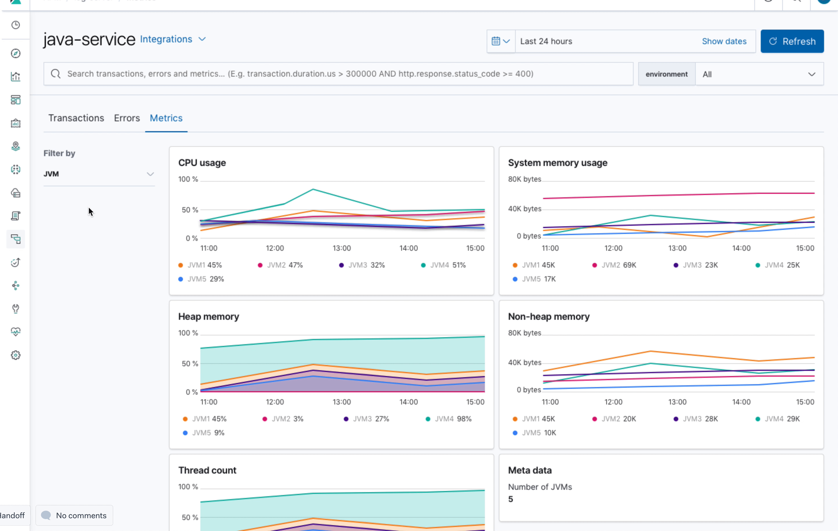
This is what we agreed on: For Java services we will change the metrics tab to hold a list of JVMs. This overview has the same (local) filter capabilities as the other tabs (transactions, errors). The list of JVMs will show 3-4 metrics and can be sorted accordingly. The items in this list link to individual JVM pages. The JVM pages show the same charts as we currently have in the overview page but for an individual JVM.
katrin-freihofner
on 21 Aug 2019
I talked to @felixbarny and @eyalkoren and they suggest to have:
- system.process.cpu.total.norm.pct (average)
- jvm.memory.heap.used (average)
- jvm.memory.non_heap.used (average)
jvm.thread.count (max)
total GC time if available
katrin-freihofner
on 21 Aug 2019
Related issues
 socialmineruser1
·
3Comments
socialmineruser1
·
3Comments
 mark54g
·
3Comments
mark54g
·
3Comments
 cafuego
·
3Comments
cafuego
·
3Comments
 timmolter
·
3Comments
timmolter
·
3Comments
 MaartenUreel
·
3Comments
MaartenUreel
·
3Comments
Most helpful comment
As @felixbarny and @sqren found some issues with the proposed design we are back to the drawing board:
The idea here is to show the max and average over all JVMs in the charts. Additionally to the charts there is a table listing all JVMs and and their metrics. The overview tab could show totals, the other tabs are for further investigating specific metrics like CPU, Memory...

This view could be filtered by JVM:
I'm not sure yet about how to trigger the filter -> I would suggest to indicate that with a filter icon.
I did not include the meta data (Container ID, Host...) in this proposal.