Kibana: [SIEM] Page Enrichments with Histograms, Tabs & Updated KPIs
This issue is meant to capture the work involved in enriching the existing SIEM pages with histograms. To avoid further increasing page height and potentially improve user navigability and performance, the addition of the new histograms should follow implementation of EUI tabs for page sub-navigation. Additionally, as some of these new histograms will result in redundant visualizations, the existing page KPIs will need to be updated following the addition of each page's histograms. In addition to updating the KPI contents and layout accordingly, we can consider enhancing the data by also including percentage difference over the previous time range.
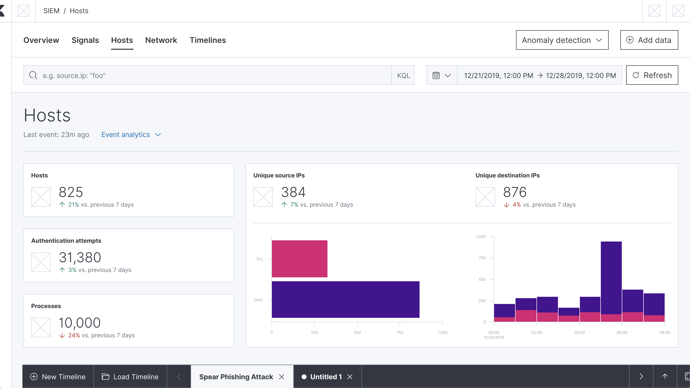
Hosts Page
Hosts Page Figma Wireframes
Hosts Page Figma Prototype
- [x] Implement tabbed sub-navigation - https://github.com/elastic/kibana/pull/44037
- [ ] Add all hosts histogram
- [x] Add authentications histogram - https://github.com/elastic/kibana/pull/48260
- [x] Add anomalies histogram - PR https://github.com/elastic/kibana/pull/50295
- [x] Add events histogram - issue , PR https://github.com/elastic/kibana/pull/45403
- [ ] Update page KPIs
Host Details Page
- [x] Implement tabbed sub-navigation - https://github.com/elastic/kibana/pull/44037
- [x] Add authentications histogram - https://github.com/elastic/kibana/pull/48260
- [x] Add anomalies histogram - PR https://github.com/elastic/kibana/pull/50295
- [x] Add events histogram - issue , PR https://github.com/elastic/kibana/pull/45403
- [ ] Update page KPIs
Network Page
- [x] Implement tabbed sub-navigation - PR https://github.com/elastic/kibana/pull/47556
- [ ] Add top talkers histogram
- [x] Add top DNS domains histogram - PR https://github.com/elastic/kibana/pull/50409
- [x] Add anomalies histogram - PR https://github.com/elastic/kibana/pull/50295
- [ ] Update page KPIs
IP Details Page
- ~[ ] Implement tabbed sub-navigation~
- [ ] Add domains histogram
- [ ] Add users histogram
- [ ] Add transport layer security histogram
- [ ] Add anomalies histogram
- [ ] Update page KPIs
 MichaelMarcialis
All 12 comments
Pinging @elastic/secops
 elasticmachine
on 1 Aug 2019
elasticmachine
on 1 Aug 2019
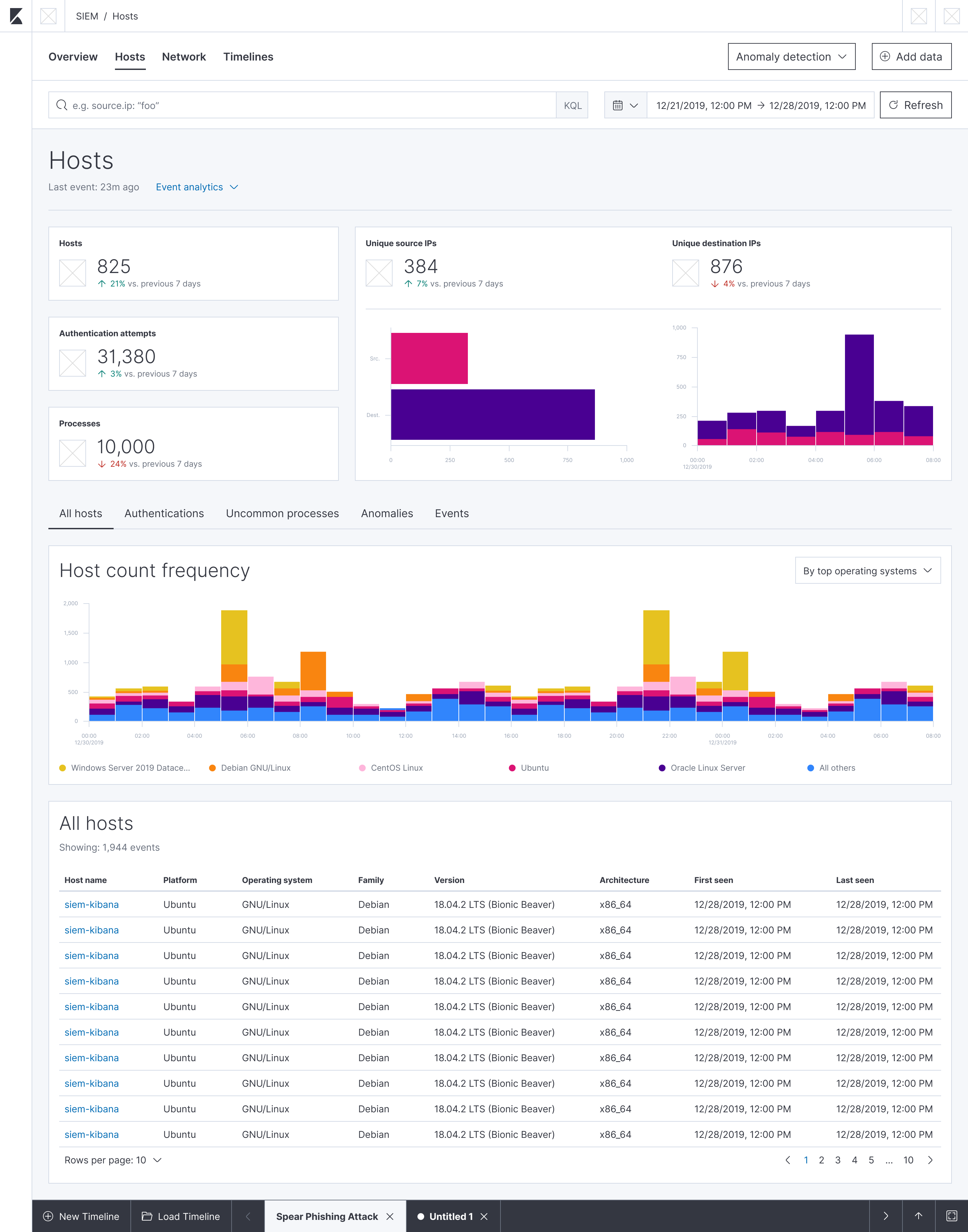
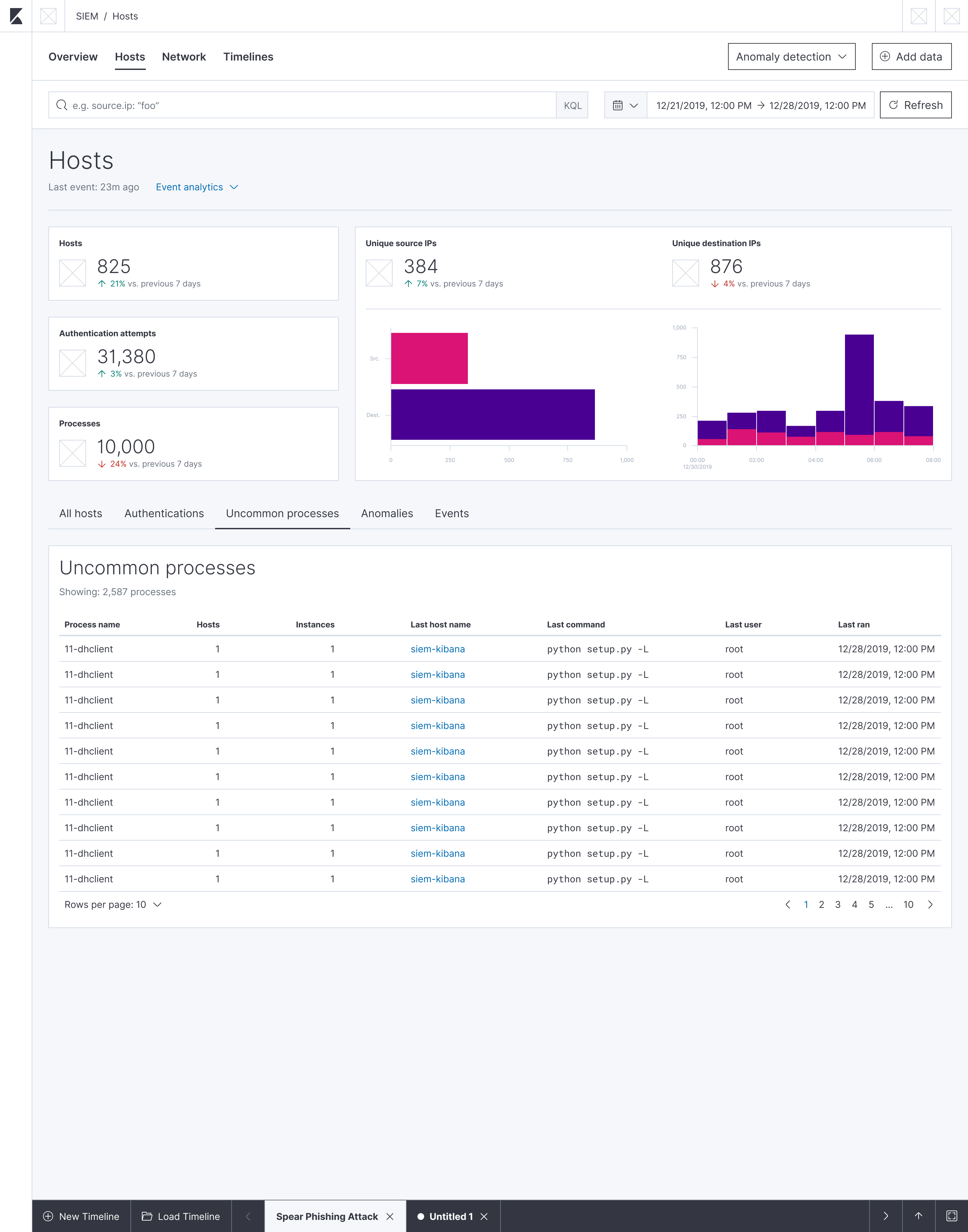
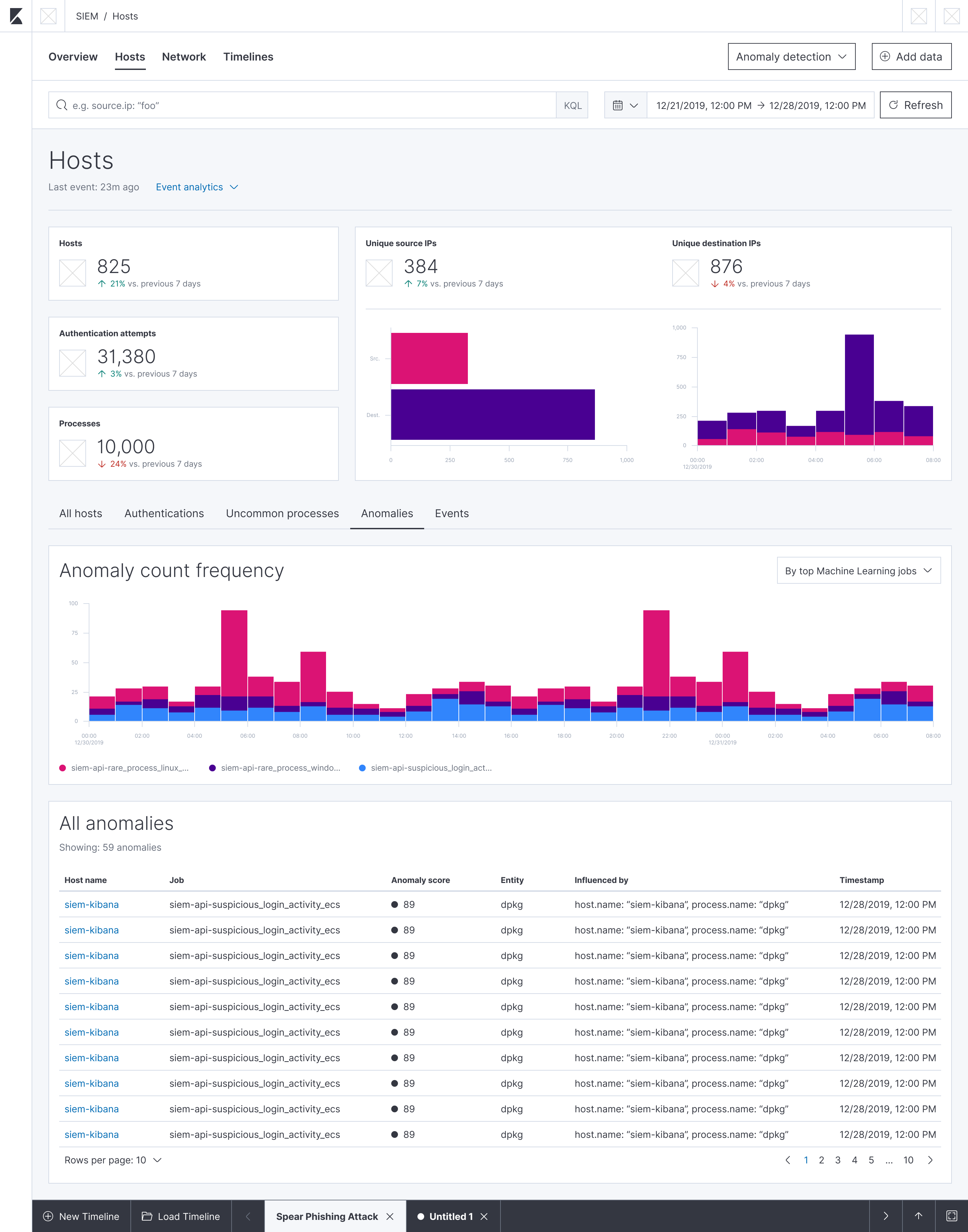
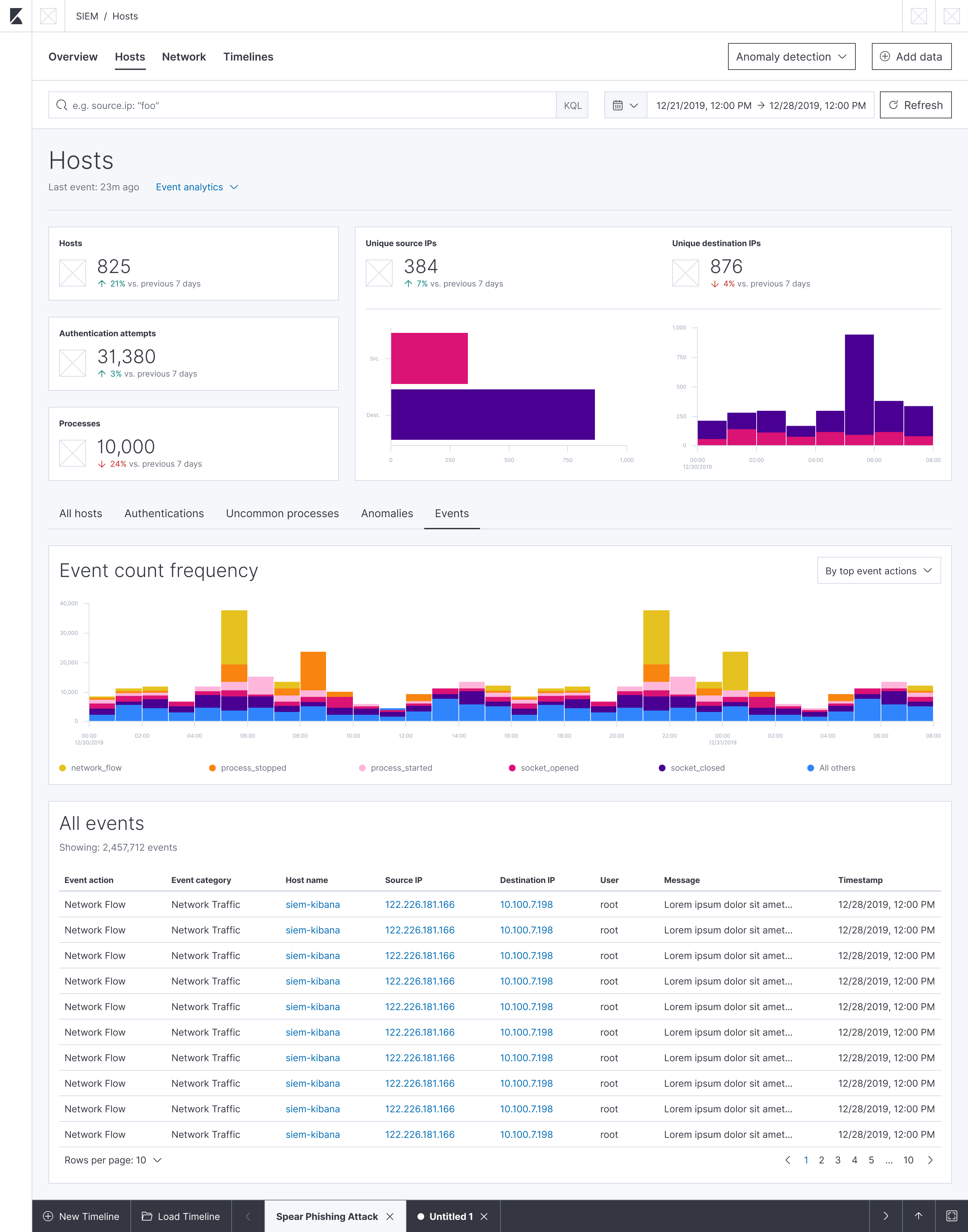
Here are screenshots of the wireframes we looked at in today's SIEM sync. If there are any comments or questions, please feel free to drop here or as a comment in the Figma links above.
All Hosts Tab:
Authentications Tab:

Uncommon Processes Tab:
Anomalies Tab:
Events Tab:
MichaelMarcialis
on 1 Aug 2019
A small comment on the new KPIs: When I open the Figma prototype on the mac laptop screen, the second level of tabs are just below the fold:
Since we've said before that we want the tabs to be visible, we might want to reduce a bit the KPIs in height so that the tab headers fit comfortably on the page?
 tsg
on 8 Aug 2019
tsg
on 8 Aug 2019
@tsg @MichaelMarcialis
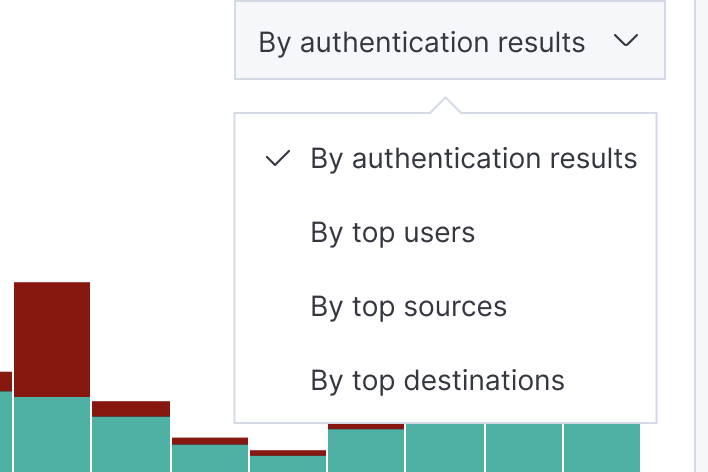
I think we can remove the word 'frequency' from the histogram headers (Event count, Anomaly count, Authentication count, Host count).
Don't think we need the word 'top' in any of the drop-downs either.
 benskelker
on 7 Oct 2019
benskelker
on 7 Oct 2019
@MichaelMarcialis Love the new tabbed sub-navigation. Is this a feature which could one day become usable in normal dashboards for Kibana users?
 willemdh
on 8 Oct 2019
willemdh
on 8 Oct 2019
@tsg @MichaelMarcialis
I think we can remove the word 'frequency' from the histogram headers (Event count, Anomaly count, Authentication count, Host count).Don't think we need the word 'top' in any of the drop-downs either.
@benskelker: Sounds good on the header text updates. I'll update the wireframes to reflect that.
Regarding the word "top" prefixing some of the stack options, the original intent was that we would only show the top 5 users/sources/destinations/etc. in the stacked bar chart, with a 6th stack reserved for "All others". The idea there was to prevent from having too many colors/stacks and instead focus on only the most numerous.
In implementation however (with the host events histogram), it looks like we are not limiting the number of stacks/colors in the chart, and are instead showing them all. If that's how we plan to proceed with these histograms, I agree with you that we should remove the "top" prefix text. However, if we want to limit the number of colors/stacks as my wireframes suggest, it would make sense to keep the text. I'm not sure if we discussed which way would be best to proceed. @tsg, do you have any opinions on the matter?
MichaelMarcialis
on 8 Oct 2019
@MichaelMarcialis Love the new tabbed sub-navigation. Is this a feature which could one day become usable in normal dashboards for Kibana users?
@willemdh: Thanks so much for the kind feedback! Any and all feedback is most welcome.
Regarding your question, it looks like there is an open issue for using pagination or tabs in a dashboard. I'm sure if you inquire about the status of it on the issue, someone from the Kibana app team can give you an update on its progress.
If that issue isn't what you were looking for though, please do feel free to open a new feature request.
MichaelMarcialis
on 9 Oct 2019
@MichaelMarcialis
Thanks - let's decide on the drop-down text after the implementation is finalised.
Just wondering, would displaying the least common Authentication and Event counts also be useful for SIEM (especially if we only display the top 5 and all others are aggregated)?
benskelker
on 10 Oct 2019
Just wondering, would displaying the least common Authentication and Event counts also be useful for SIEM (especially if we only display the top 5 and all others are aggregated)?
@benskelker: I agree there's value in showing something like the least common authentications, though I'm not sure if a histogram is the best way to convey that information (as its presence will be minimal by definition, yielding a not-so-interesting shape to the data). It's also tricky because it's subjective depending on what field the user is defining as "uncommon." For example, is it the number of login successes? Login failures? Both? I wonder if filtering and manipulating the table data would be more successful in that regard.
@randomuserid: Do you have any thoughts on this?
MichaelMarcialis
on 14 Oct 2019
@MichaelMarcialis @cwurm @tsg could you check if we do need any more histograms to add?
 patrykkopycinski
on 12 Dec 2019
patrykkopycinski
on 12 Dec 2019
Awesome to see most of the checkboxes done :). Generally speaking, I think we'll want to go deep and add more visualizations that you can access via the drop-down in the mockups. That would make things a bit more customizable, which is a common request.
But I'd say that for now, we've managed to get pretty good coverage and the pages look really good, so I'm fine with closing this ticket.
tsg
on 12 Dec 2019
@MichaelMarcialis @cwurm @tsg could you check if we do need any more histograms to add?
Hey, @patrykkopycinski. You and @angorayc have done a great job knocking these out! Regarding your question above, here's some comments and questions:
- For all the histograms that you all have added, do we plan to continue iterating on them to include allowing users to select the stack dimension via the dropdown interface indicated in the wireframes?
- On the hosts page, do we still want to do a histogram for the
All hoststab? Or has that been cut? - On the network page, top talkers has since been replaced with source/destination IPs and source/destination countries. Do we wish to have histograms for any or all of those? I'm happy to mock those up if need be.
- The IP details tabbed navigation task has been struck-through. Was it decided that we wouldn't be introducing tabbed navigation into that page at all?
- If we do plan to add tabbed navigation to the IP details page, do we want to include histograms for source/destination IPs, source/destination countries, users, HTTP requests, transport layer security and anomalies?
- There was also the notion of enhancing the existing KPIs for each page, which would include metrics for percentage change from the previous time interval, removal of redundant visualizations (with the addition of the new histograms), and some layout changes. Things have changed a fair bit since this issue was opened, so it probably requires that I take another pass at determining the best KPIs to include and mocking them up for each page. Do we want to spin this off as a separate issue?
MichaelMarcialis
on 14 Dec 2019
Related issues
 spalger
·
3Comments
spalger
·
3Comments
 timroes
·
3Comments
timroes
·
3Comments
 ctindel
·
3Comments
ctindel
·
3Comments
 treussart
·
3Comments
treussart
·
3Comments
 timmolter
·
3Comments
timmolter
·
3Comments