Kibana: 'Read more' link in Telemetry banner should stand out as a link
Kibana version: 6.3.0
Elasticsearch version: 6.3.0
Server OS version: Windows 10
Browser version: Chrome
Browser OS version: Ubuntu 18.04
Original install method (e.g. download page, yum, from source, etc.): zip
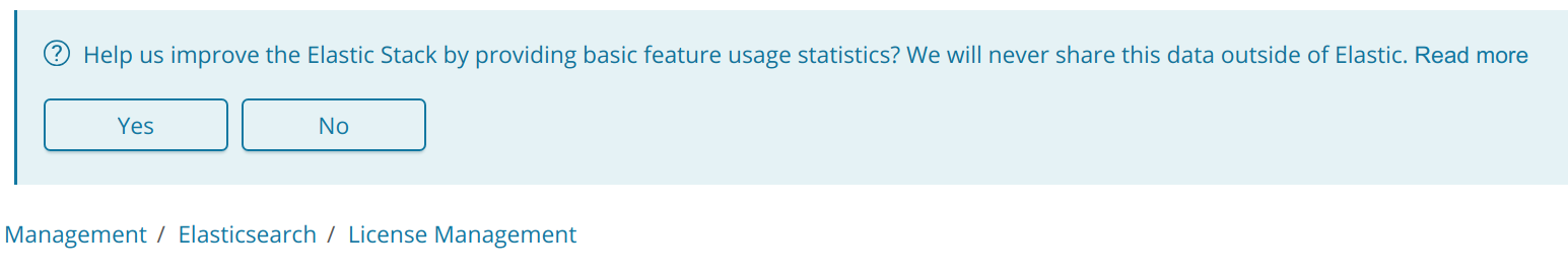
Describe the bug:
The Read more link text should somehow stand out as being a link. It looks like it might be very slightly bold compared to the preceding text. But it's very hard to tell.
In other places in Kibana the main text is black and then the blue link text stands out. But in this case its blue on blue.
 LeeDr
LeeDr
All 8 comments
Would underlining this text to indicate its a link be a suitable fix?
 Vimal-Raghubir
on 31 May 2018
Vimal-Raghubir
on 31 May 2018
This link uses EuiLink, which does not have an underline variant: https://elastic.github.io/eui/#/navigation/link
cc @pickypg @elastic/kibana-design
 tsullivan
on 5 Jun 2018
tsullivan
on 5 Jun 2018
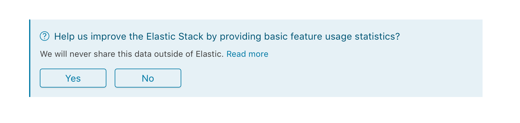
I would move the second sentence (plus link) to a paragraph in the callout content area. Like so:
 cchaos
on 5 Jun 2018
cchaos
on 5 Jun 2018
Would it be possible if I submit a PR for this change?
Vimal-Raghubir
on 5 Jun 2018
Hi @Vimal-Raghubir, we're not actually sure on the direction that we're going to take with this issue yet. Chances are that it will be @cchaos' example, but we're debating if we want to do something else. We appreciate the offer to help though!
 pickypg
on 5 Jun 2018
pickypg
on 5 Jun 2018
Thank you for the response @pickypg. Another suggestion I would like to make is putting the Read More link into a button alongside the Yes and No options in the banner. This way the users will know its clickable, since buttons invite clicking, and won't cause any confusion. :)
Vimal-Raghubir
on 5 Jun 2018
@LeeDr another discussion has spun up around this topic internally. Perhaps we can close this issue and pick up the conversation over there? Seems people are favoring use of a toast message and a checkbox on the welcome page.
 ryankeairns
on 5 Oct 2018
ryankeairns
on 5 Oct 2018
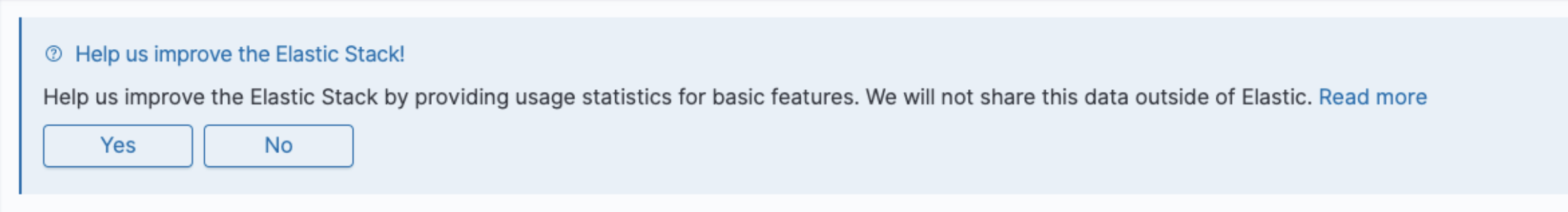
The text has been updated. It now looks like
cchaos
on 28 Aug 2019
Related issues
 MaartenUreel
·
3Comments
MaartenUreel
·
3Comments
 cafuego
·
3Comments
cafuego
·
3Comments
 celesteking
·
3Comments
celesteking
·
3Comments
 ynux
·
3Comments
ynux
·
3Comments
 socialmineruser1
·
3Comments
socialmineruser1
·
3Comments
Most helpful comment
Thank you for the response @pickypg. Another suggestion I would like to make is putting the Read More link into a button alongside the Yes and No options in the banner. This way the users will know its clickable, since buttons invite clicking, and won't cause any confusion. :)